
Recent QoR Lightfast Testing
Introduction
Our Lab, in conjunction with the Materials and Applications Specialists Department, recently updated the lightfastness testing for the entire QoR Watercolor line. Our testing methods employed a significantly expanded range of dilutions with water as well as incorporating, for the first time, tints with titanium white to more accurately simulate how artists use watercolor. The results, shared below, provide us even greater confidence in the stability and archival qualities of these modern watercolors. After reviewing these results, artists should feel confident is using QoR for a wide range of watercolor painting applications.
Methodology
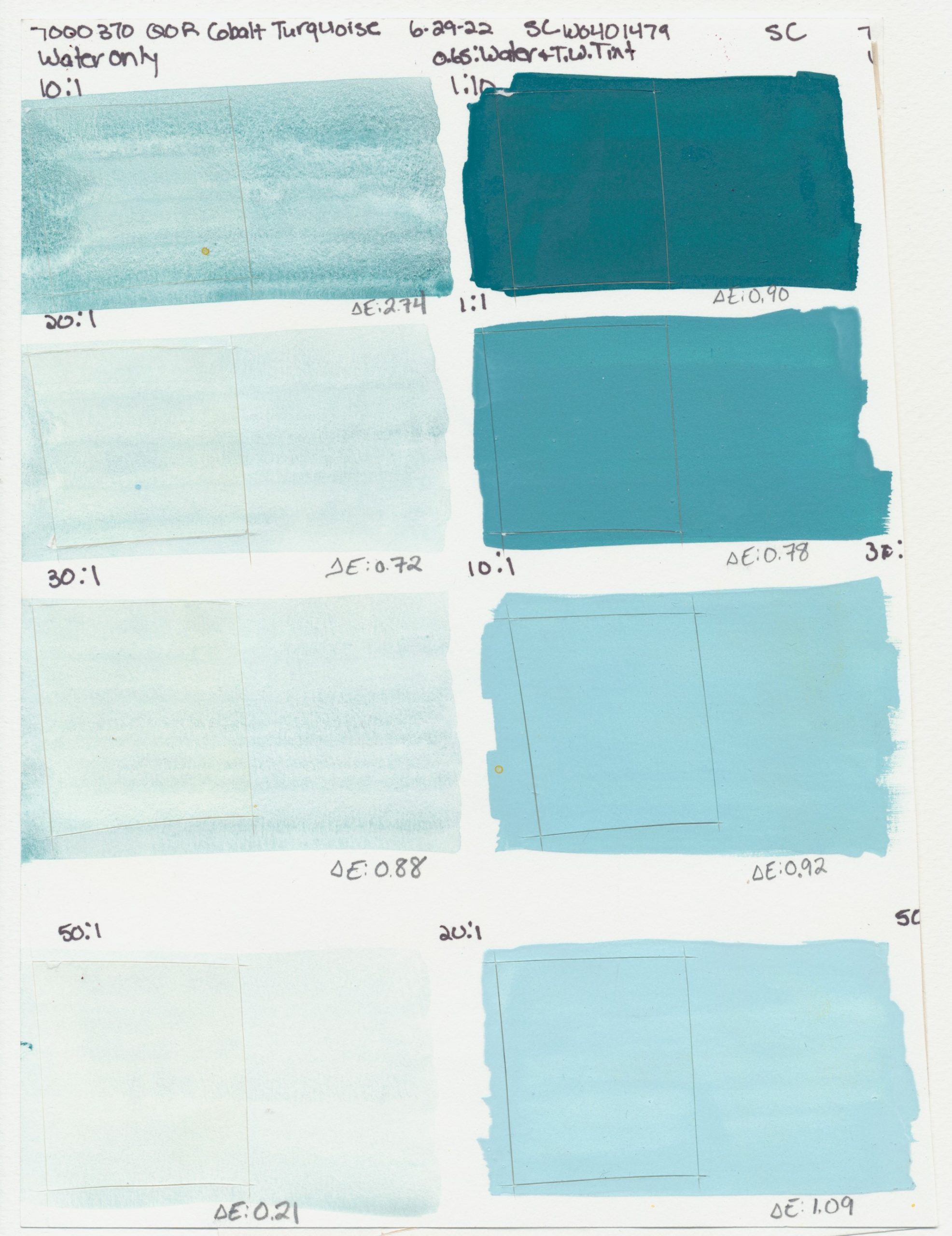
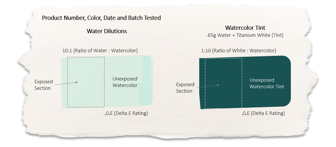
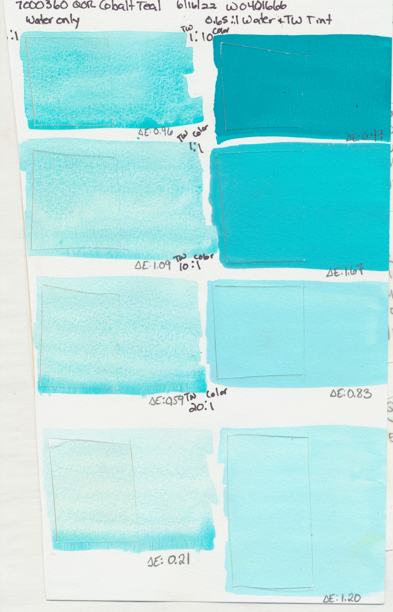
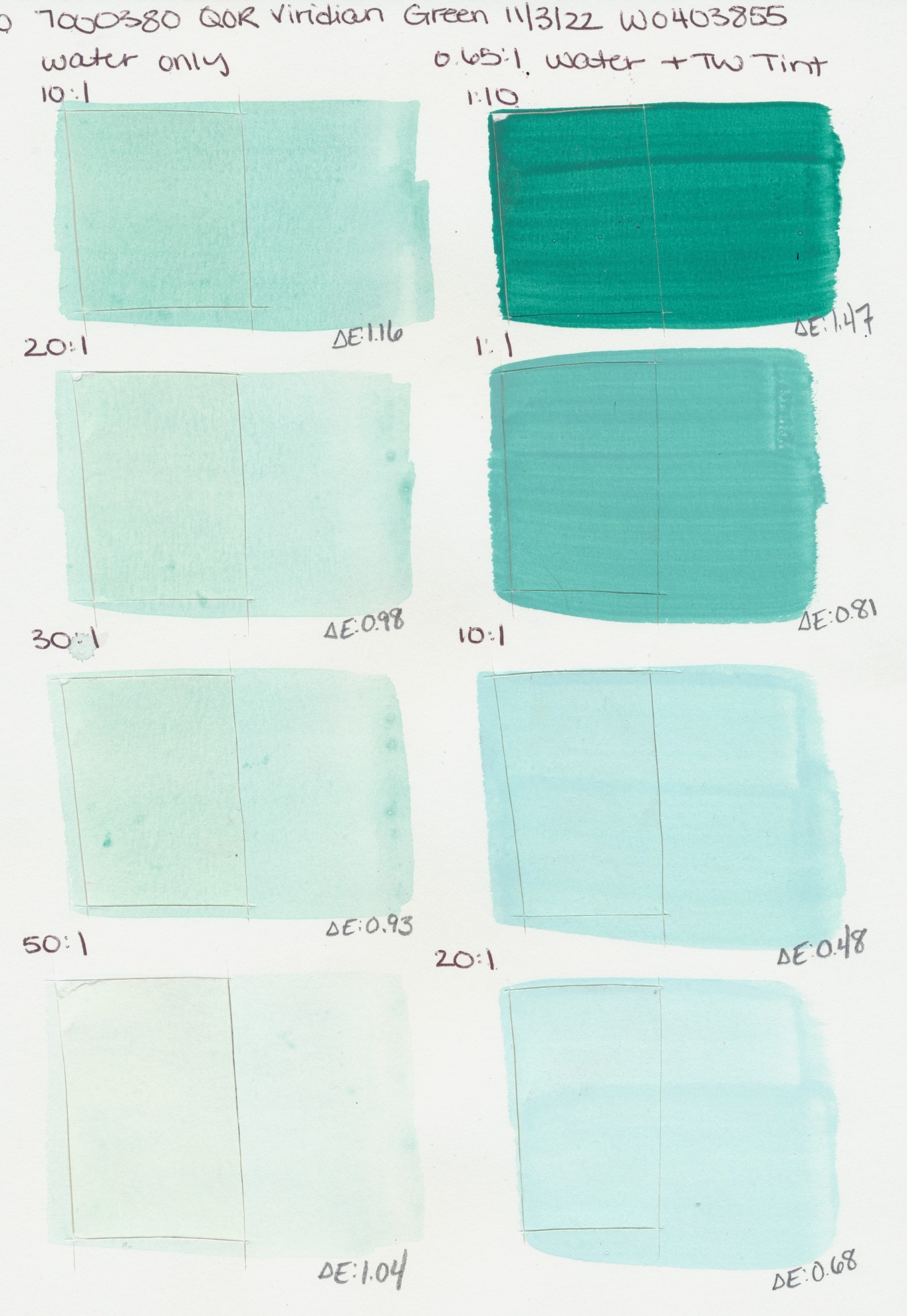
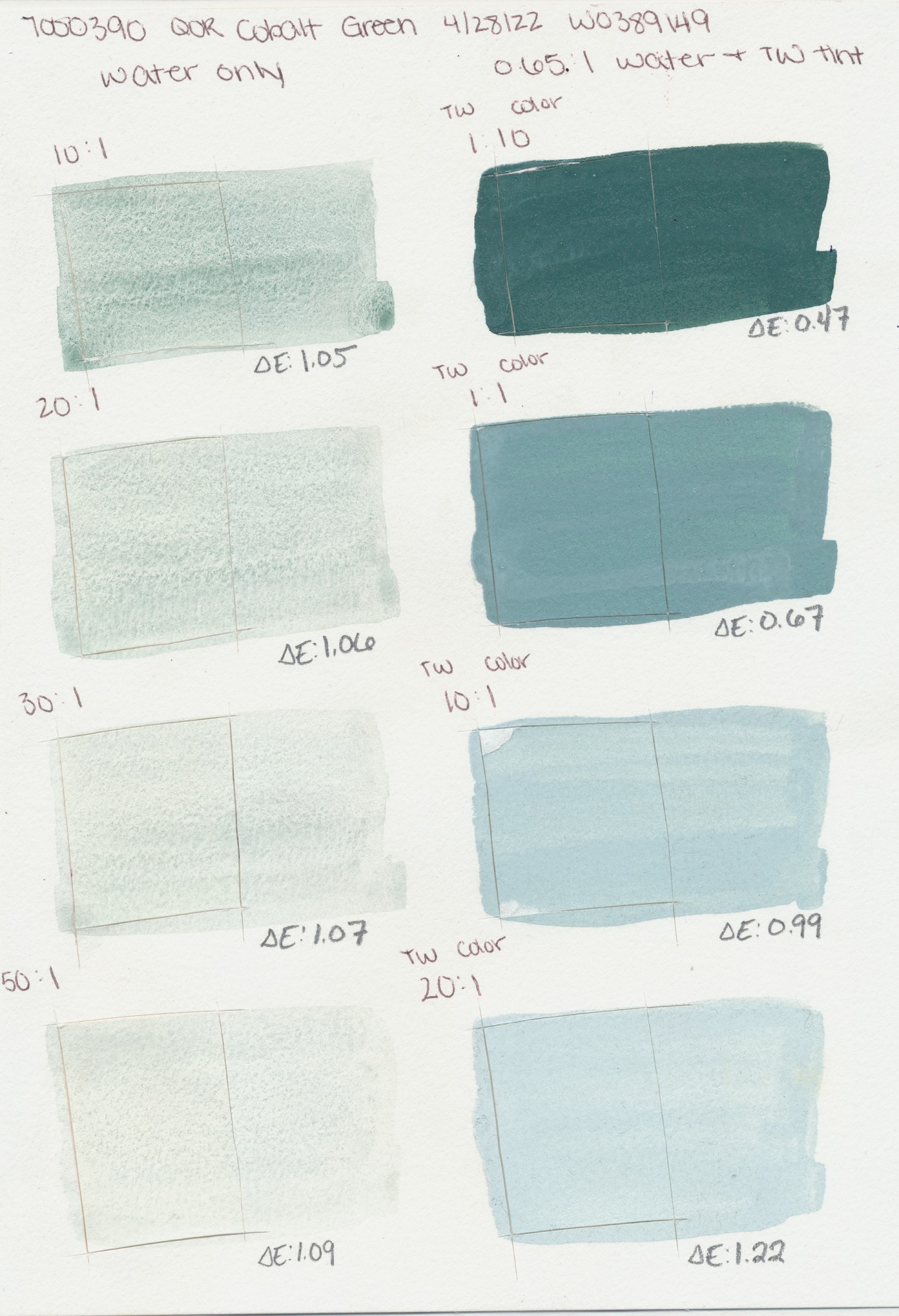
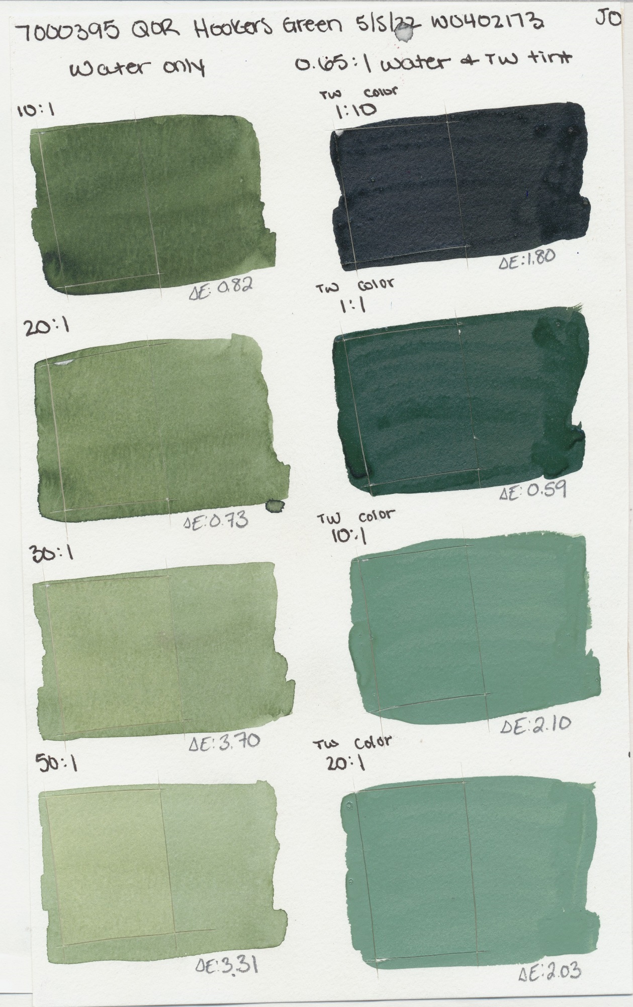
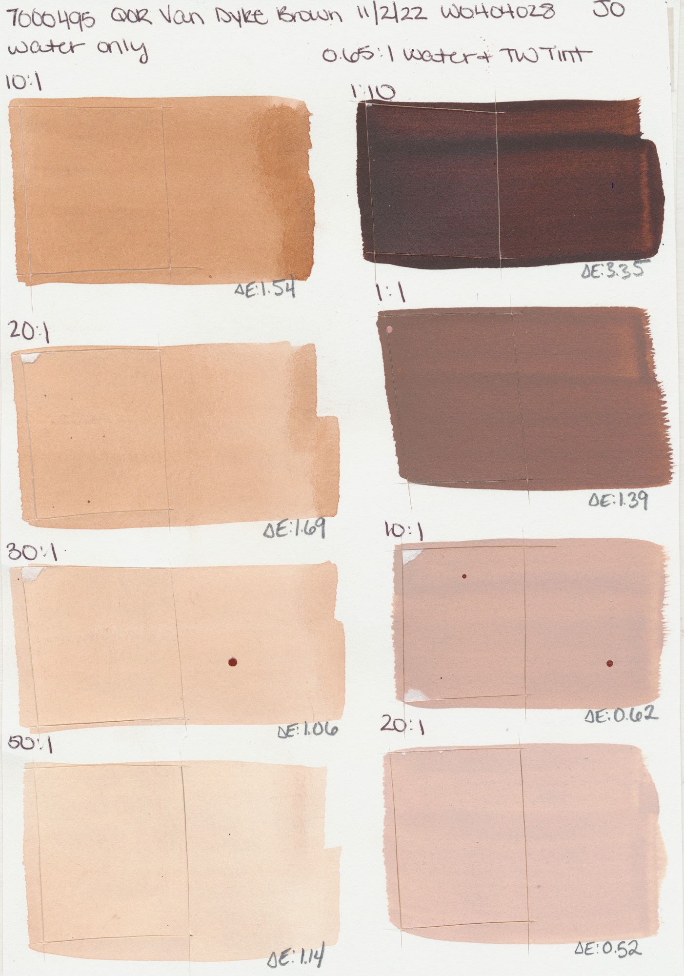
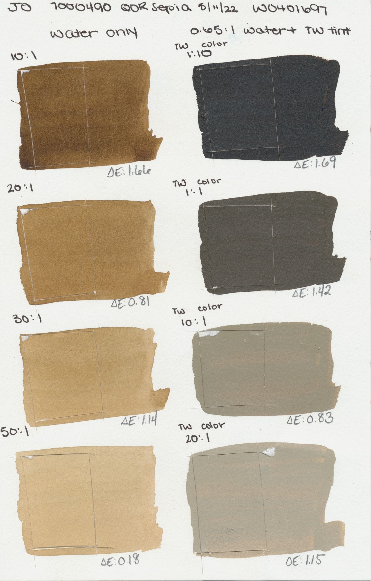
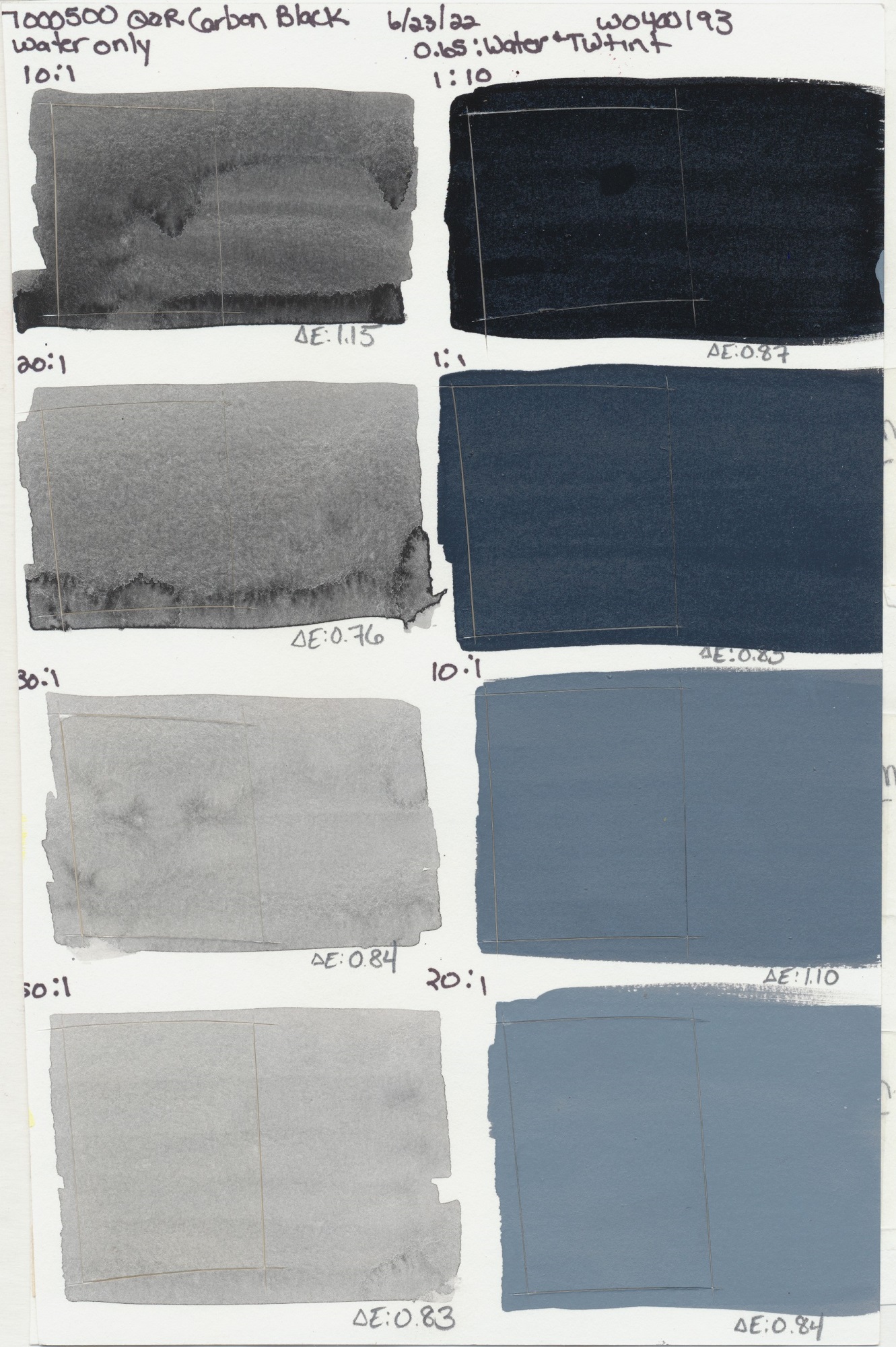
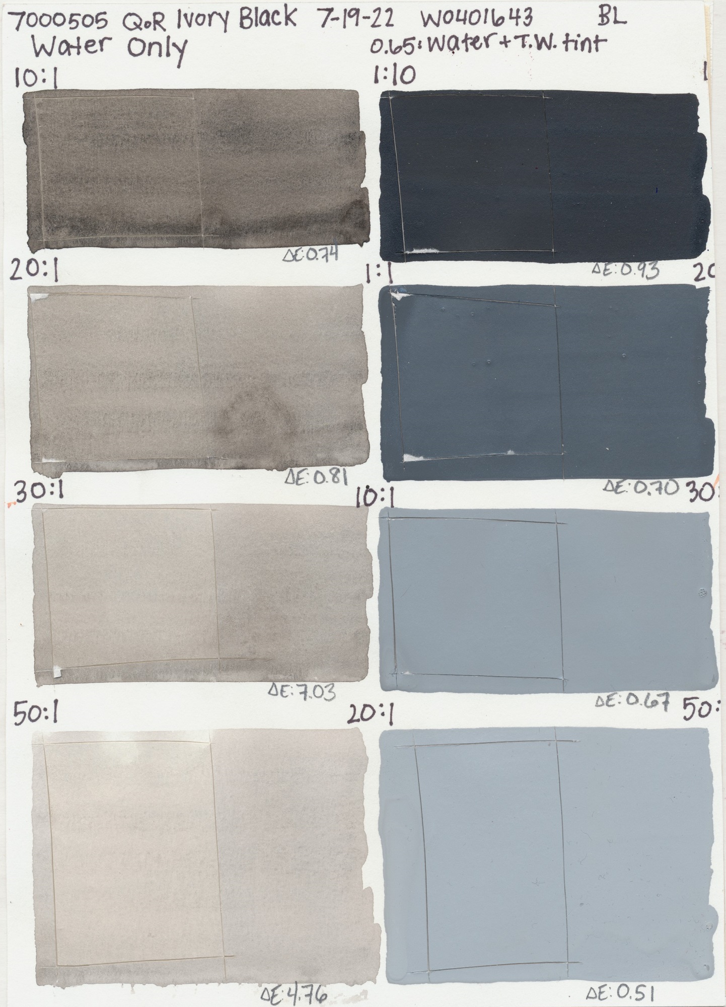
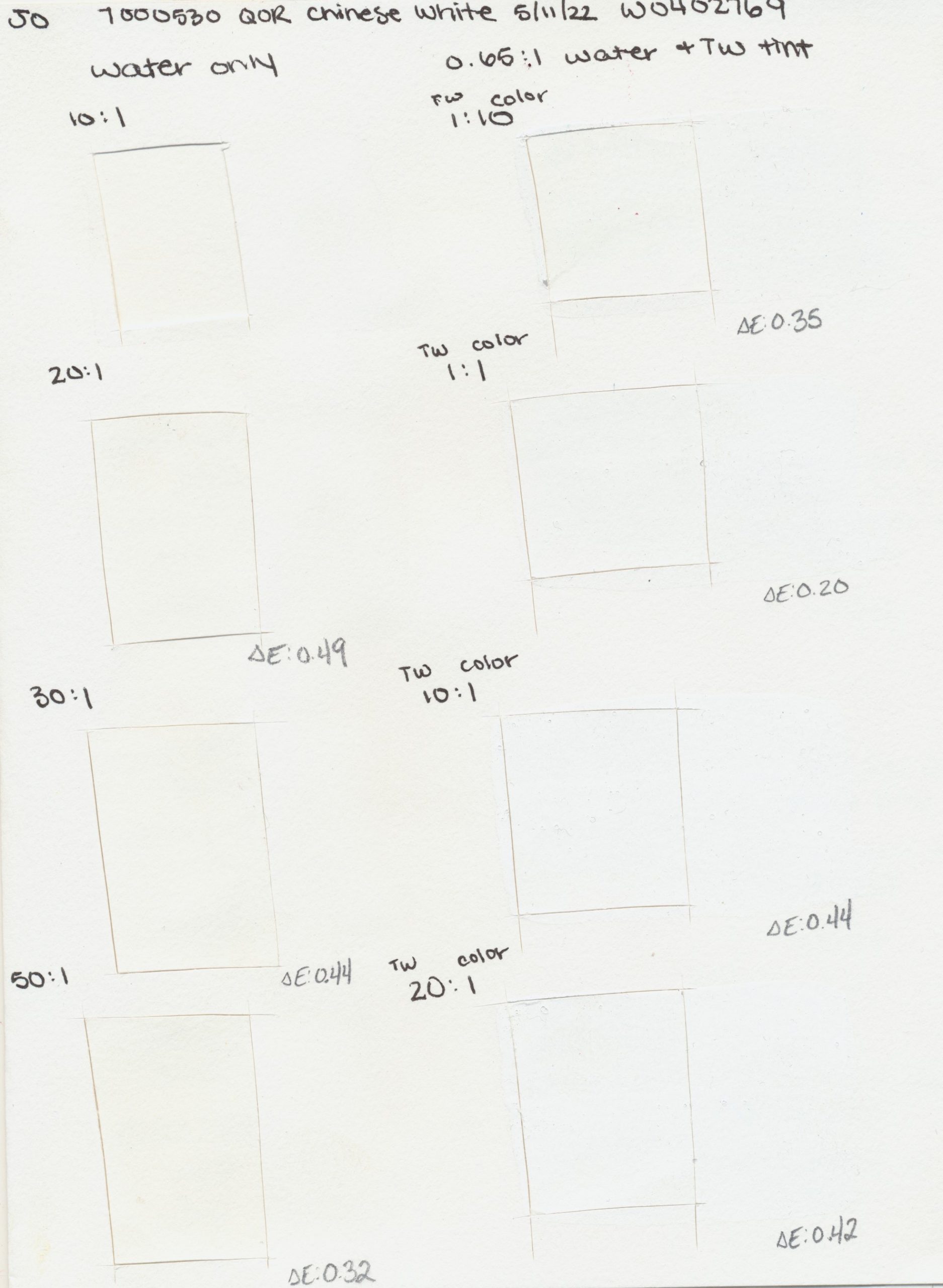
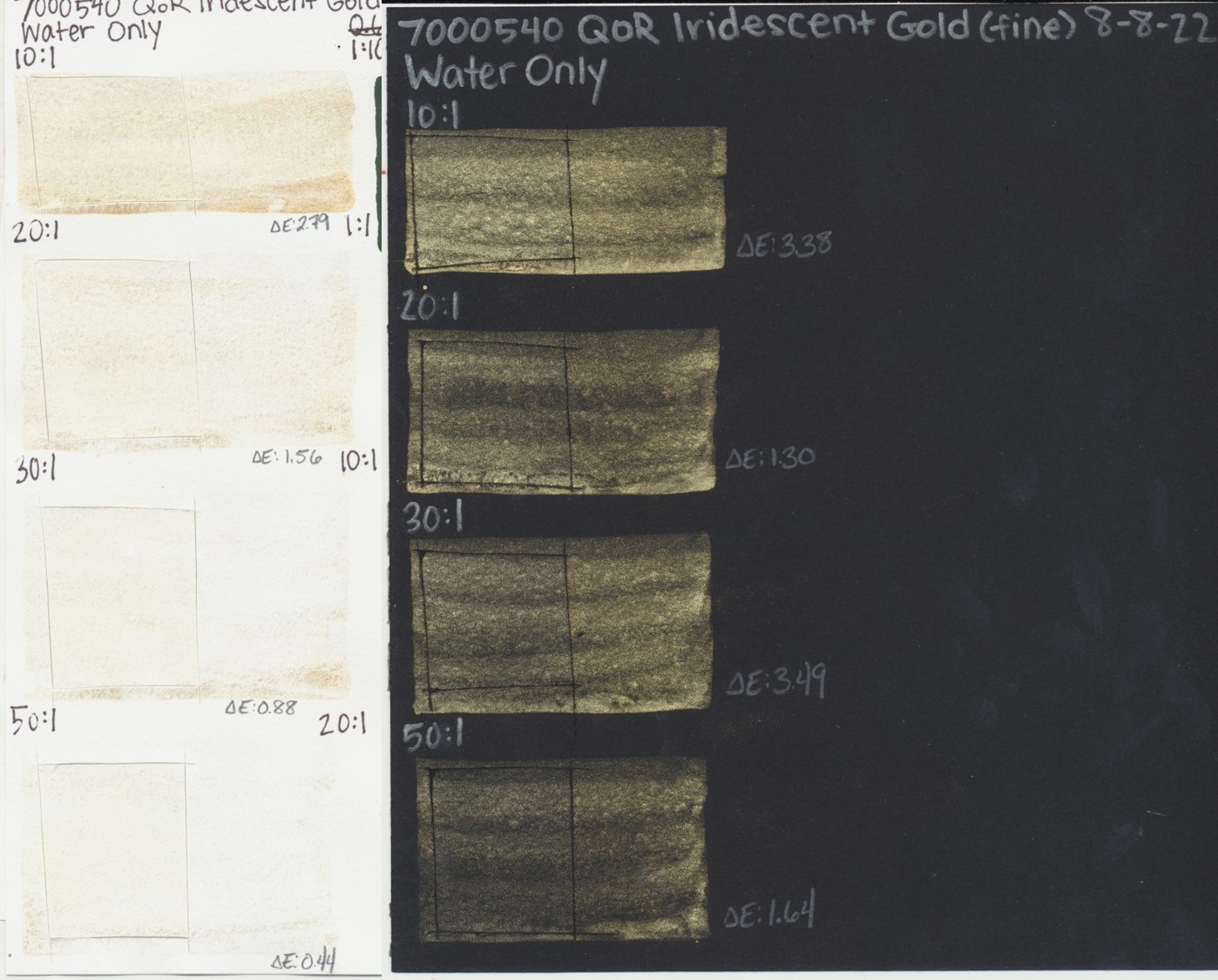
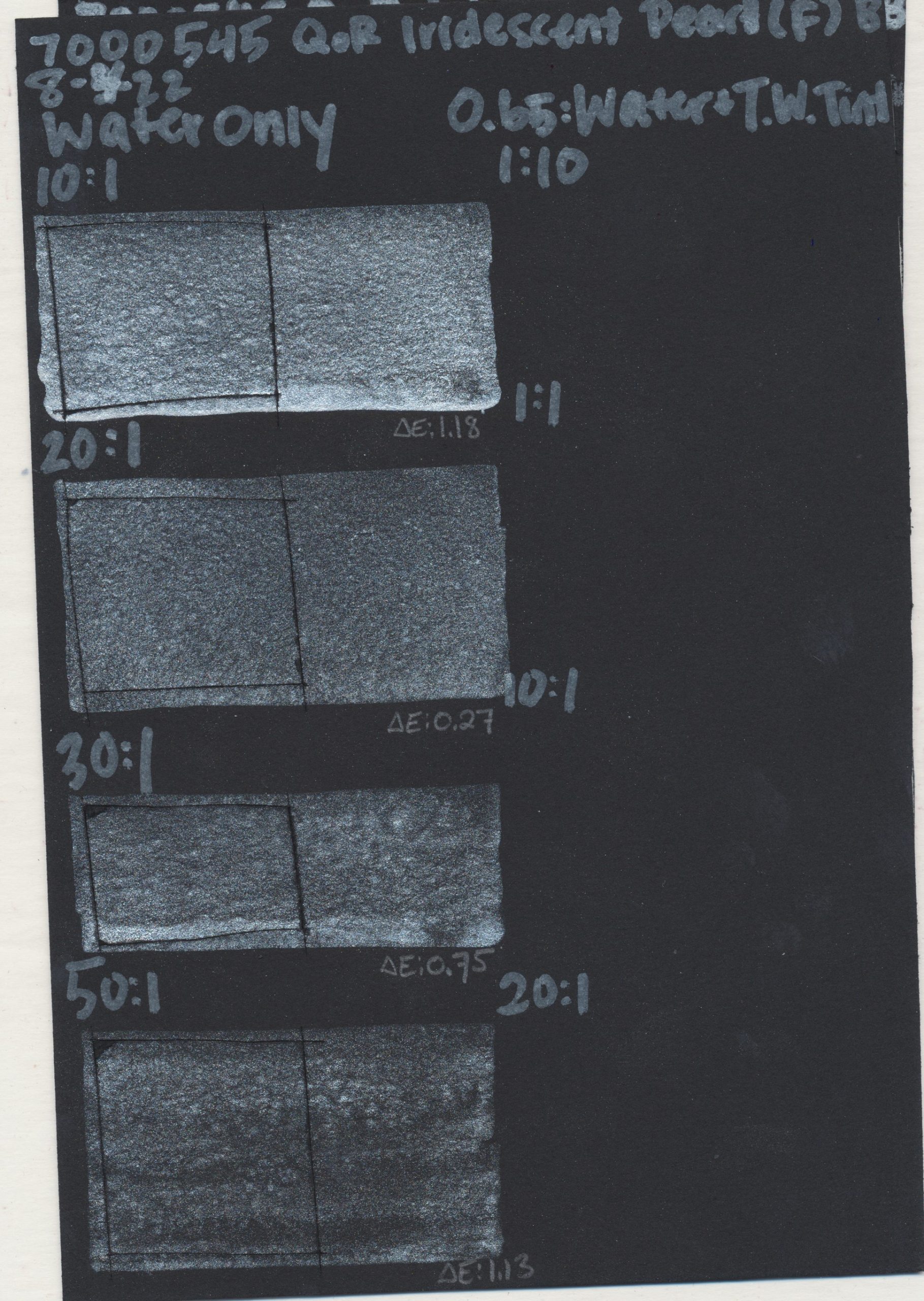
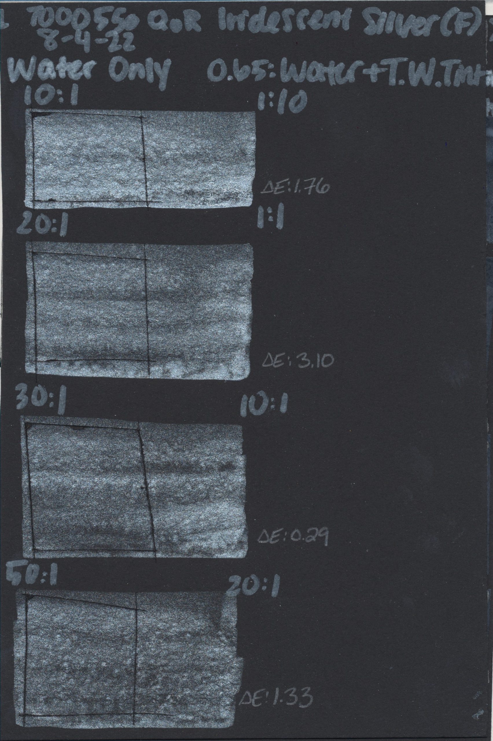
In order to account for a wider array of realistic artist applications, we expanded our testing methods by including a range of dilutions from 10:1 up to 50:1 (water to watercolor). We also included tints of every QoR watercolor in a range of ratios with QoR Titanium White, except our iridescent colors, as this produces a weak tint and diminishes their overall effect. Incorporating tints was important to us so as to address lightfastness concerns watercolorists have expressed since our article on Hansa Yellow. All watercolor tests were created on Canson Foundation paper, to use a utility grade paper over premium alternatives.
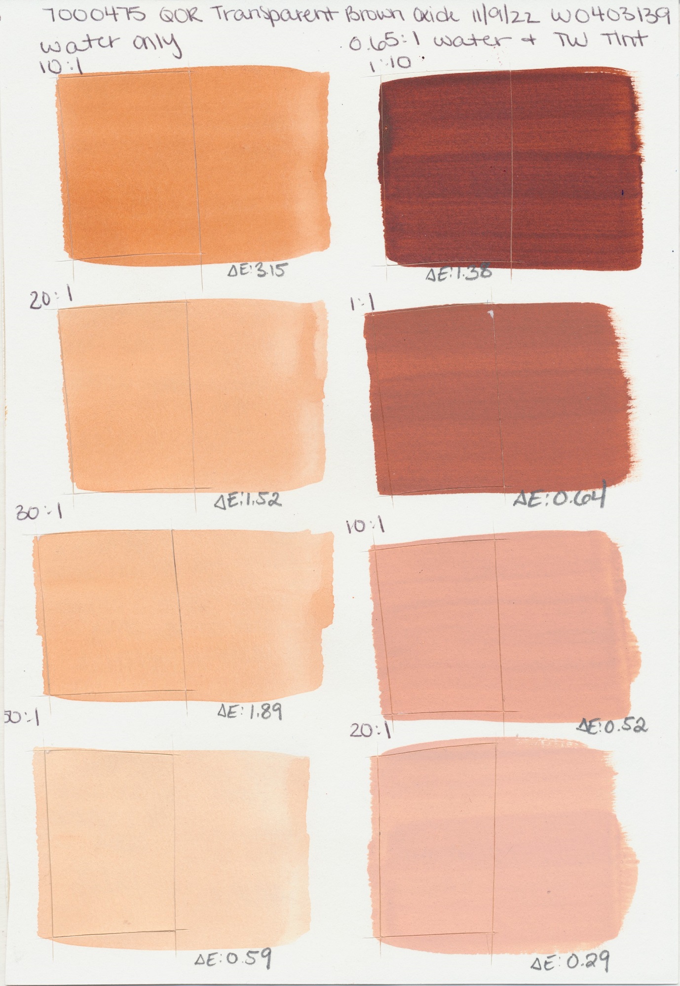
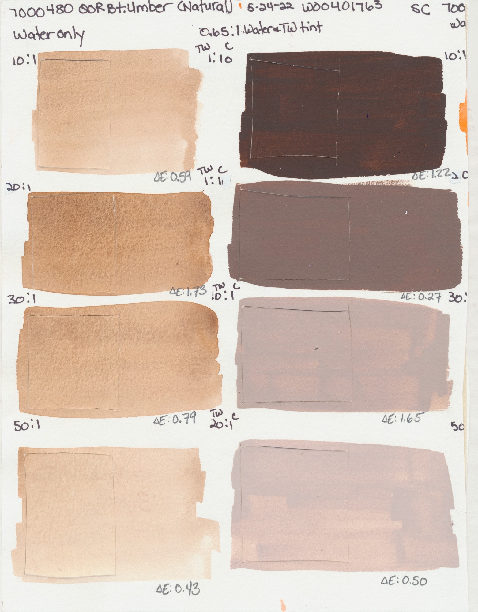
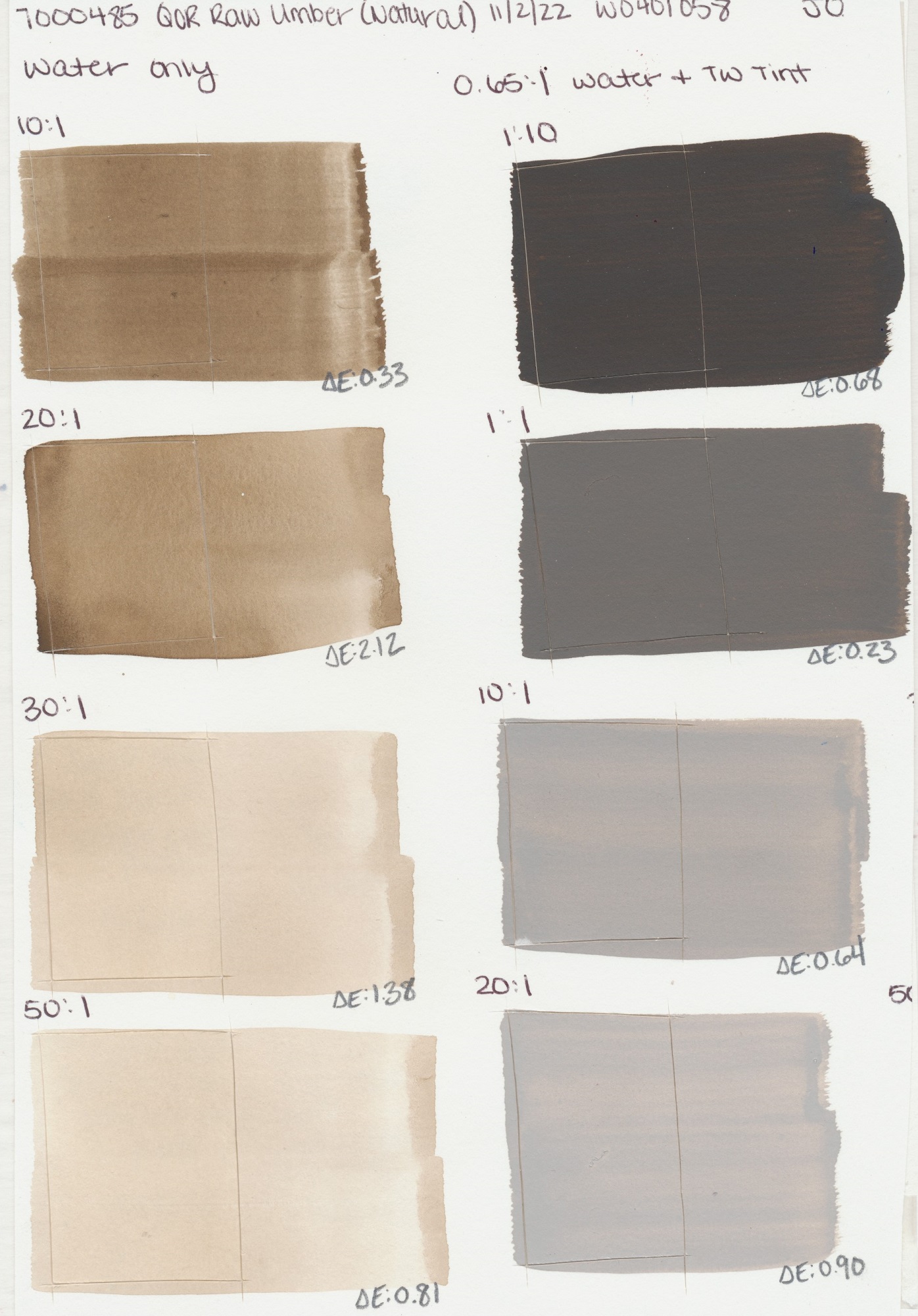
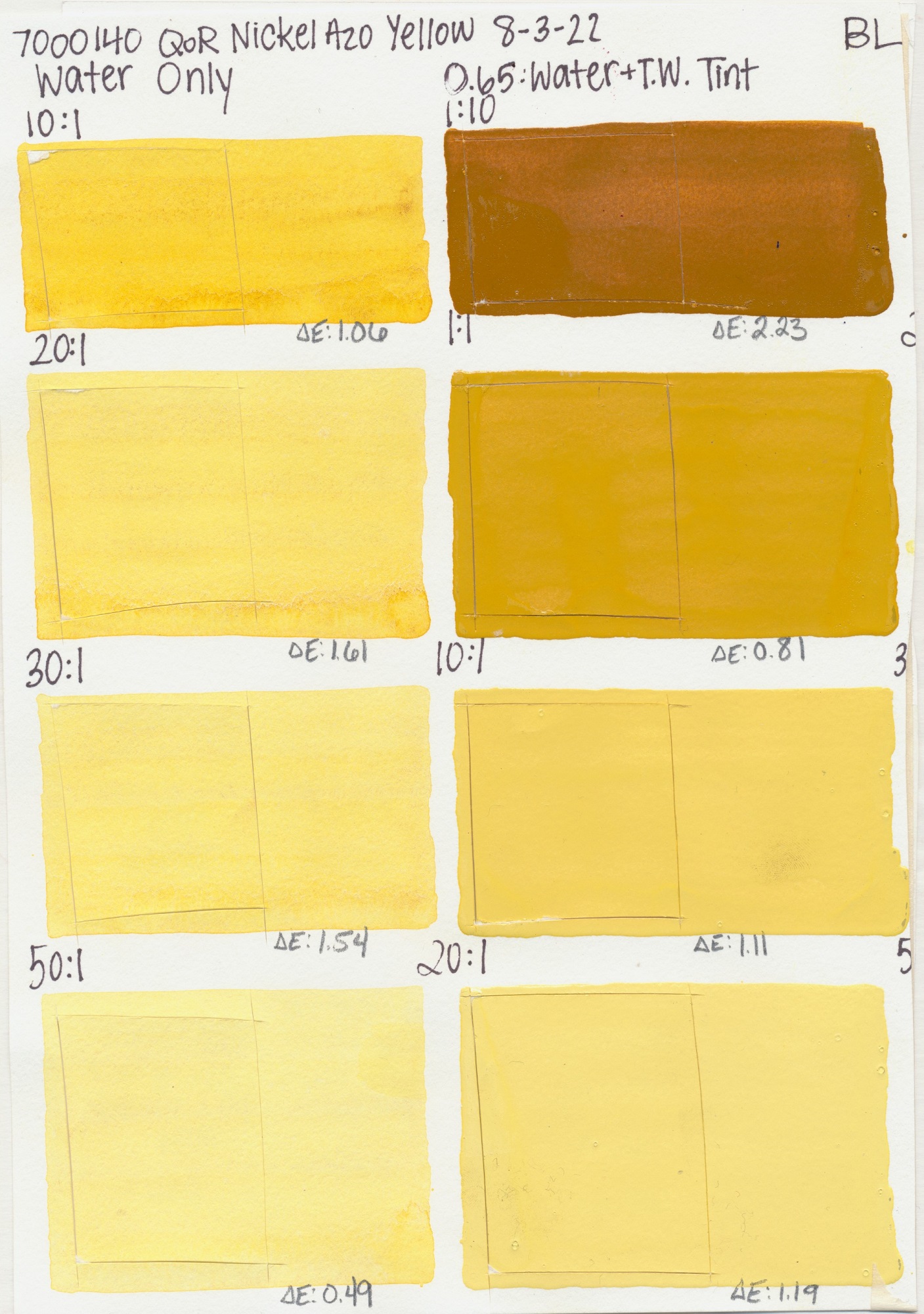
All samples had radiant exposure of 510 KJ(m2?nm) at 340nm within our xenon arc chamber, which is equivalent to roughly 100 years of indoor gallery lighting conditions. After exposure, these samples were scanned against the control using our spectrophotometer to get Delta E ratings, which is the standard unit for quantifying a visible color change or color fading. In total, we tested 84 QoR watercolors and between all of the dilutions, tints and controls, we did 4,032 spectrophotometer readings. Each test sample and control was scanned three times, then averaged, for their Delta E number.
Test Results
Overall, QoR Watercolor performed beautifully in both dilutions and tints with most colors remaining in the category of Lightfast I, meaning they have excellent resistance to UV under these testing constraints. Interestingly we observed, on average, there was minimal shift in lightfastness, even slight improvements with higher additions of water as well as Titanium White. That being said, it is important to note that Lightfastness I is a range from 0-4 Delta E and any observable trends are narrow at best, even if we love the direction they are going!

Outliers
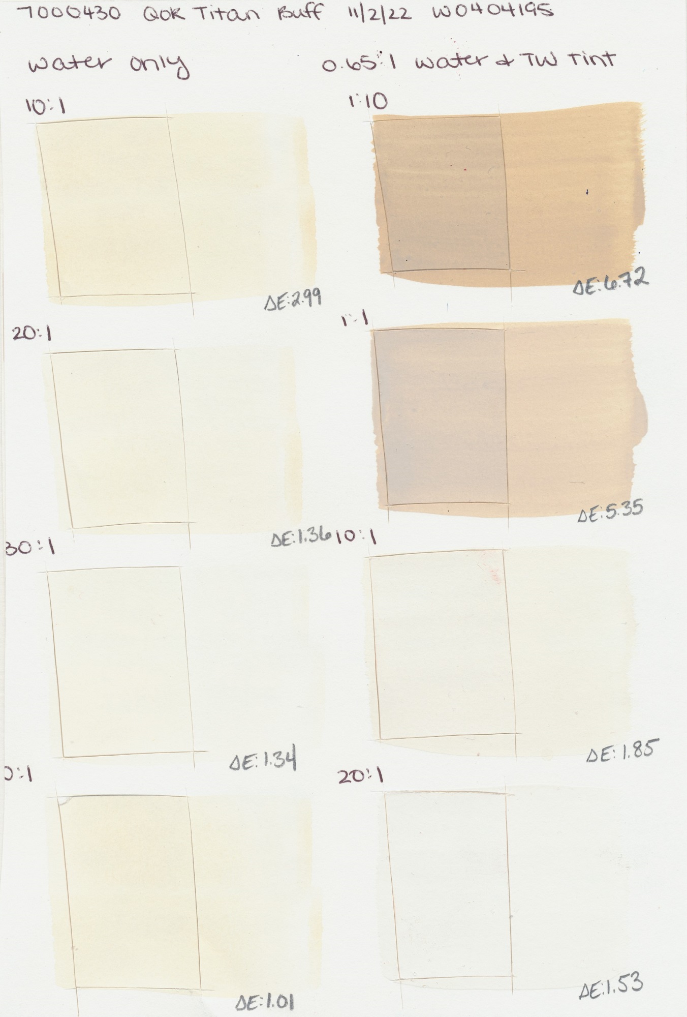
When reviewing the testing results, there are a few outliers worth mentioning and providing additional context for. The first being QoR Titan Buff, which in our testing showed the PW6:1 pigment’s tendency for darkening when exposed to xenon, especially when tinted. This is a case where in a 1:10 tint of Titanium White to Titan Buff, we see this color moving into Lightfastness II. A notable change for a white pigment.
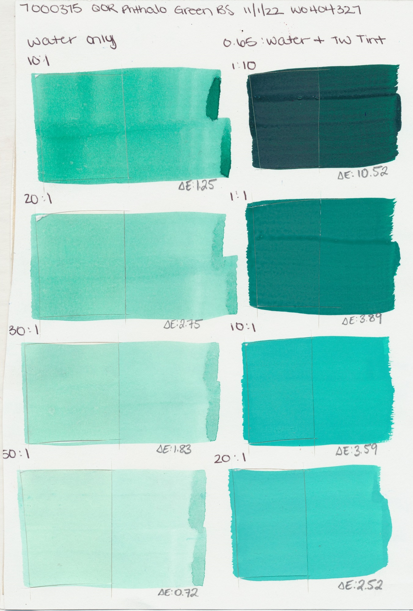
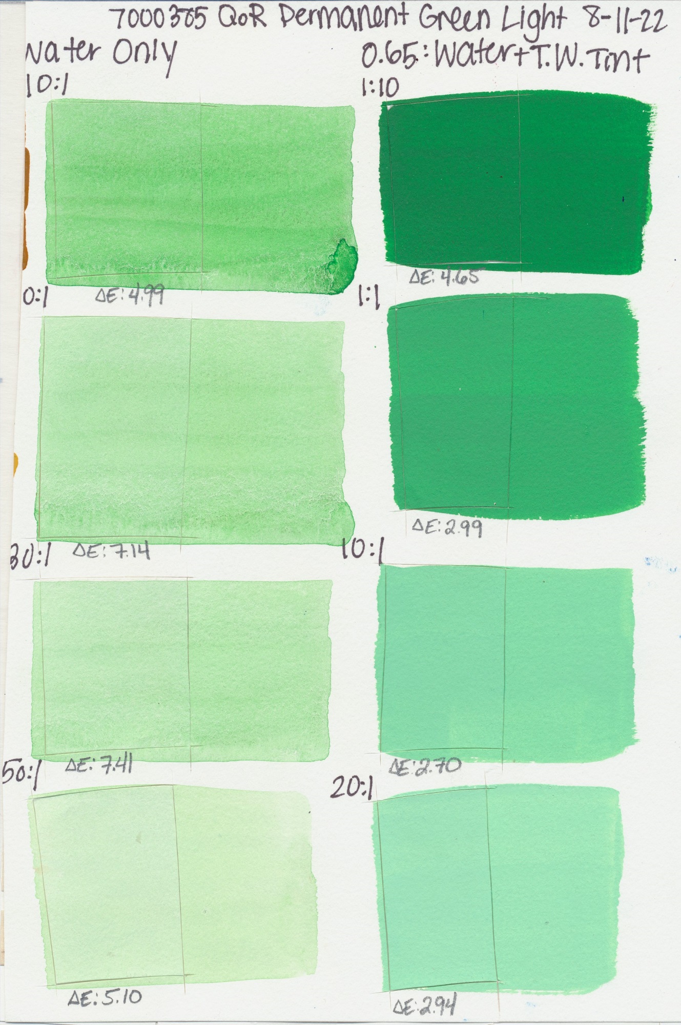
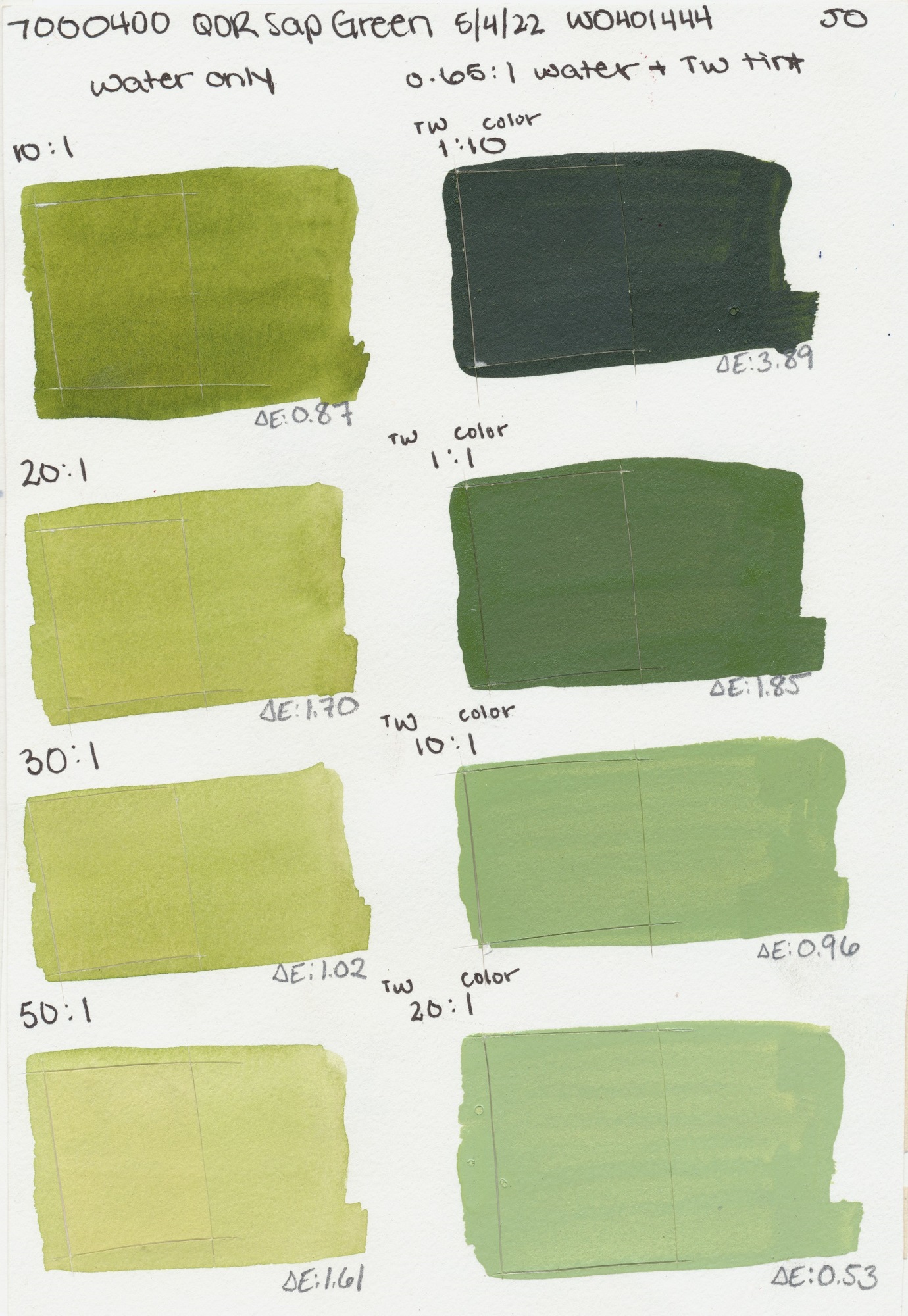
Two other outliers worth mentioning are QoR Phthalo Green (Blue Shade) and Permanent Green Light. In both colors we observed a decline in lightfastness, but in different scenarios. With Phthalo Green (Blue Shade) there was a meaningful change in the 1:10 tint (Titanium White to Phthalo Green) bringing this sample into Lightfast III. It remained in lightfastness I in all other test scenarios. Permanent Green Light showed, in higher dilutions with water, a slight reduction in lightfastness, but the color remained a Lightfastness II. In higher tint ratios with white, Permanent Green Light moved into lightfastness I. We included the test sheets for these colors below to provide visual context for what the data shows. We suspect some artists might be pleased with so little change after “100 years” and while the numbers may show a shift, visually it can be more nuanced.

Conclusion
First of all, we would like to thank our lab and all those involved in this project. It took many months to complete and we believe it offers useful information about QoR and its performance in applications that more closely resemble what an artist might do. That being said, overall, the test results look good. While we cannot fully explain some of the trends we observed, these results have been interesting, spurring more questions and ideas for future projects. In the future, we would like to test the Canson Foundation paper on its own to have a control to go along with this project. We would also like to expand our testing to include more paper options and perhaps a different white to see what effect that may have on lightfastness.
Data and Images
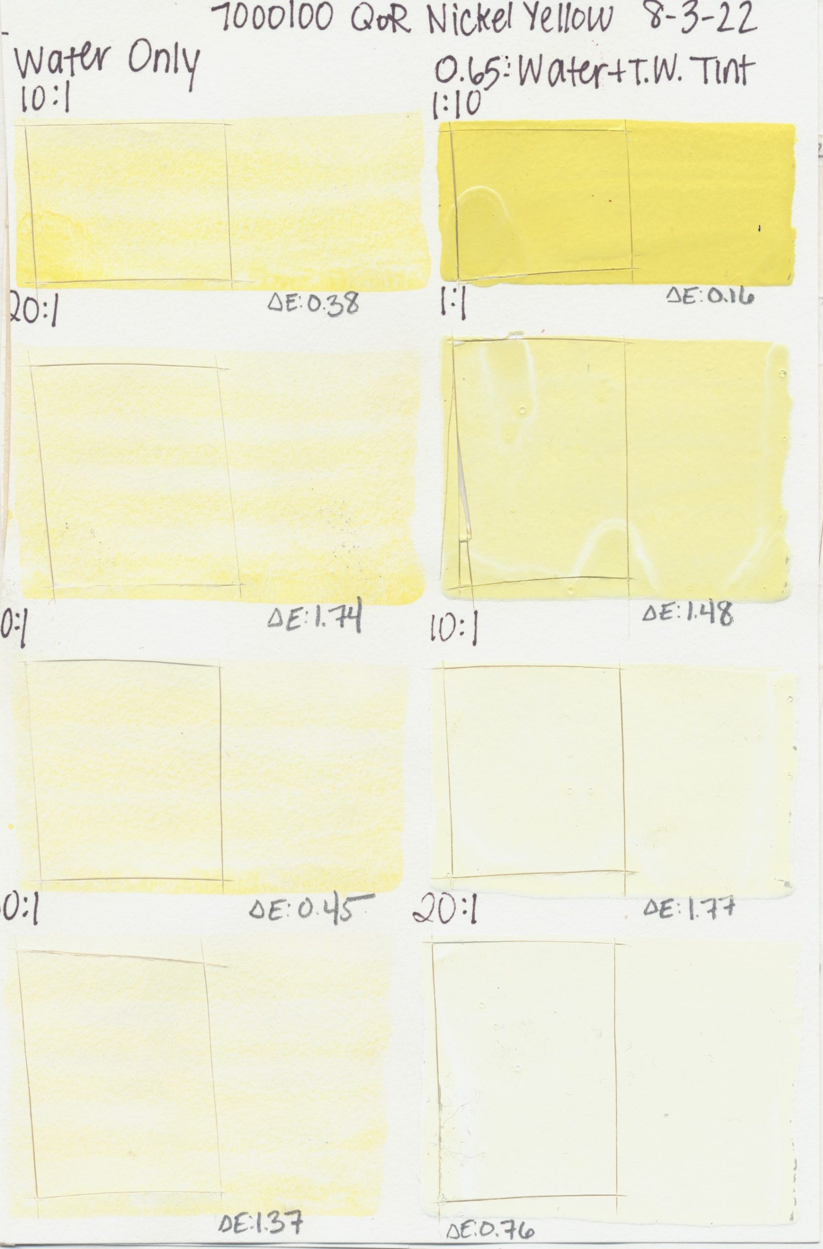
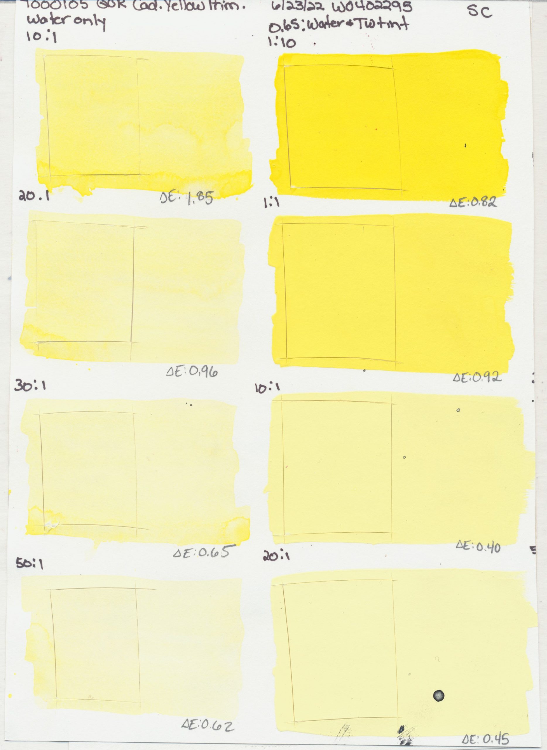
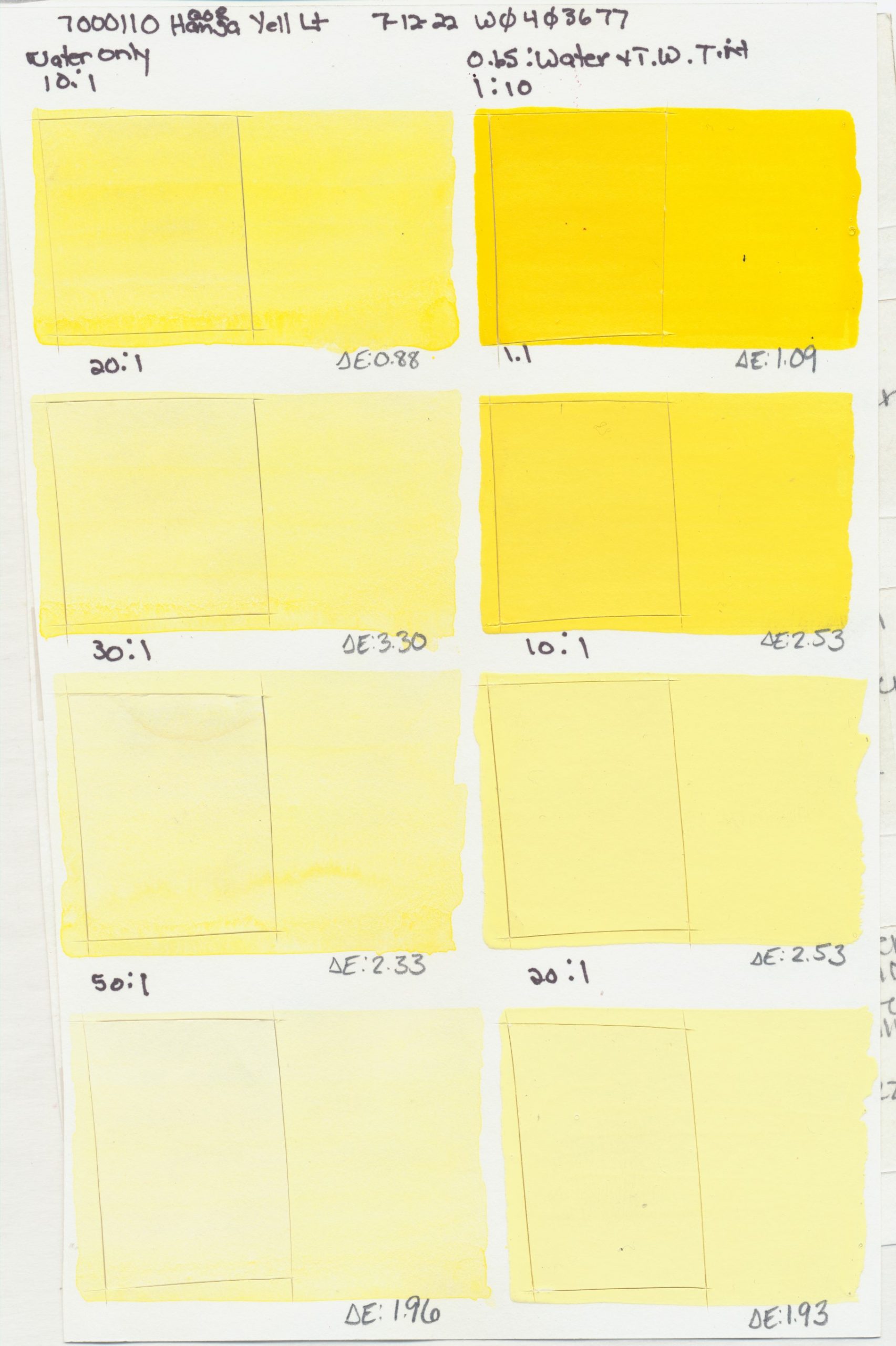
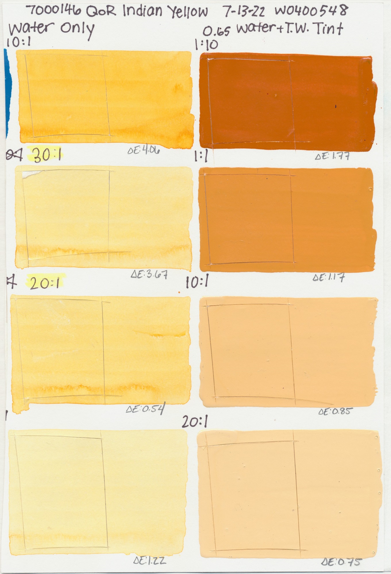
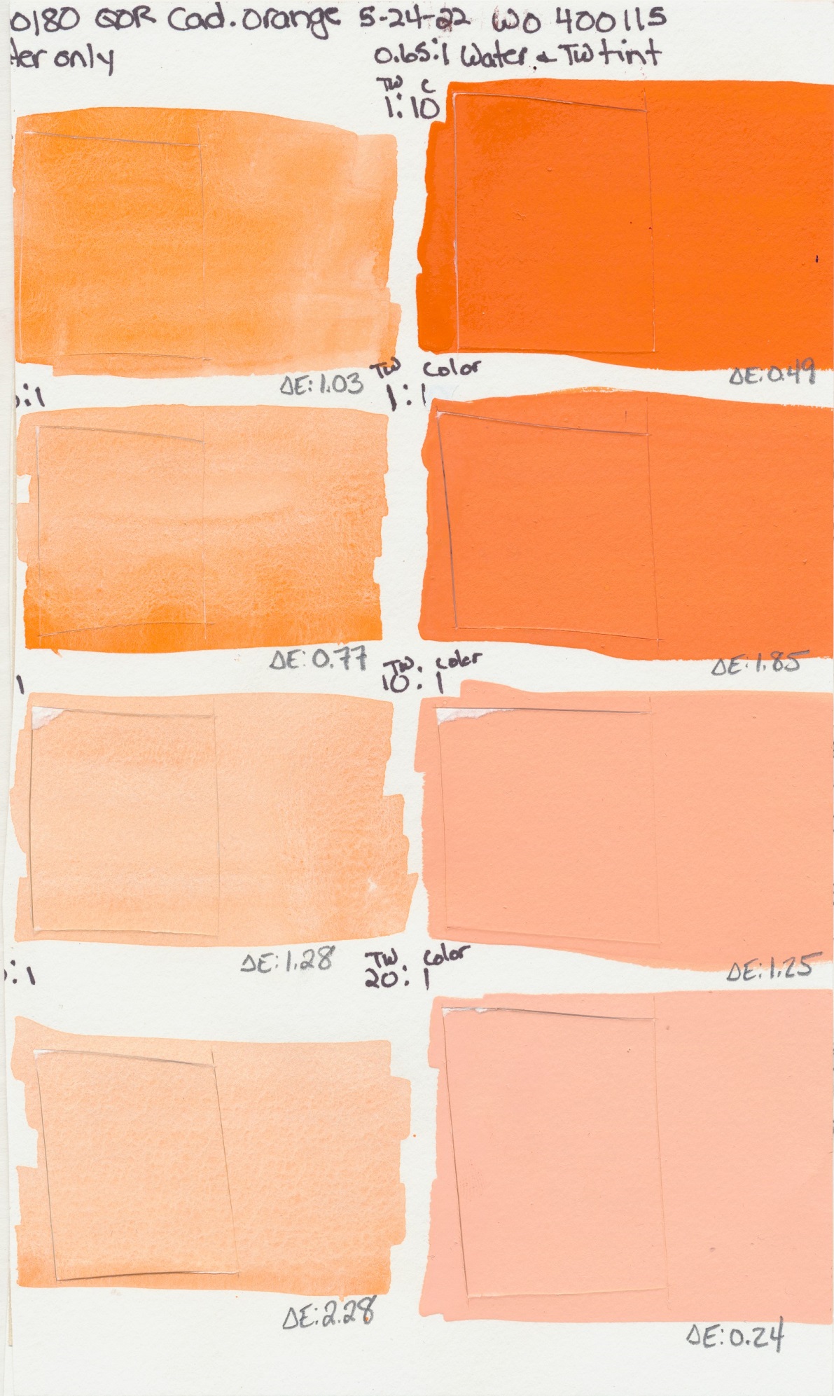
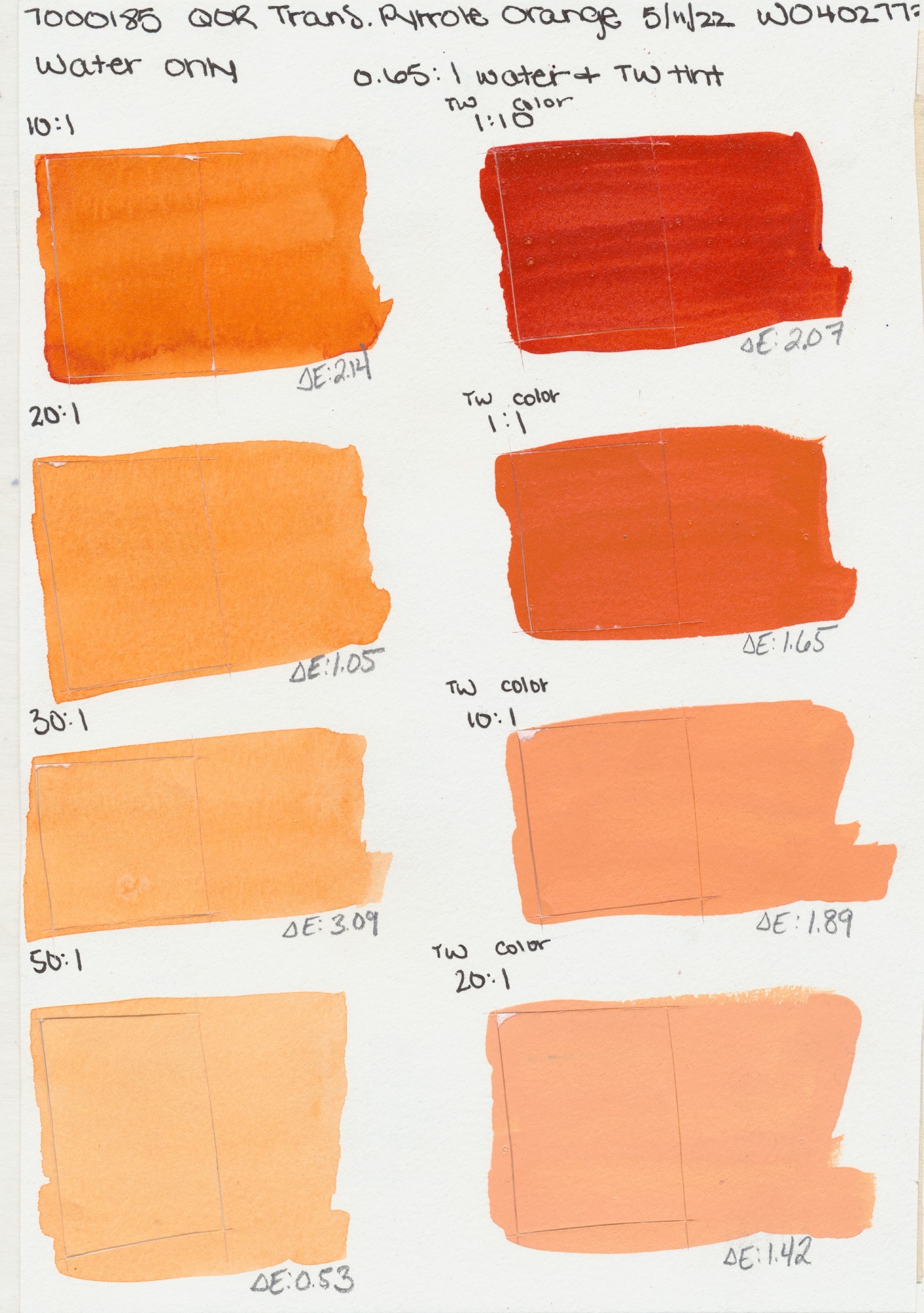
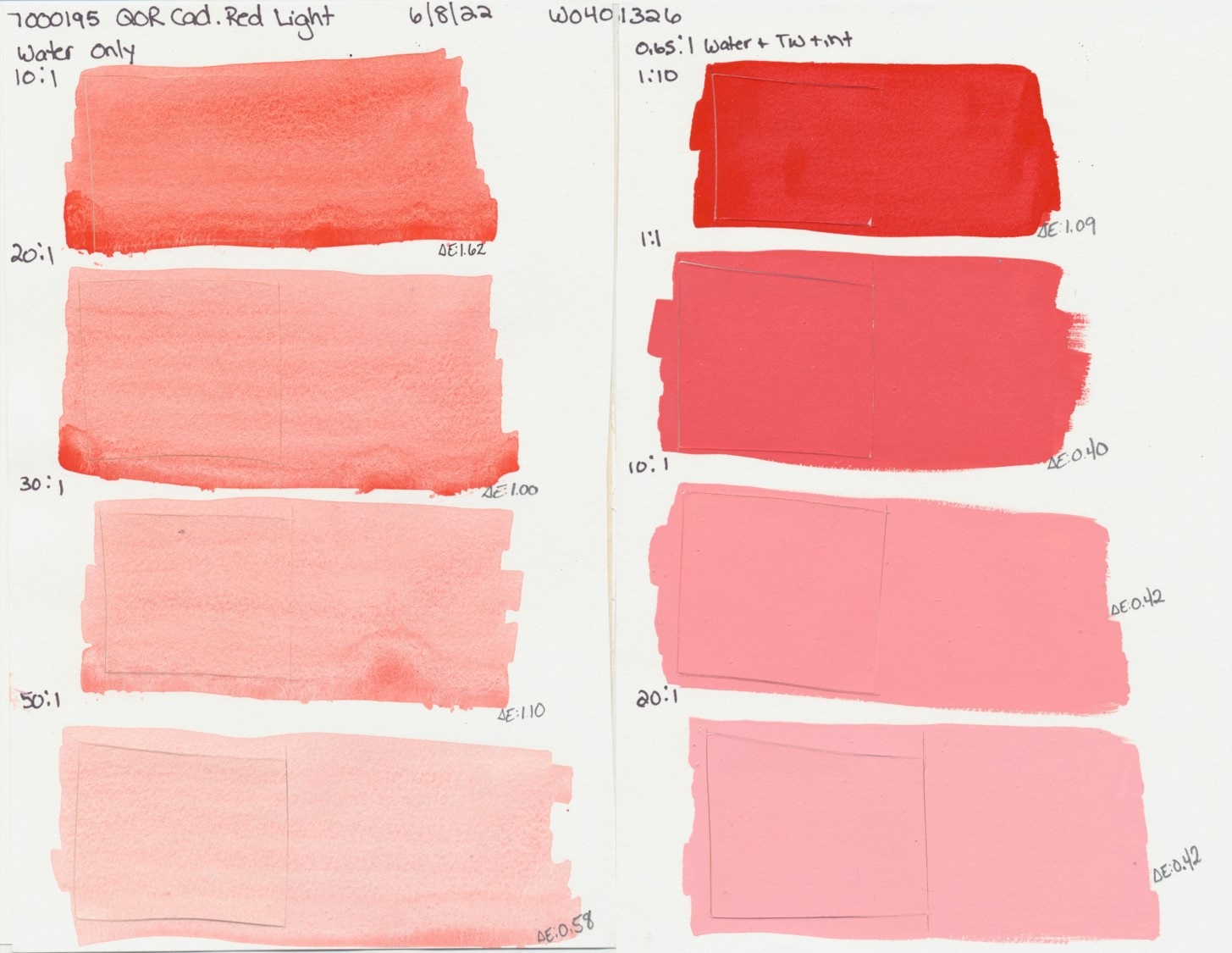
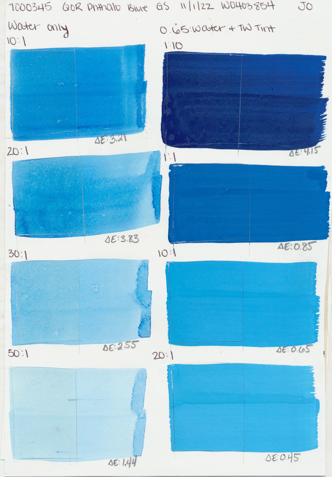
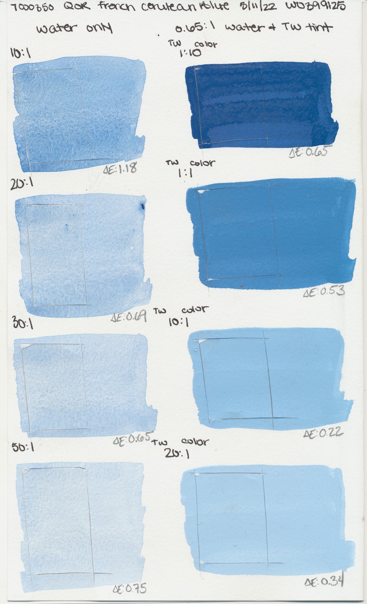
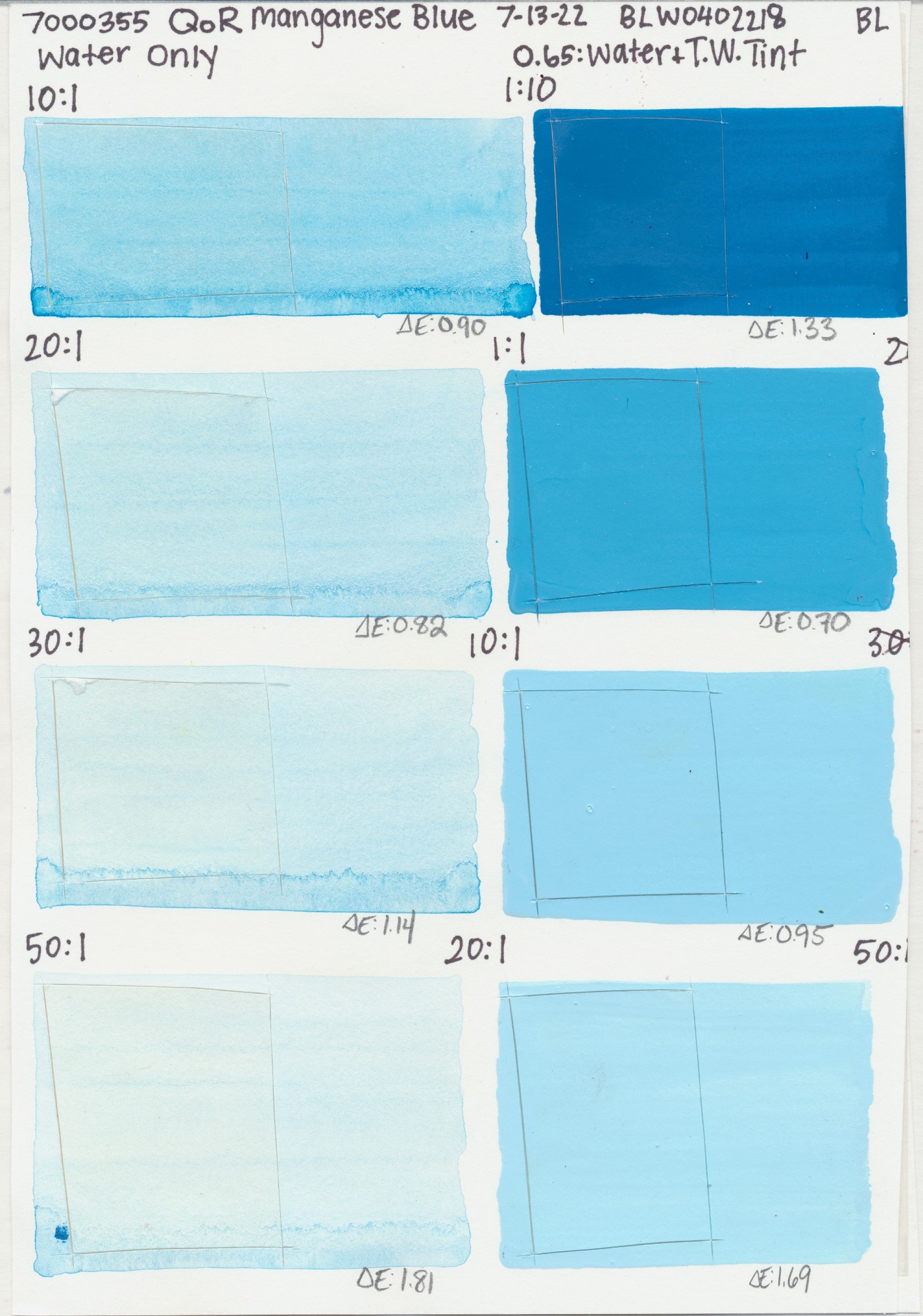
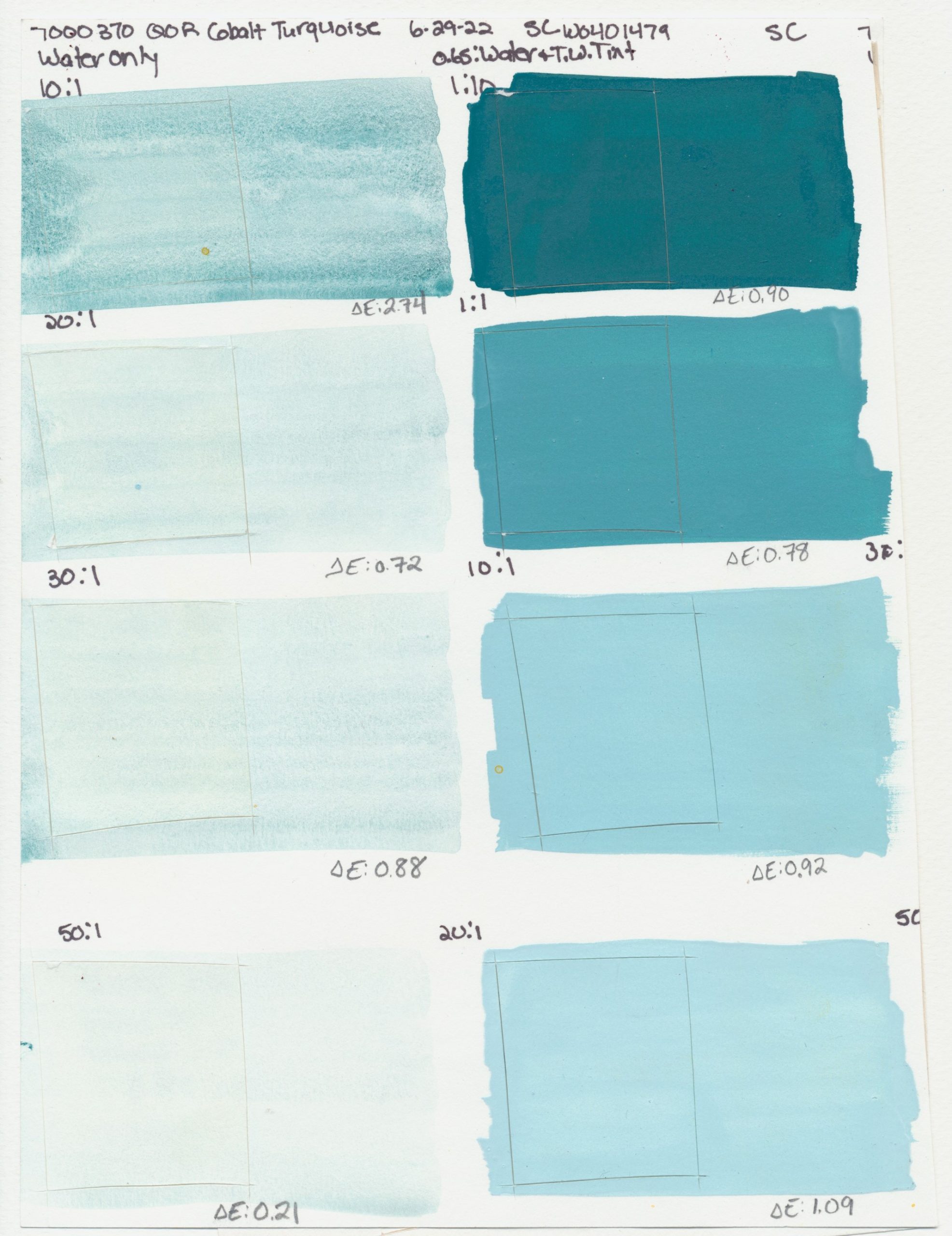
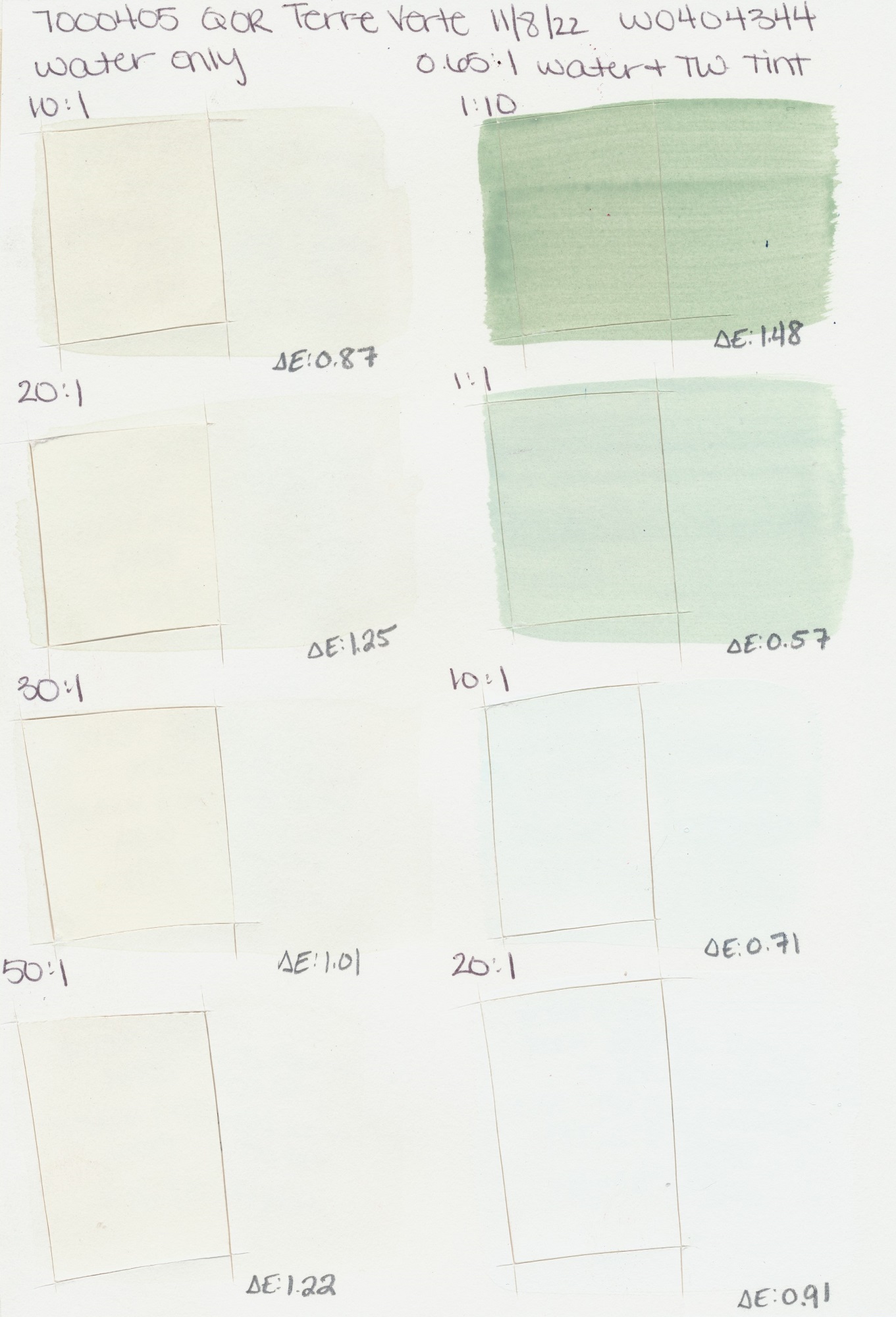
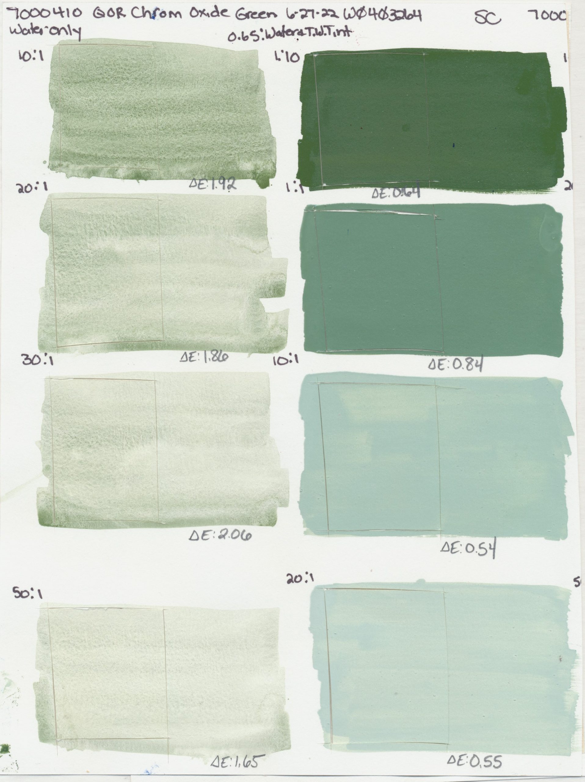
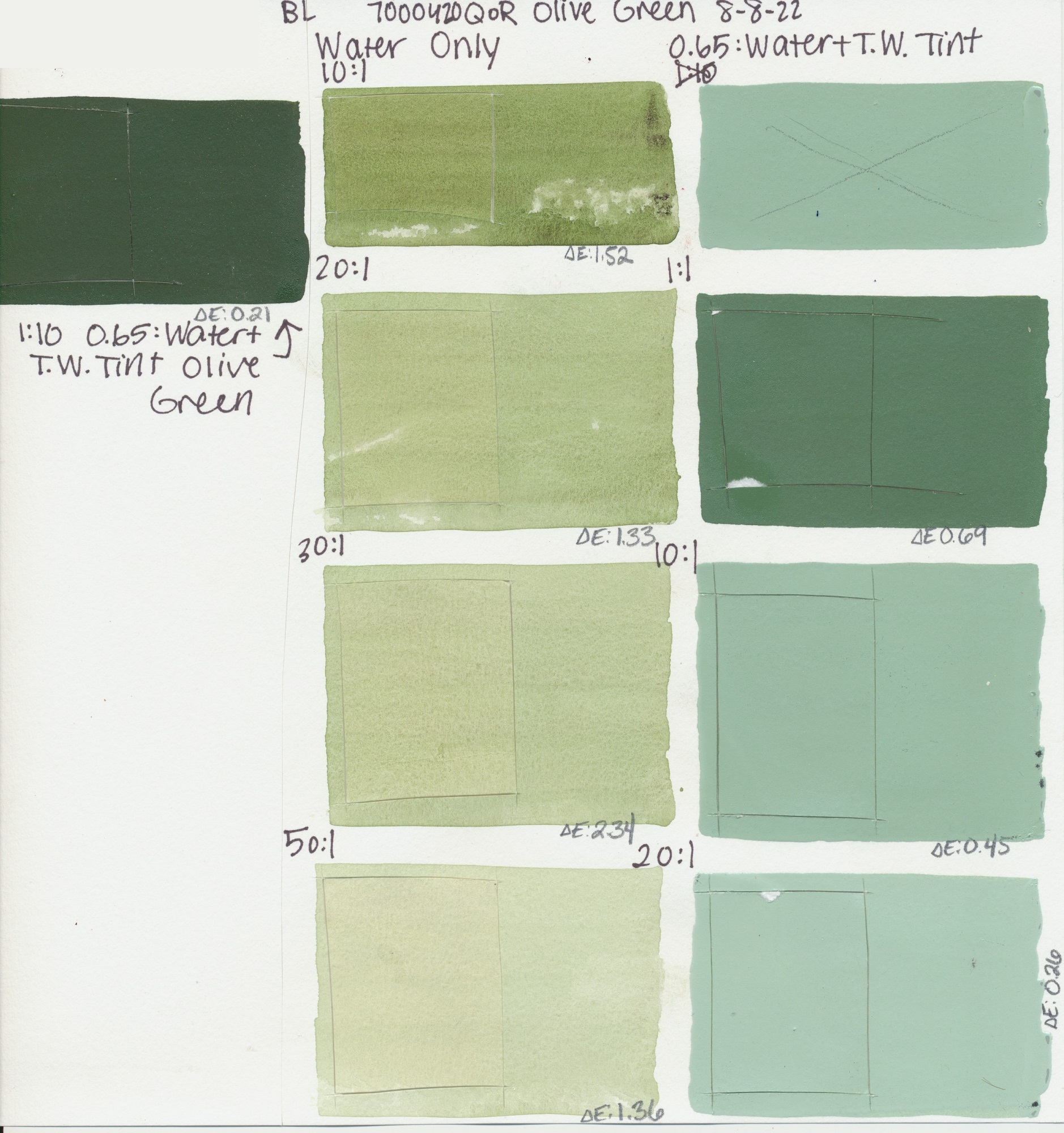
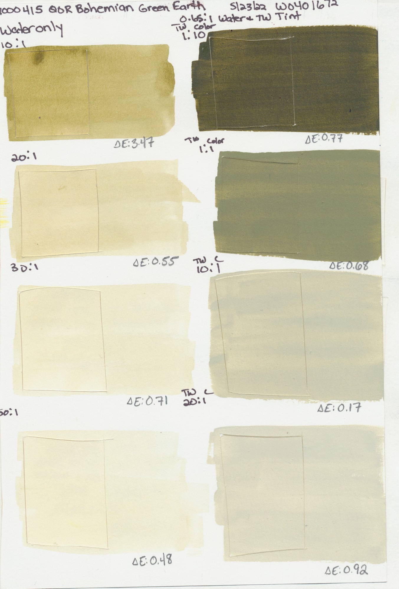
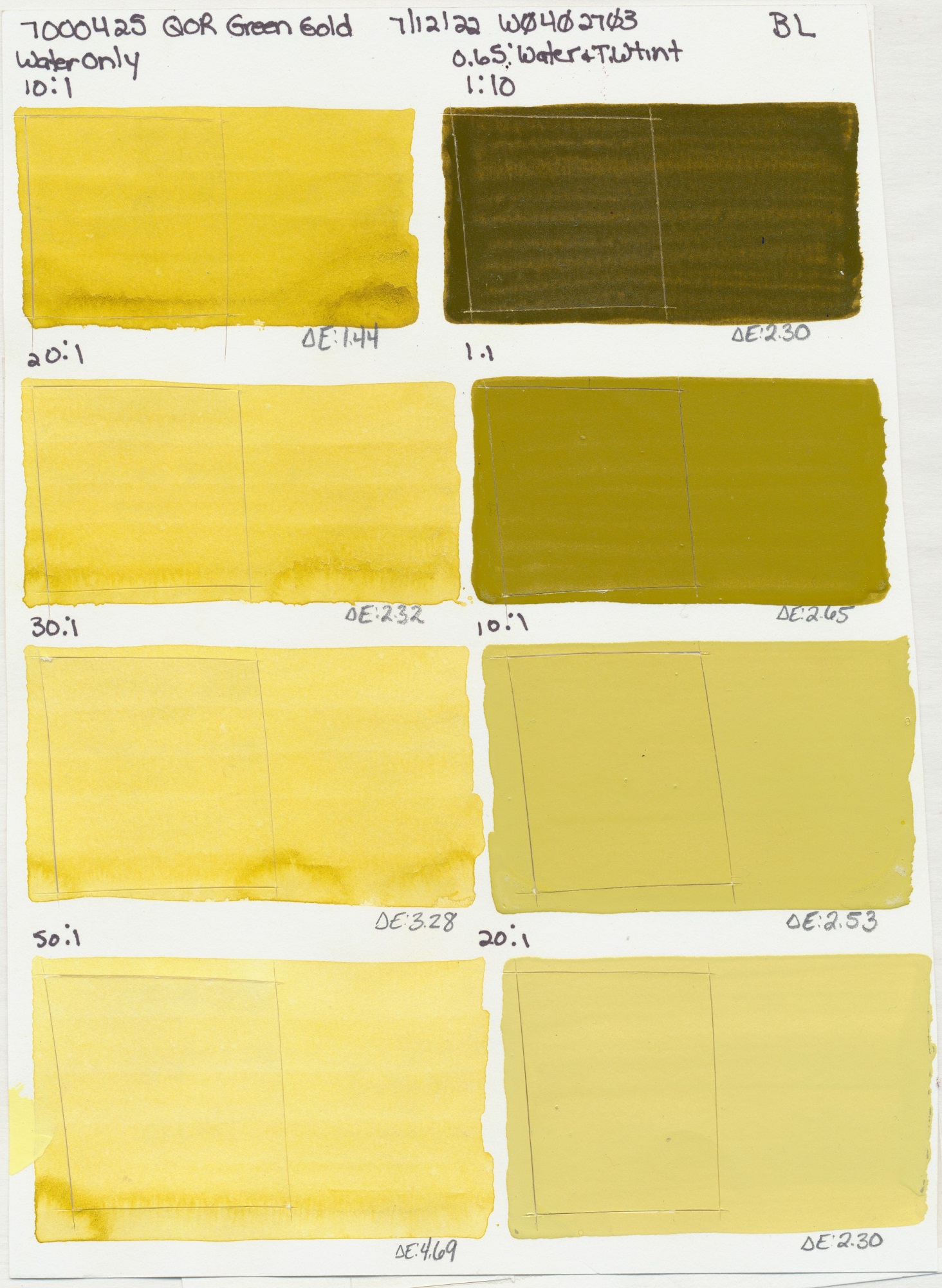
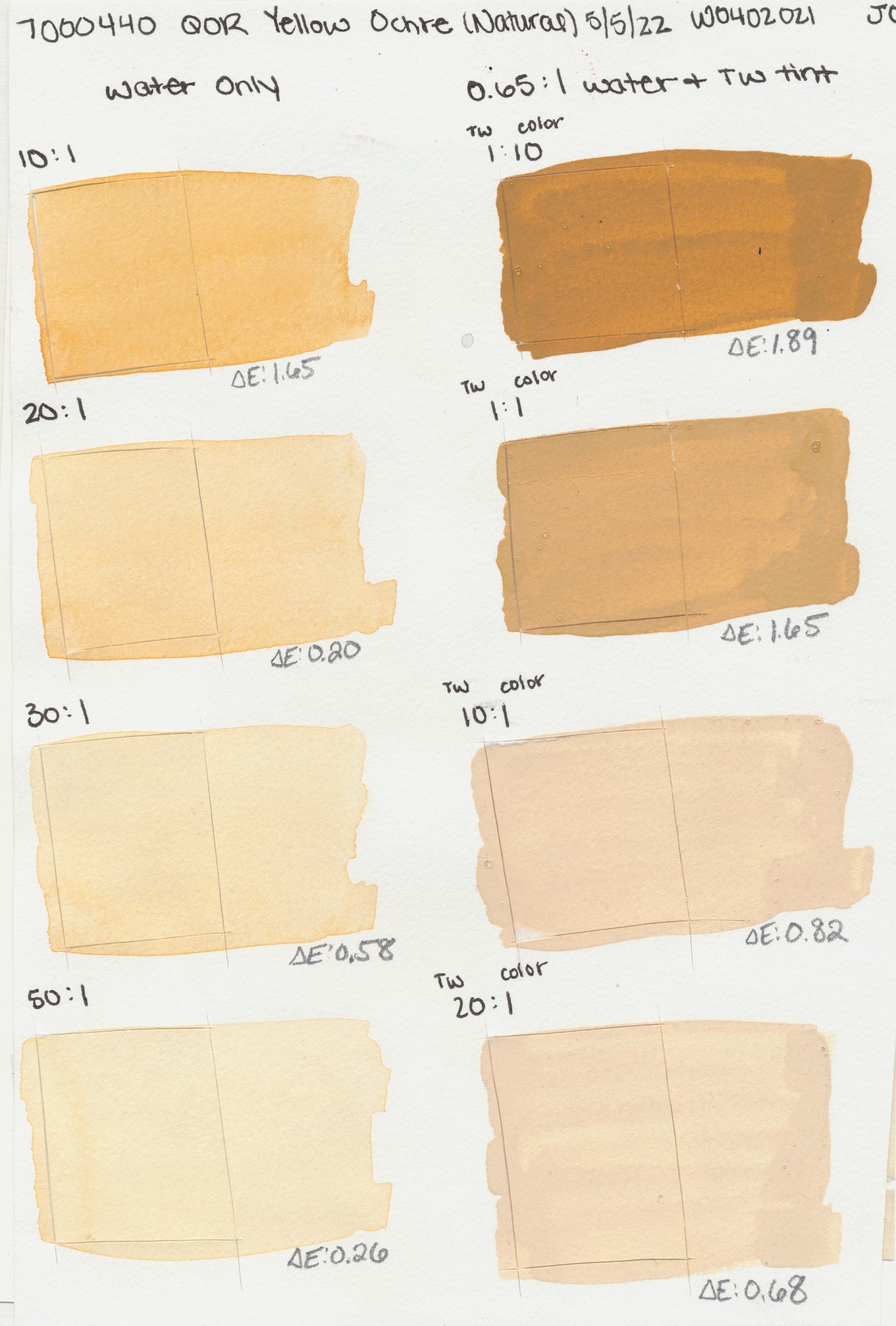
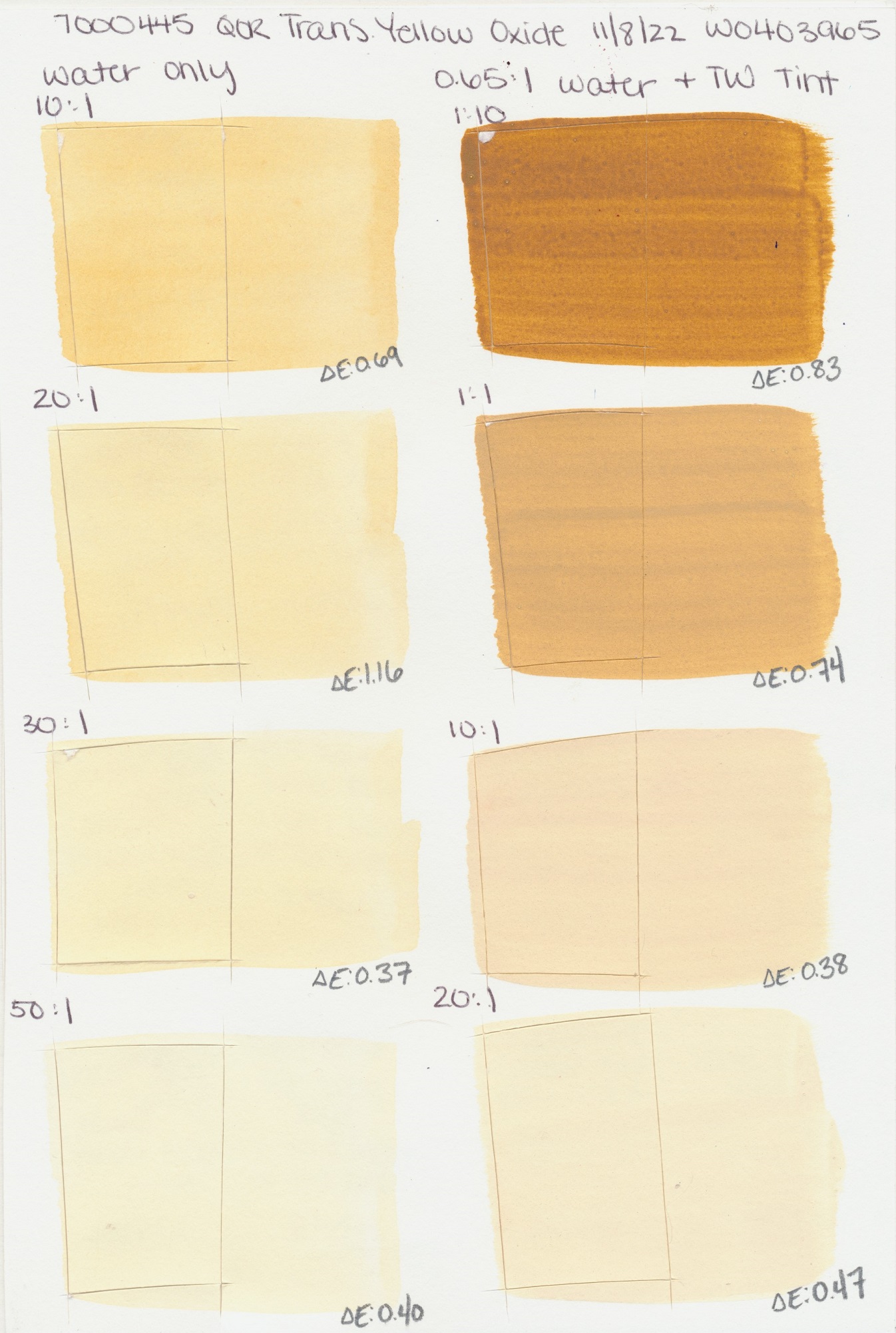
Below is a link to an excel spreadsheet containing all the lightfast results as well as the scans from this recent round of testing. Just click the icons to see the full test sheet.
Yellow
PY53
PY35
Light
PY3
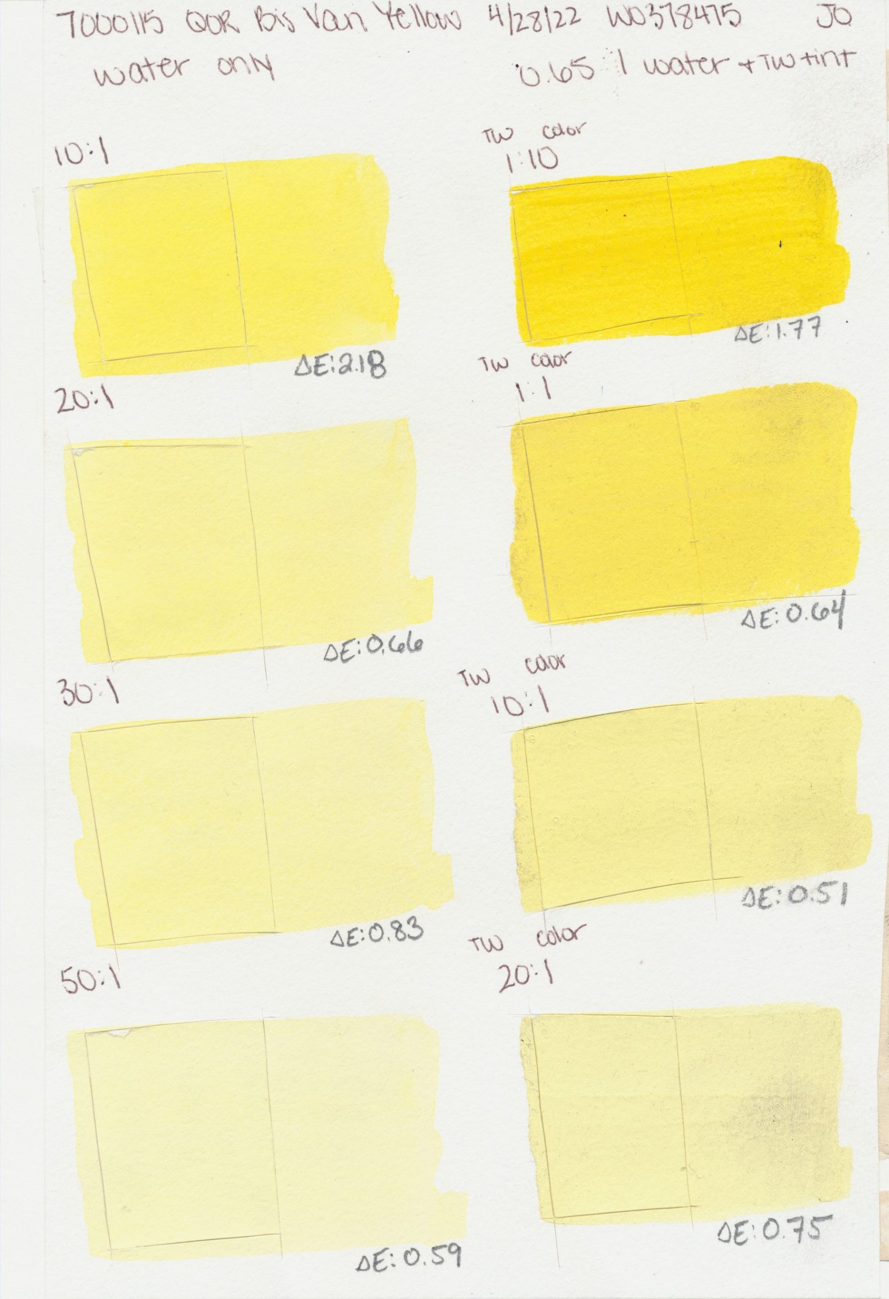
Vanadate Yellow
PY184
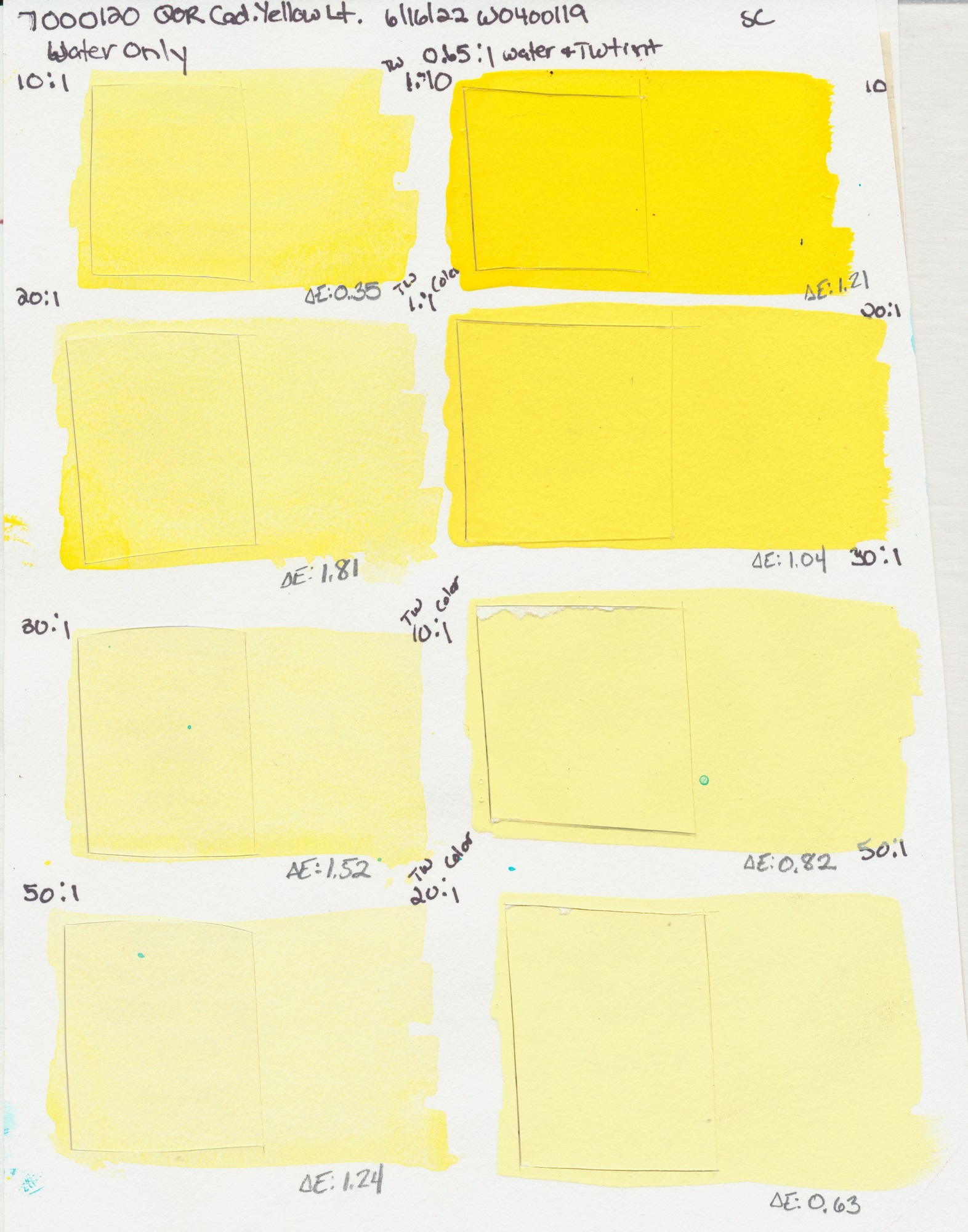
Light
PY35
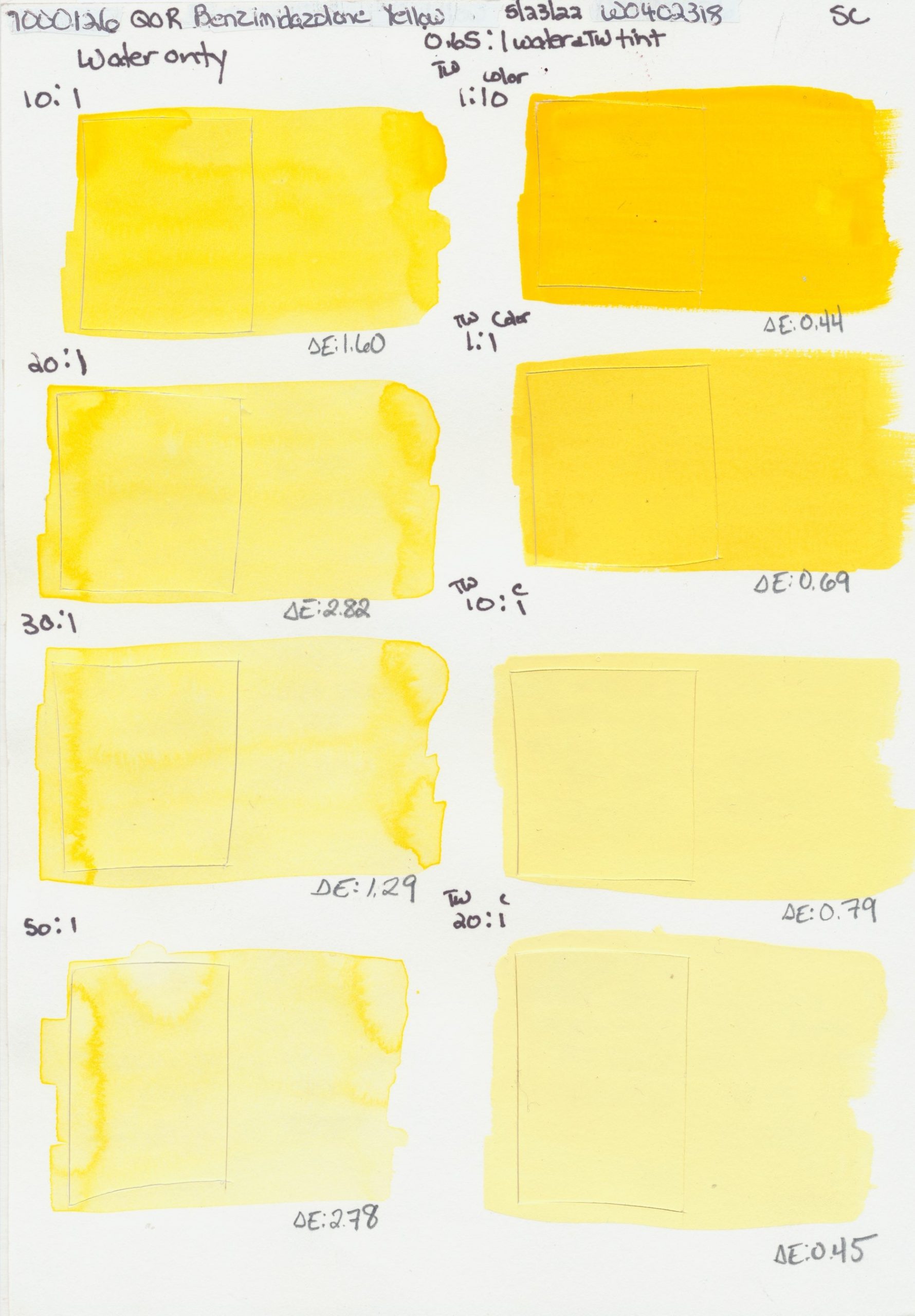
PY154
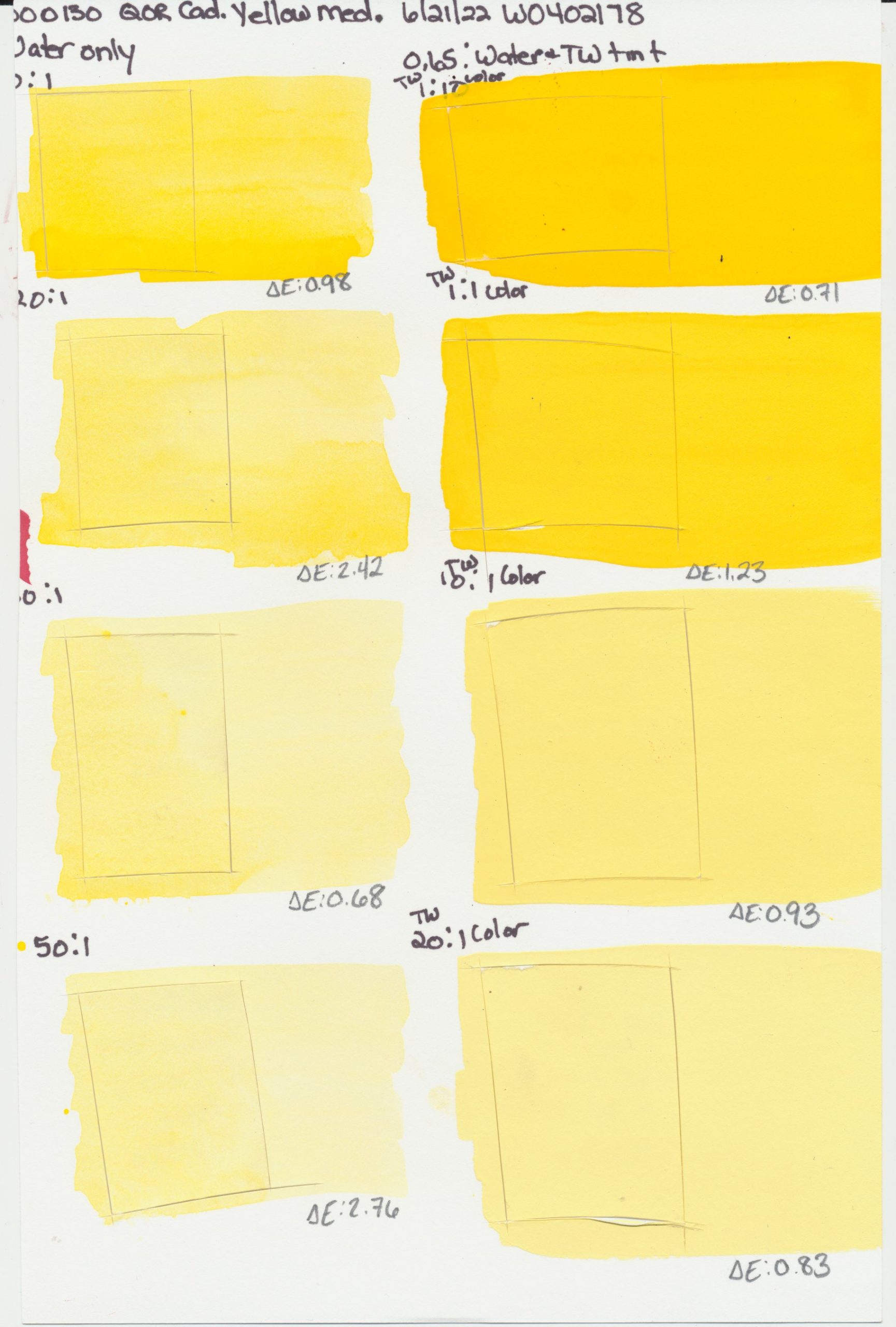
PY35
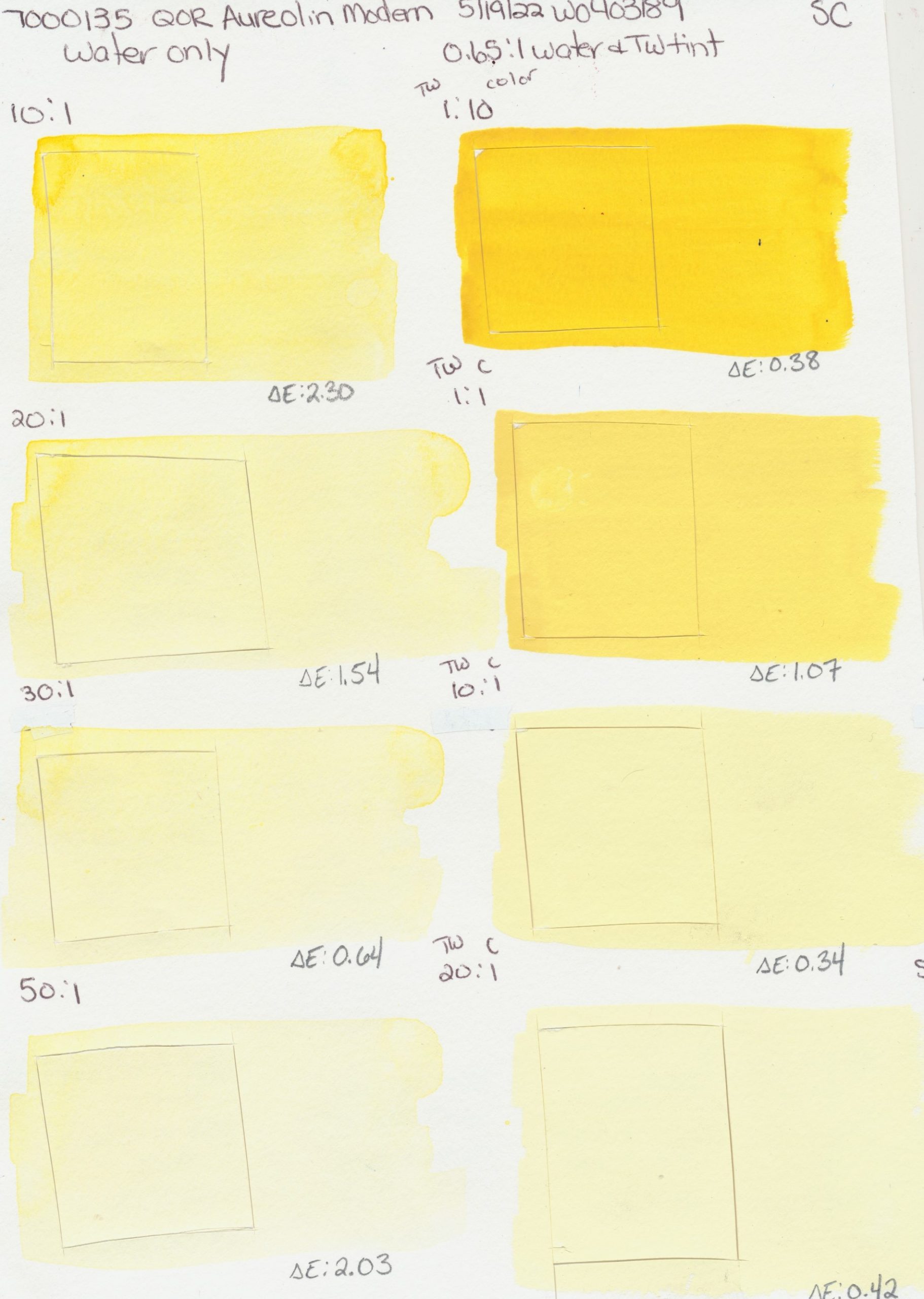
Modern
PW6, PY150
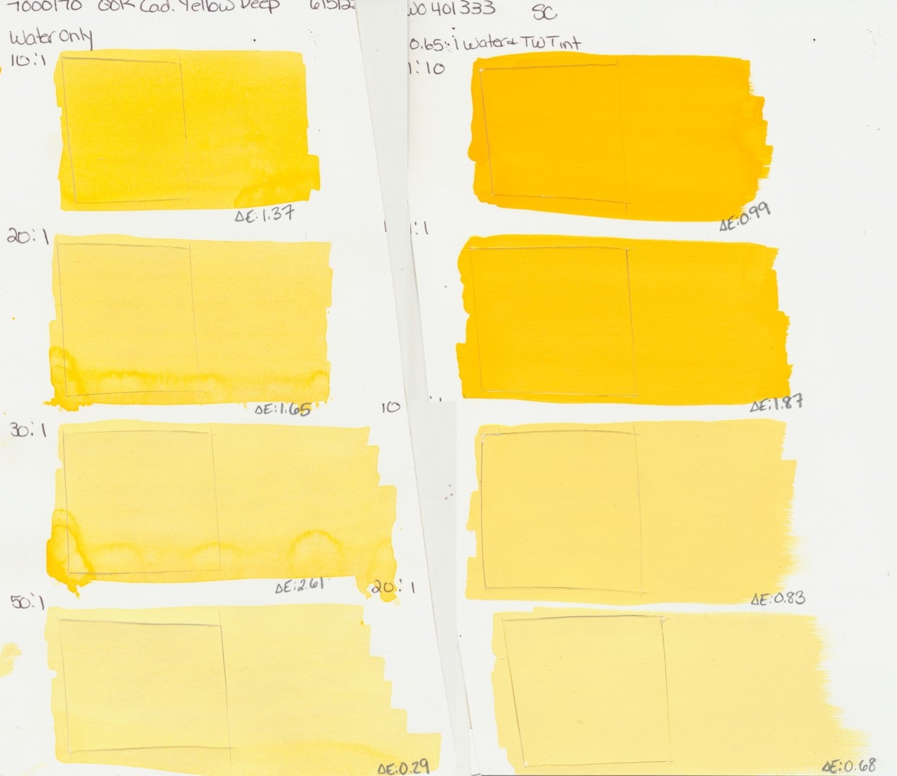
Deep
PY35
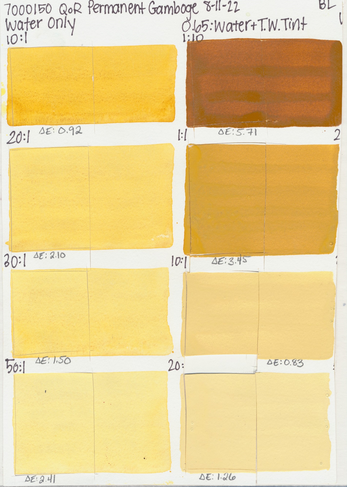
Gamboge
PY42, PV19, PY150
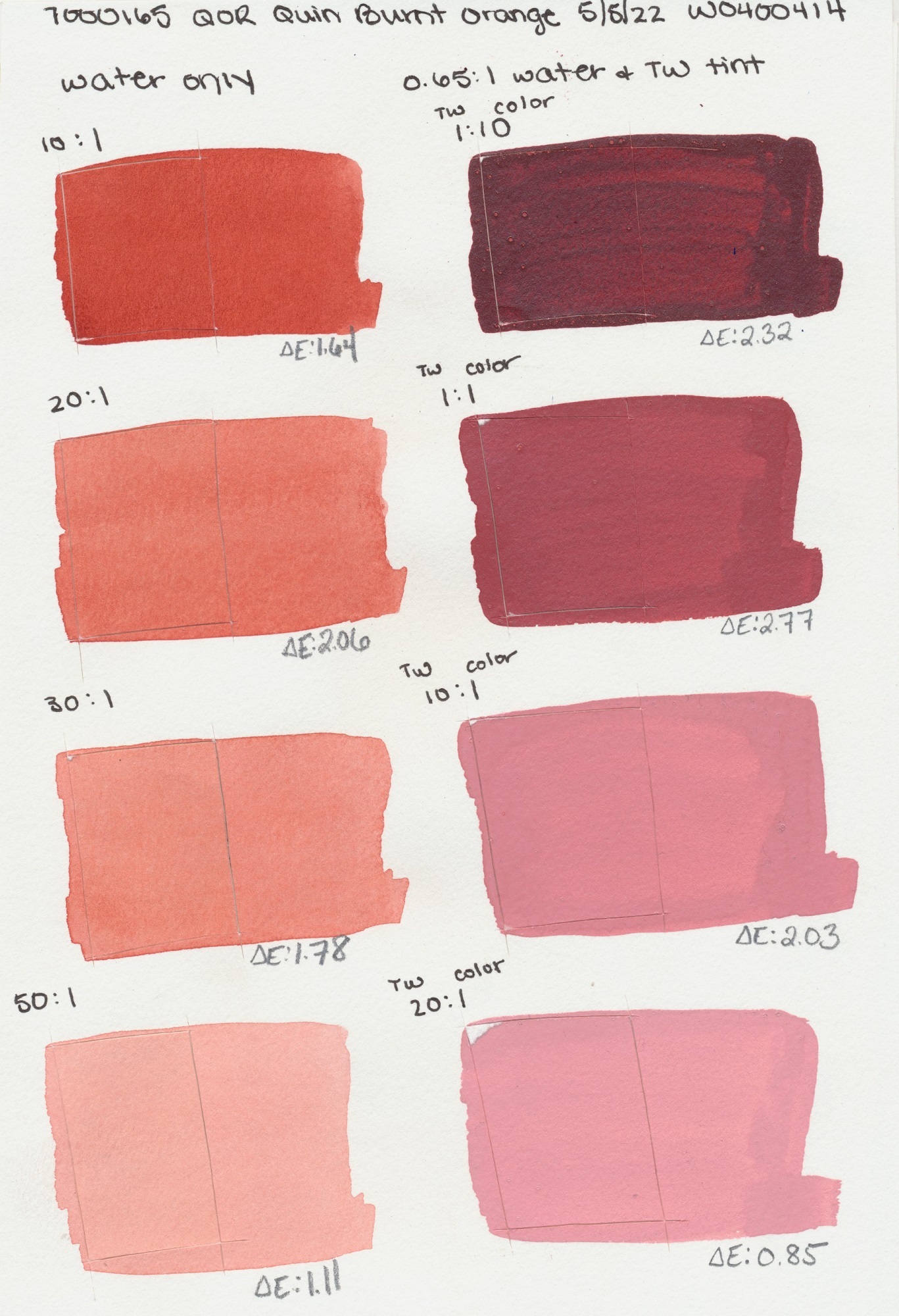
Orange
PR206
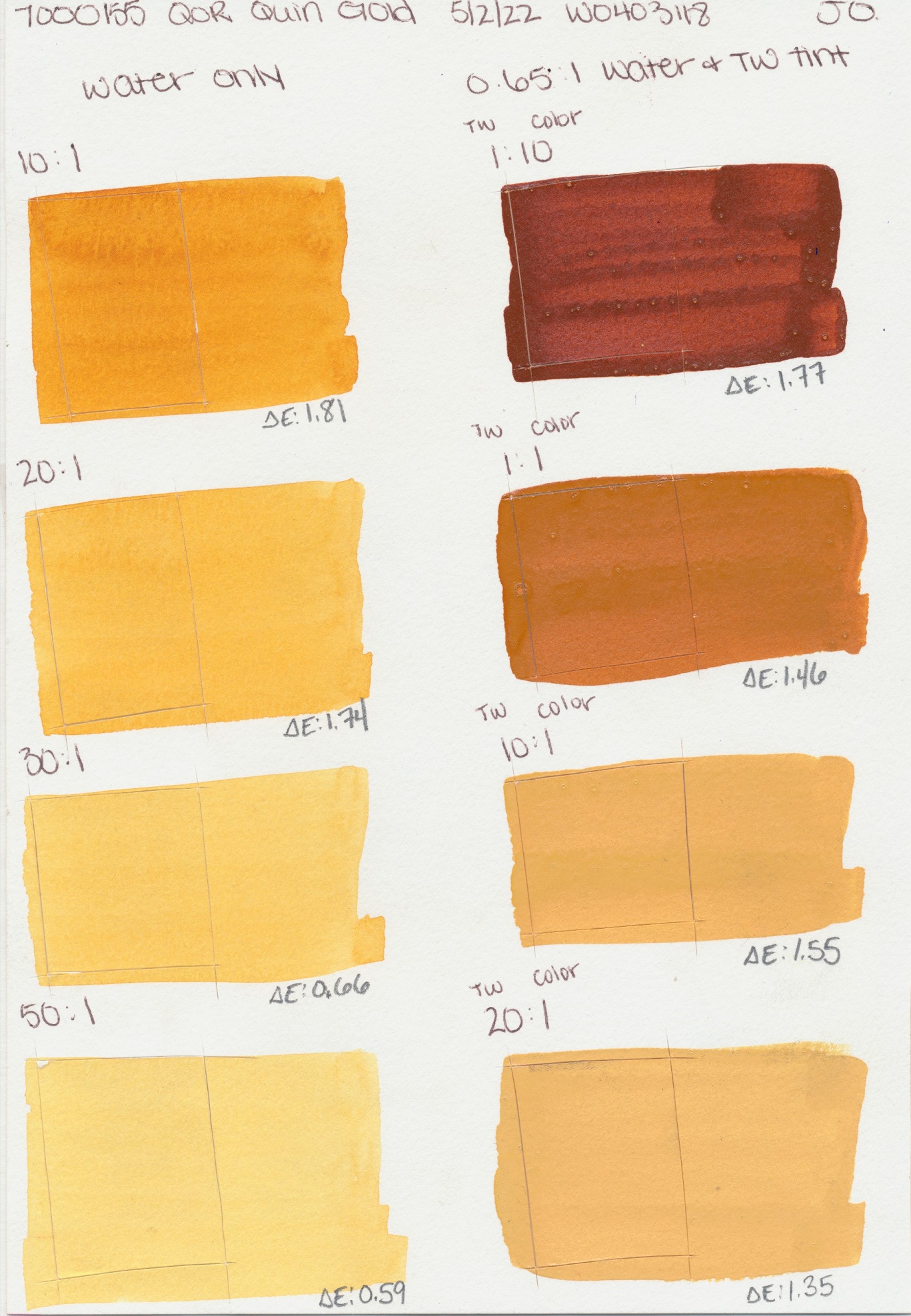
Gold
PO48, PY150
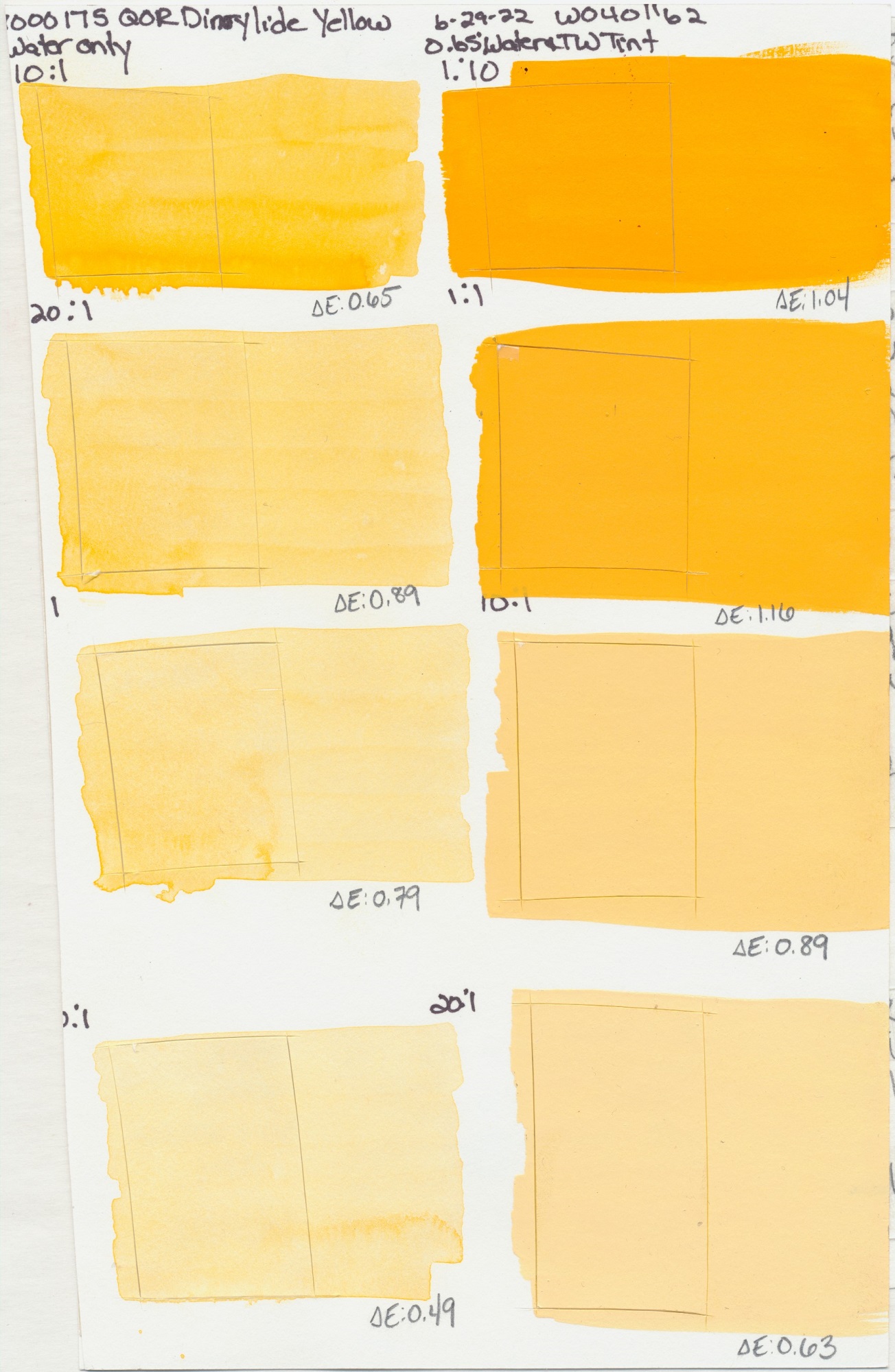
Yellow
PY83
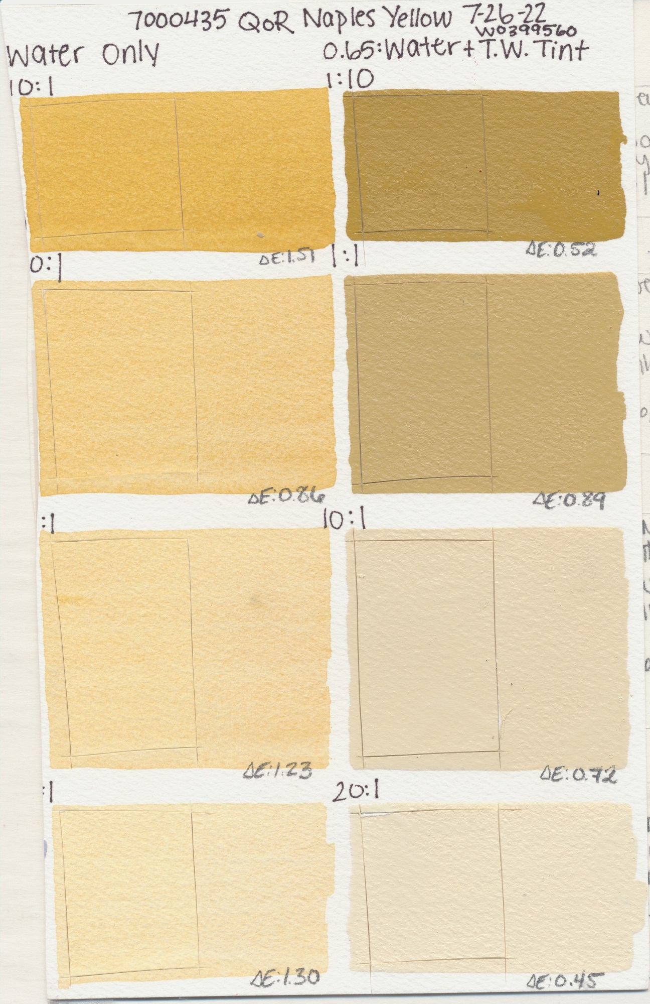
Yellow
PBr24, PBk7, PW4
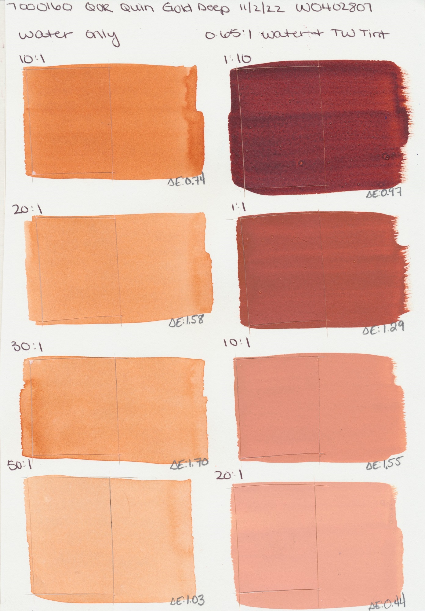
PO48
PY154, PY150, PR206
Orange
PO20
PO71
Light
PR108
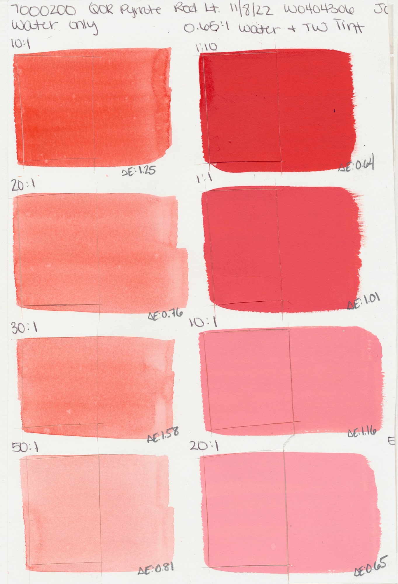
Light
PR255
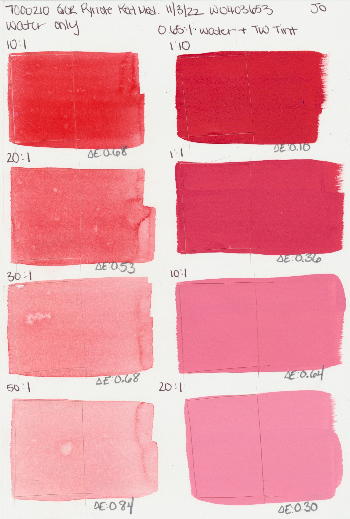
Medium
PR254
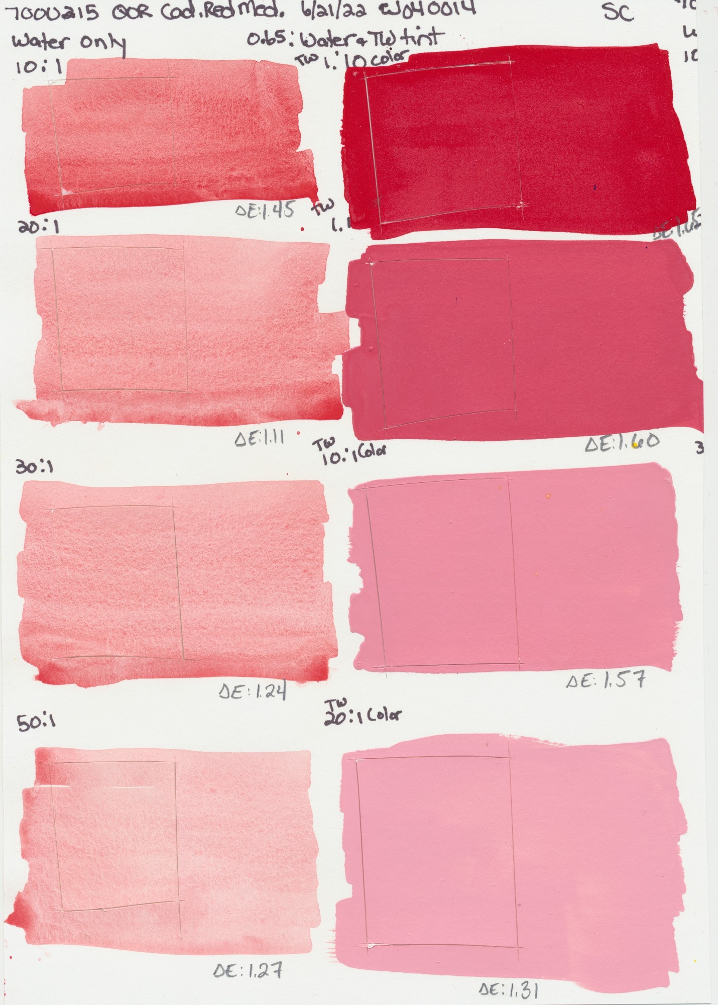
Medium
PR108
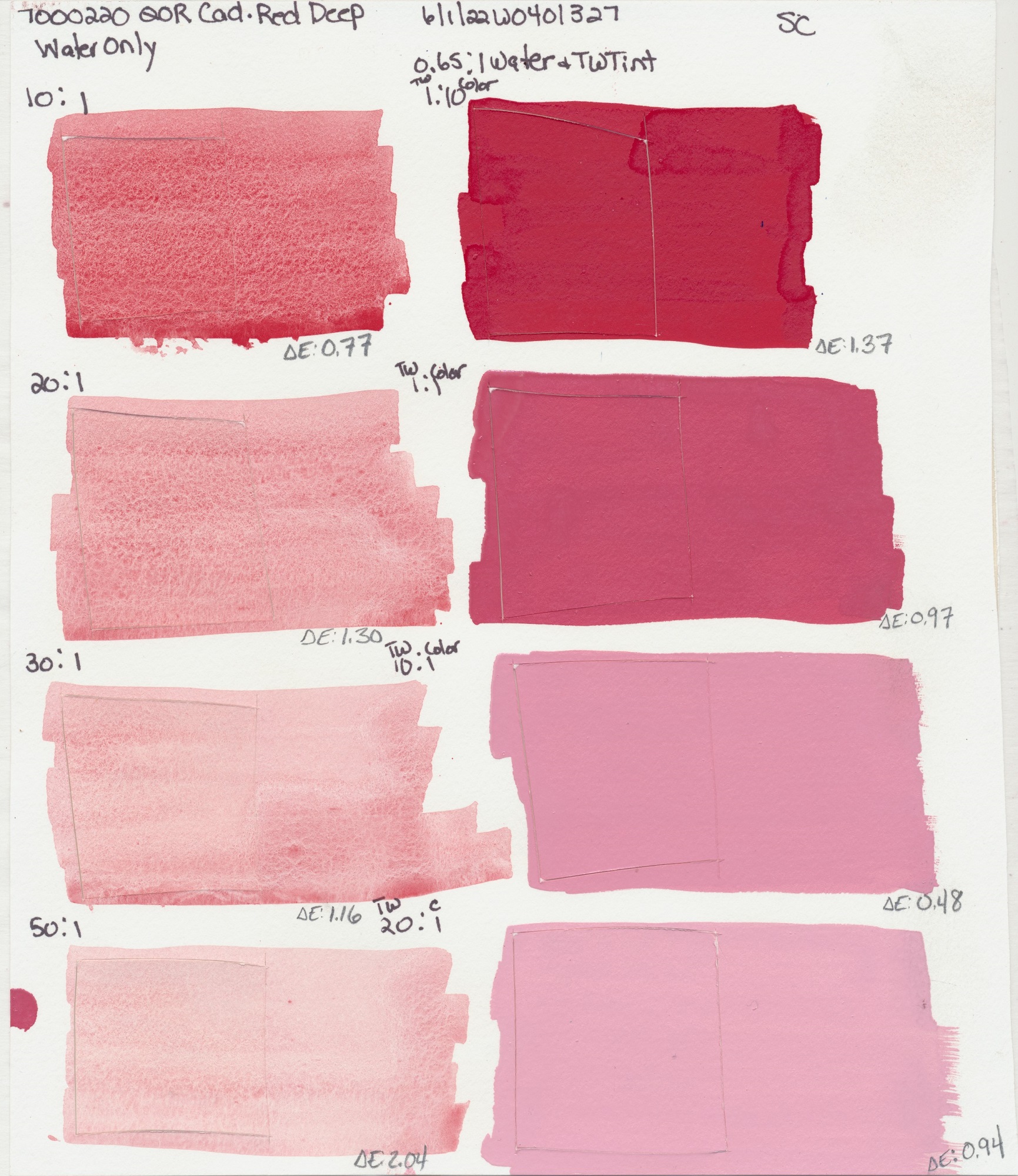
Deep
PR108
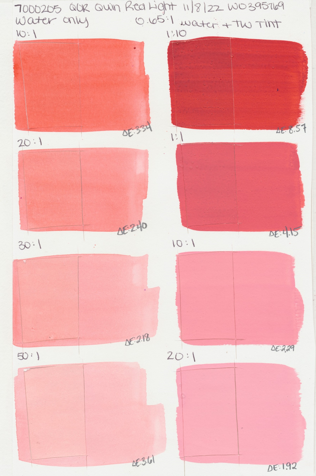
Red Light
PR207
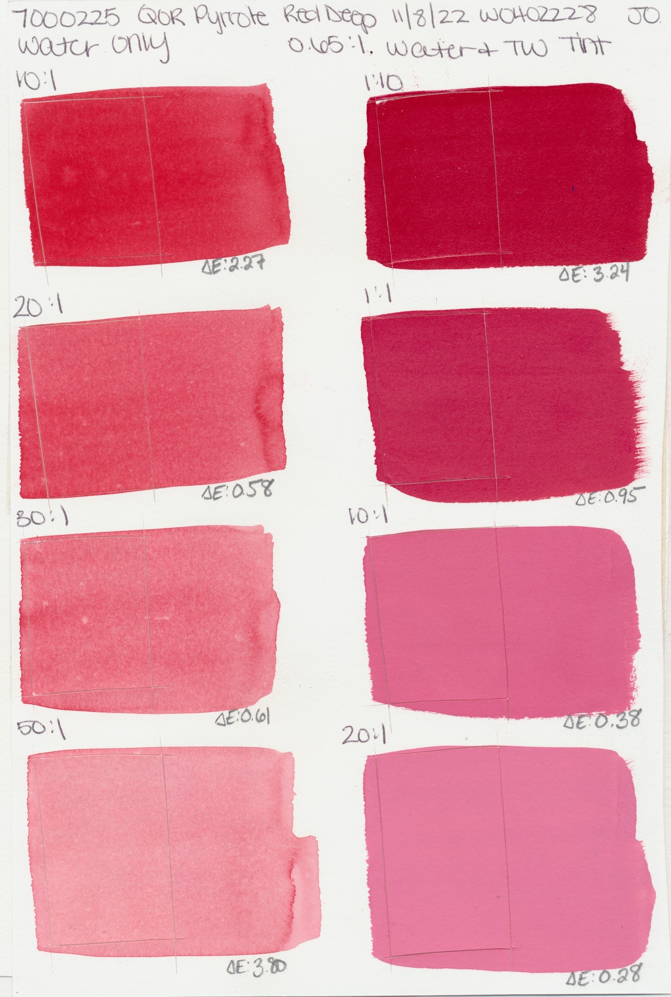
Deep
PR264
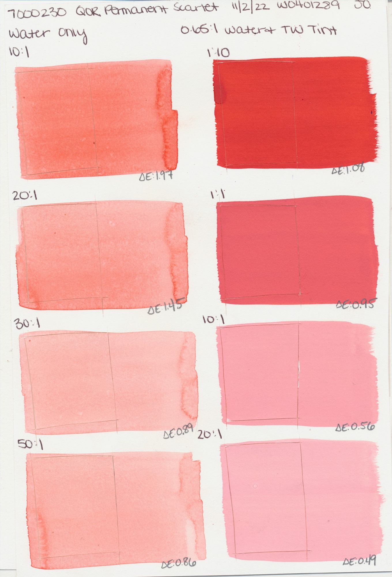
Scarlet
PR168
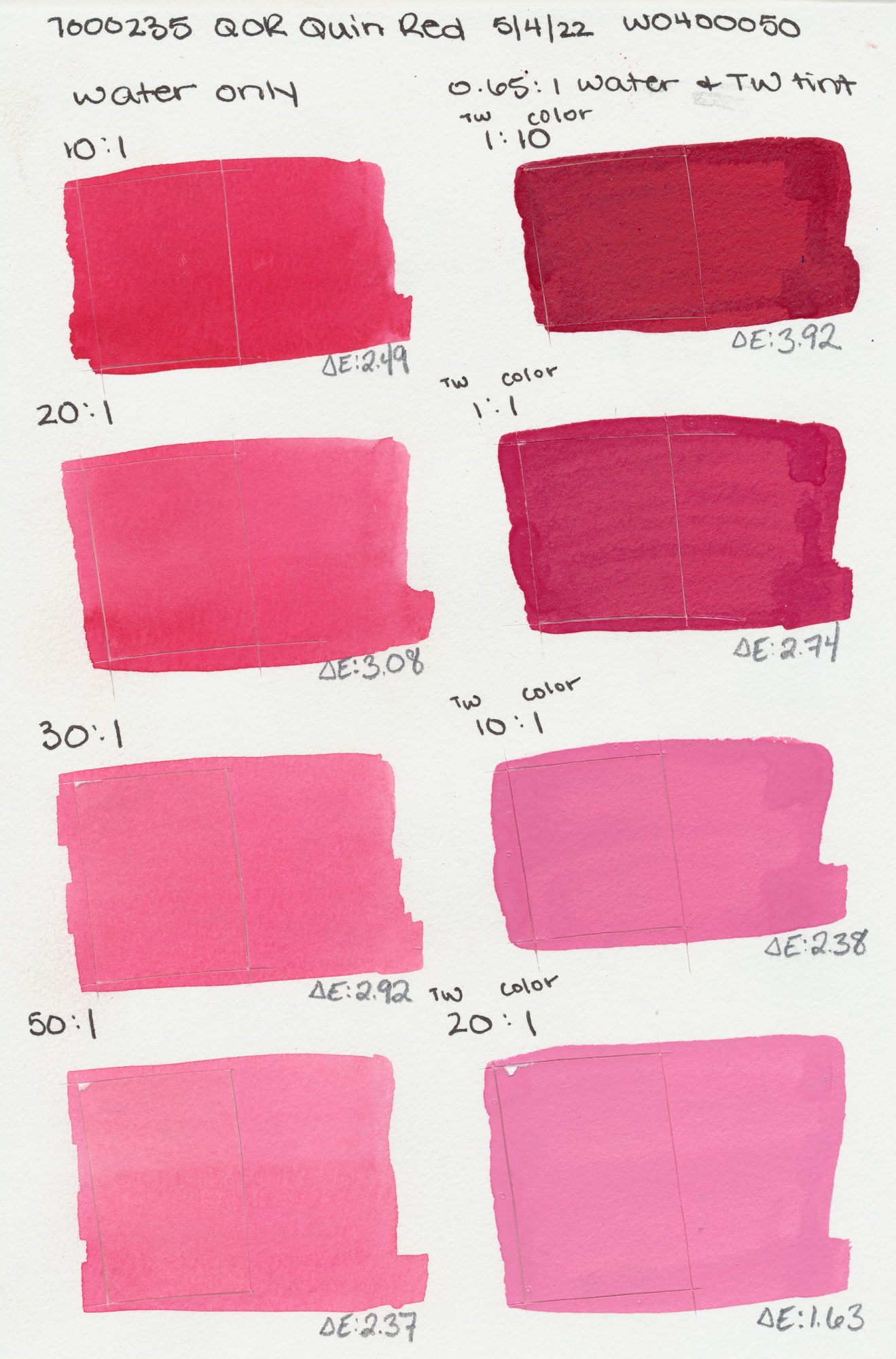
Red
PV19
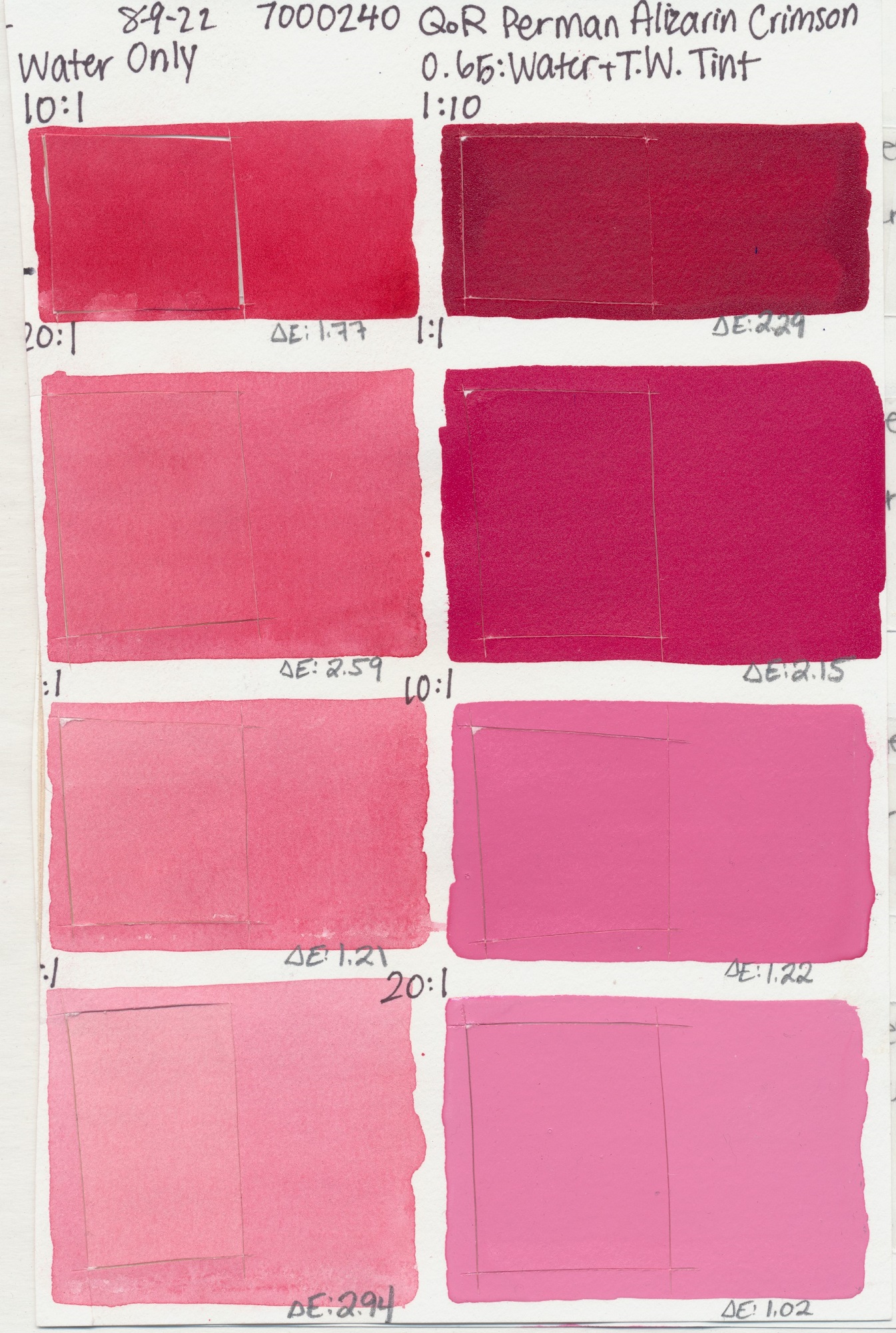
PR177
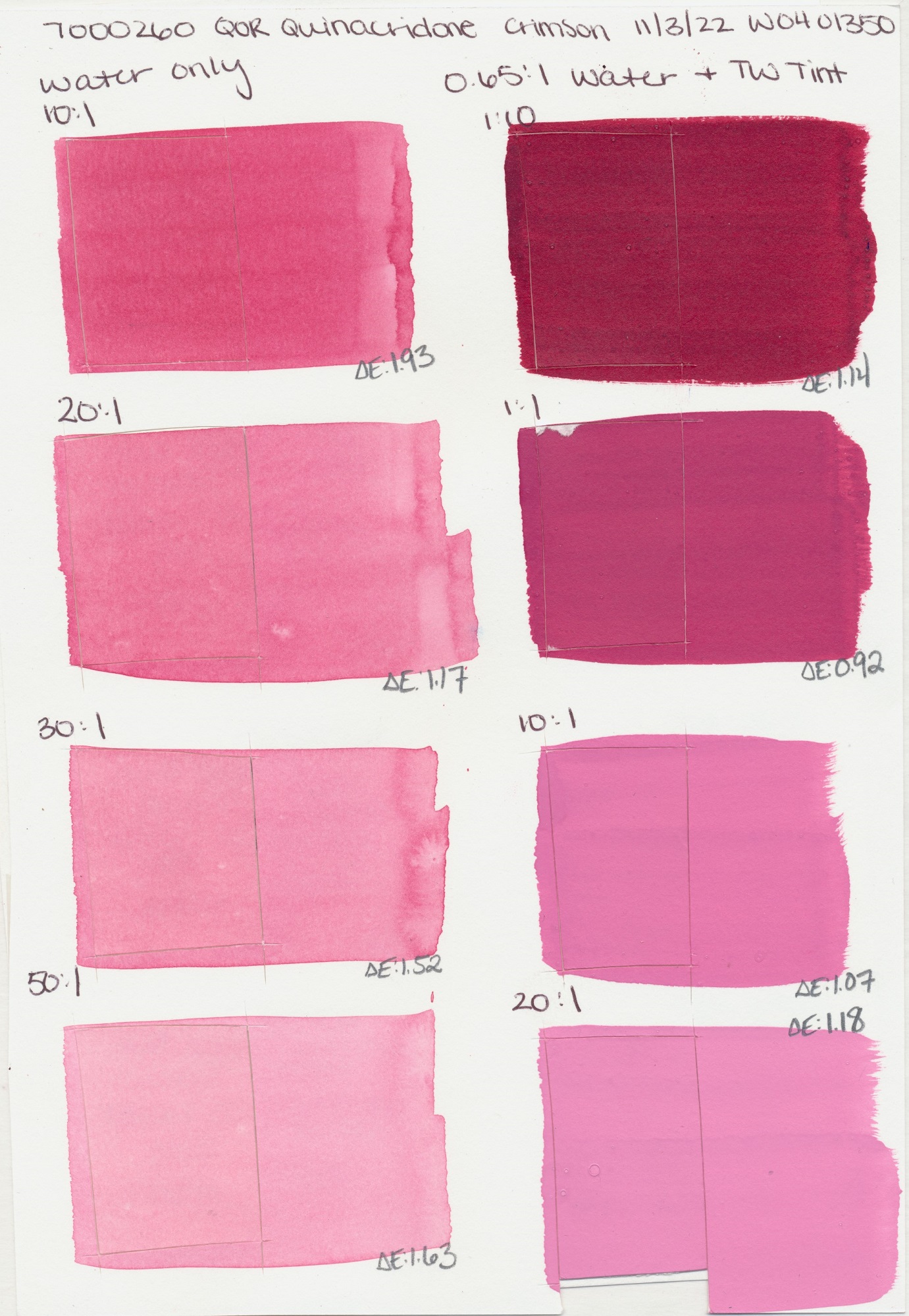
Crimson
PR122, PR206
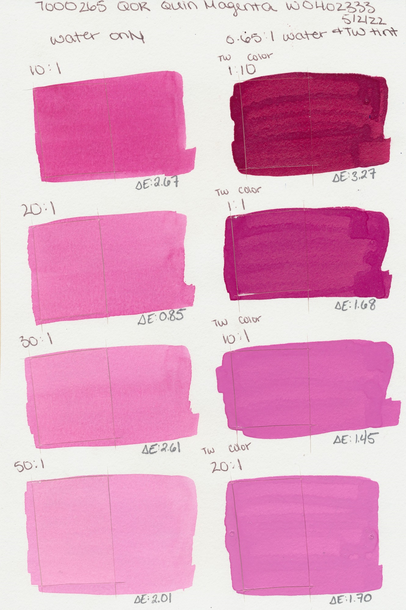
Magenta
PR122
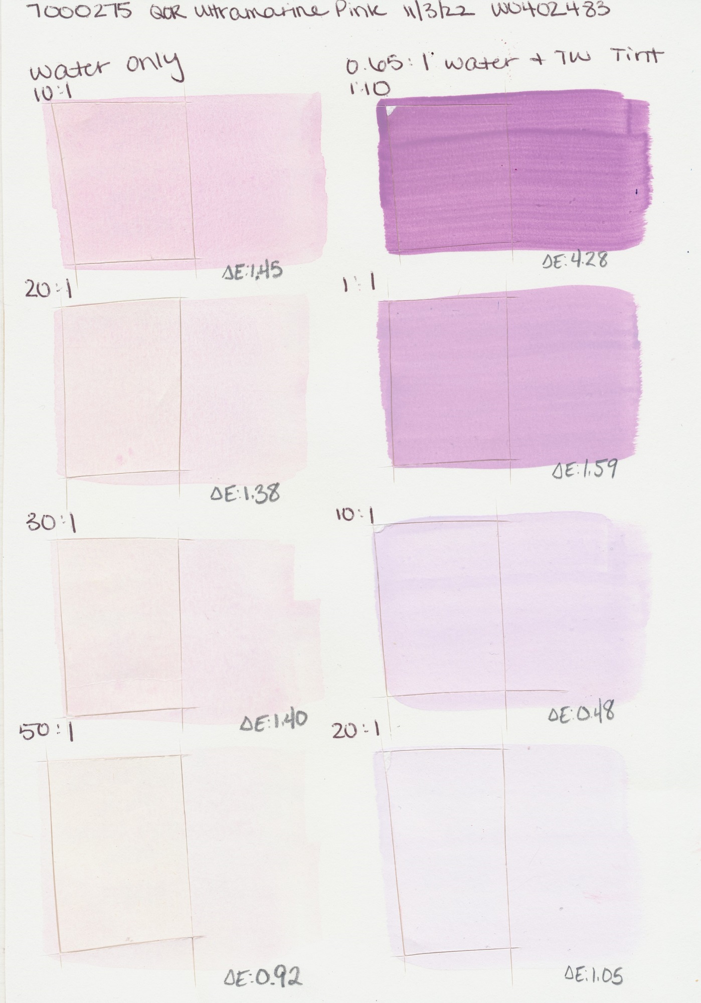
Pink
PV15
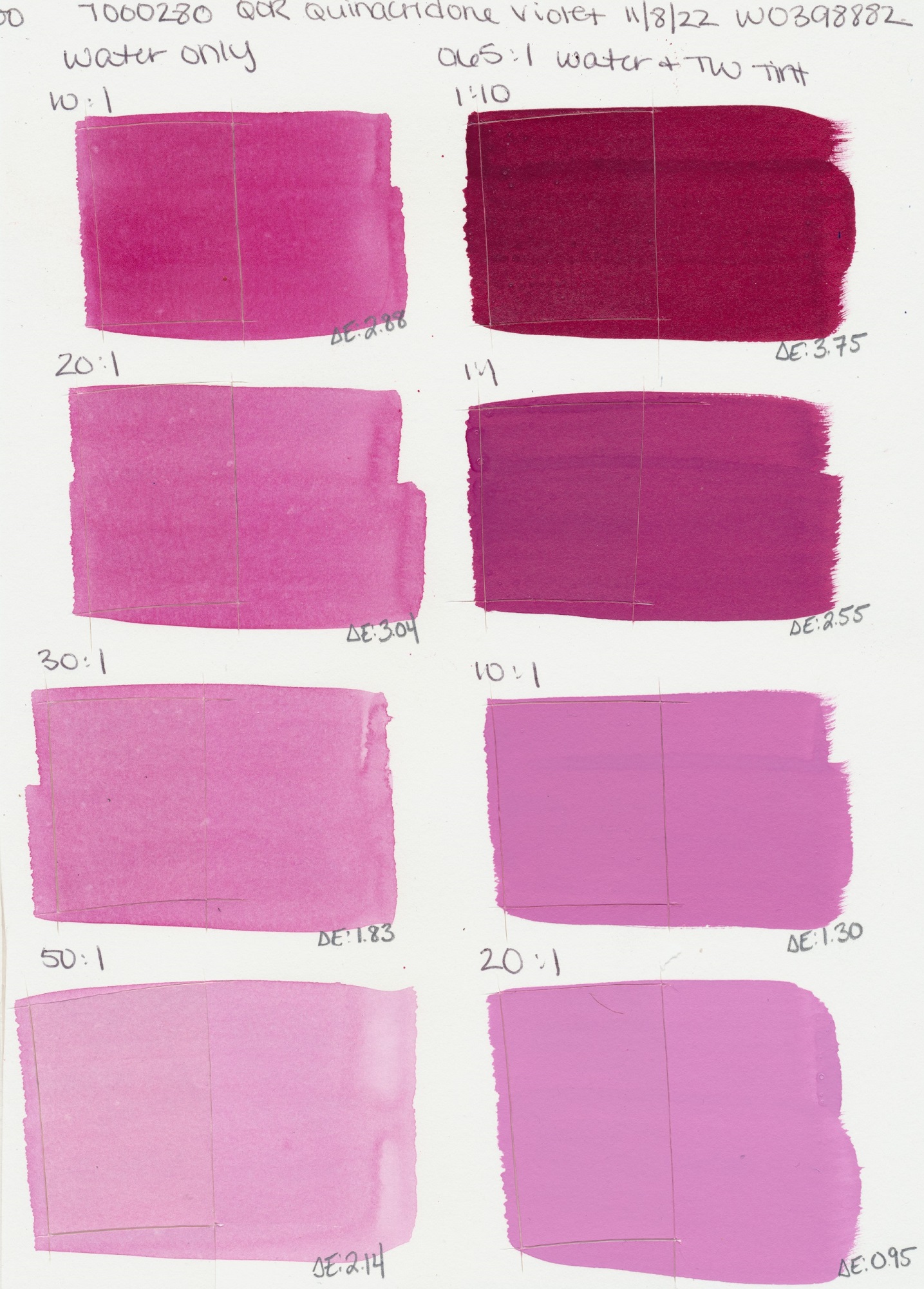
Violet
PV19
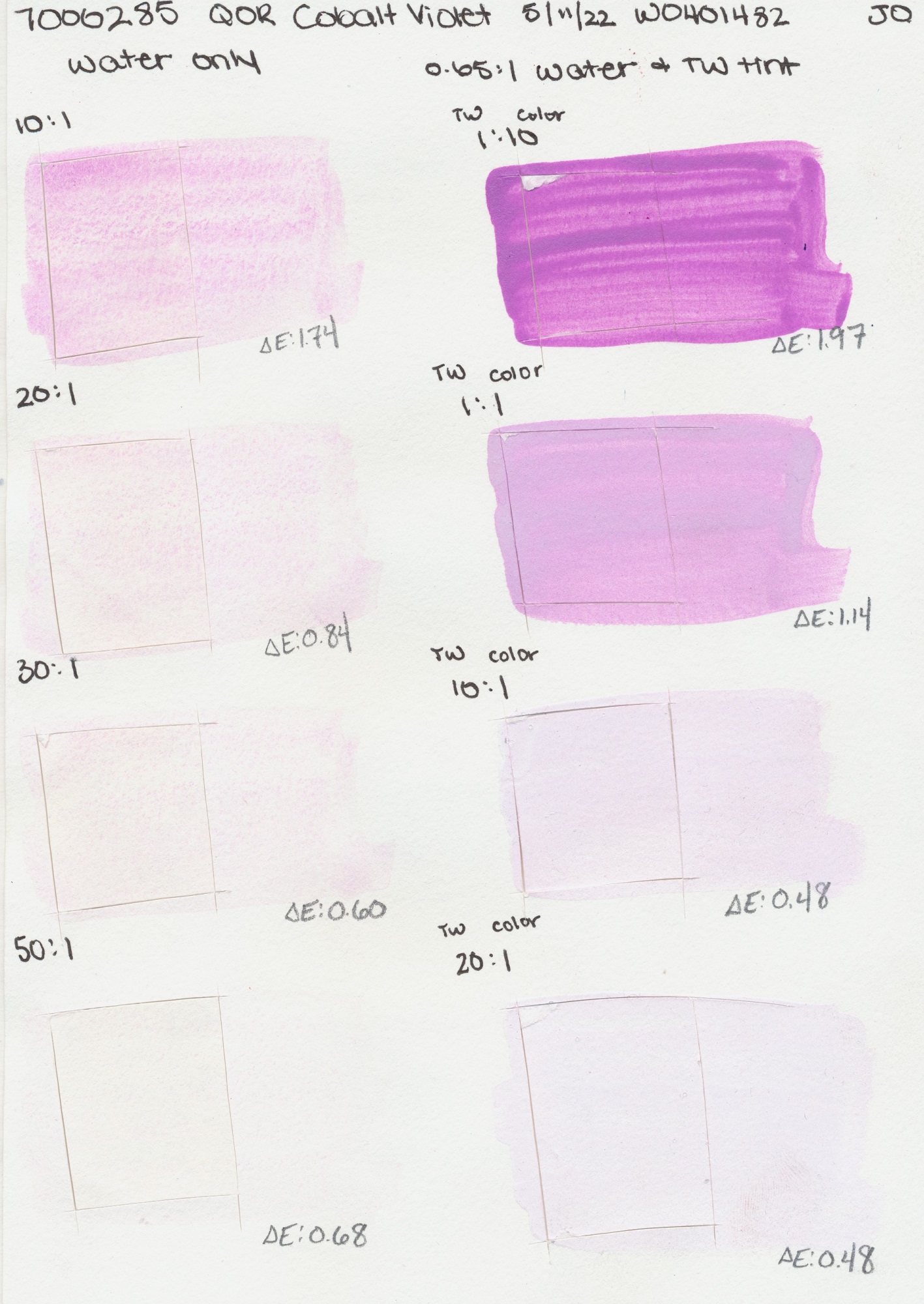
Pink
PV49
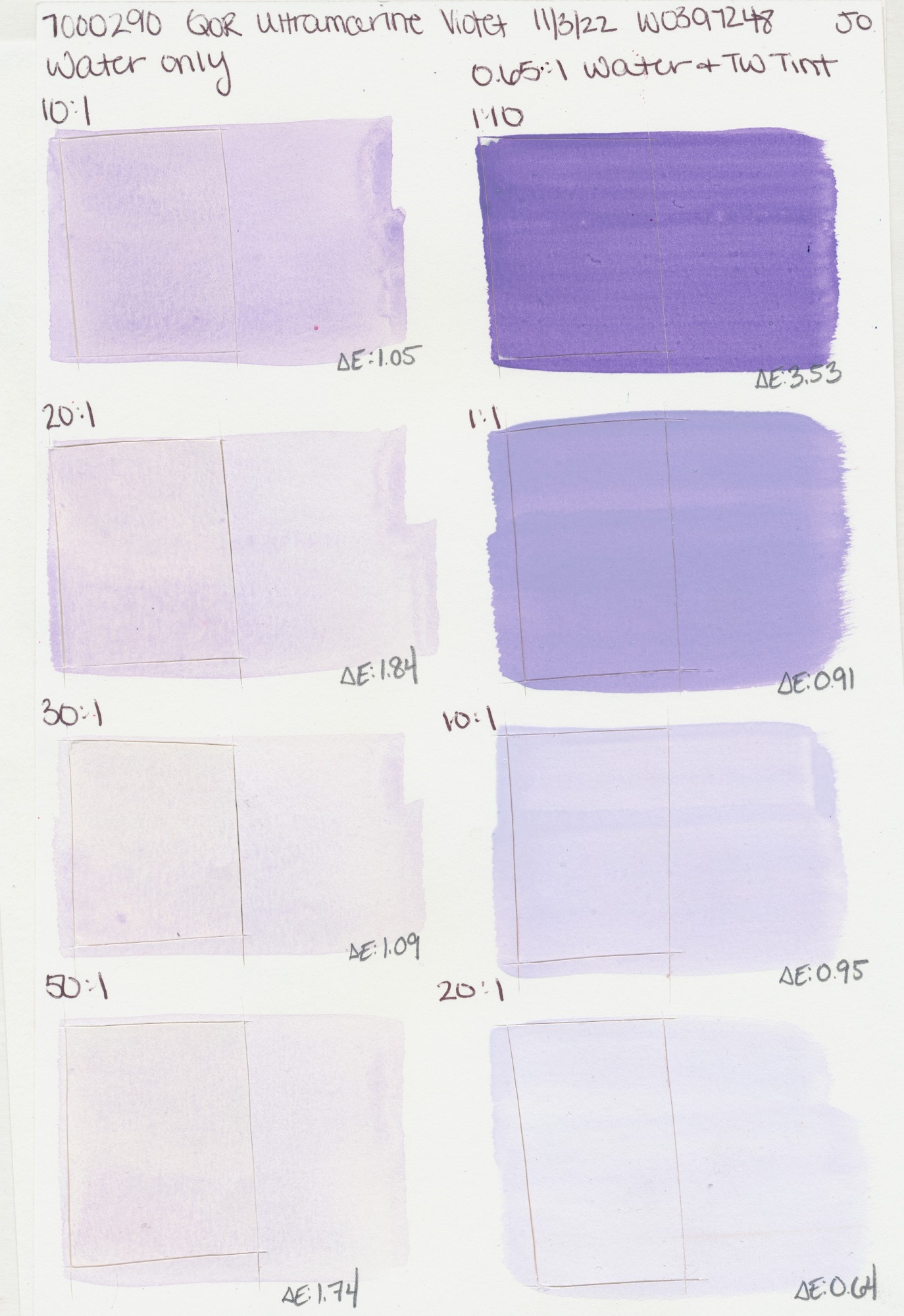
Violet
PV15
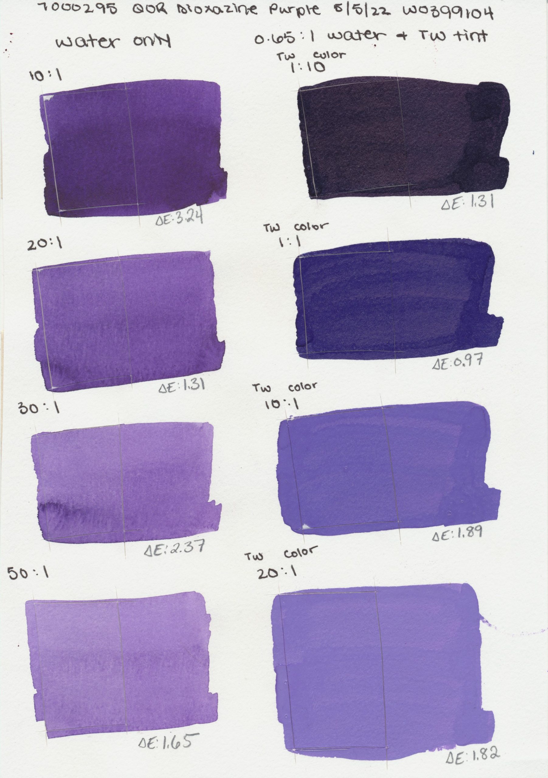
Purple
PV23
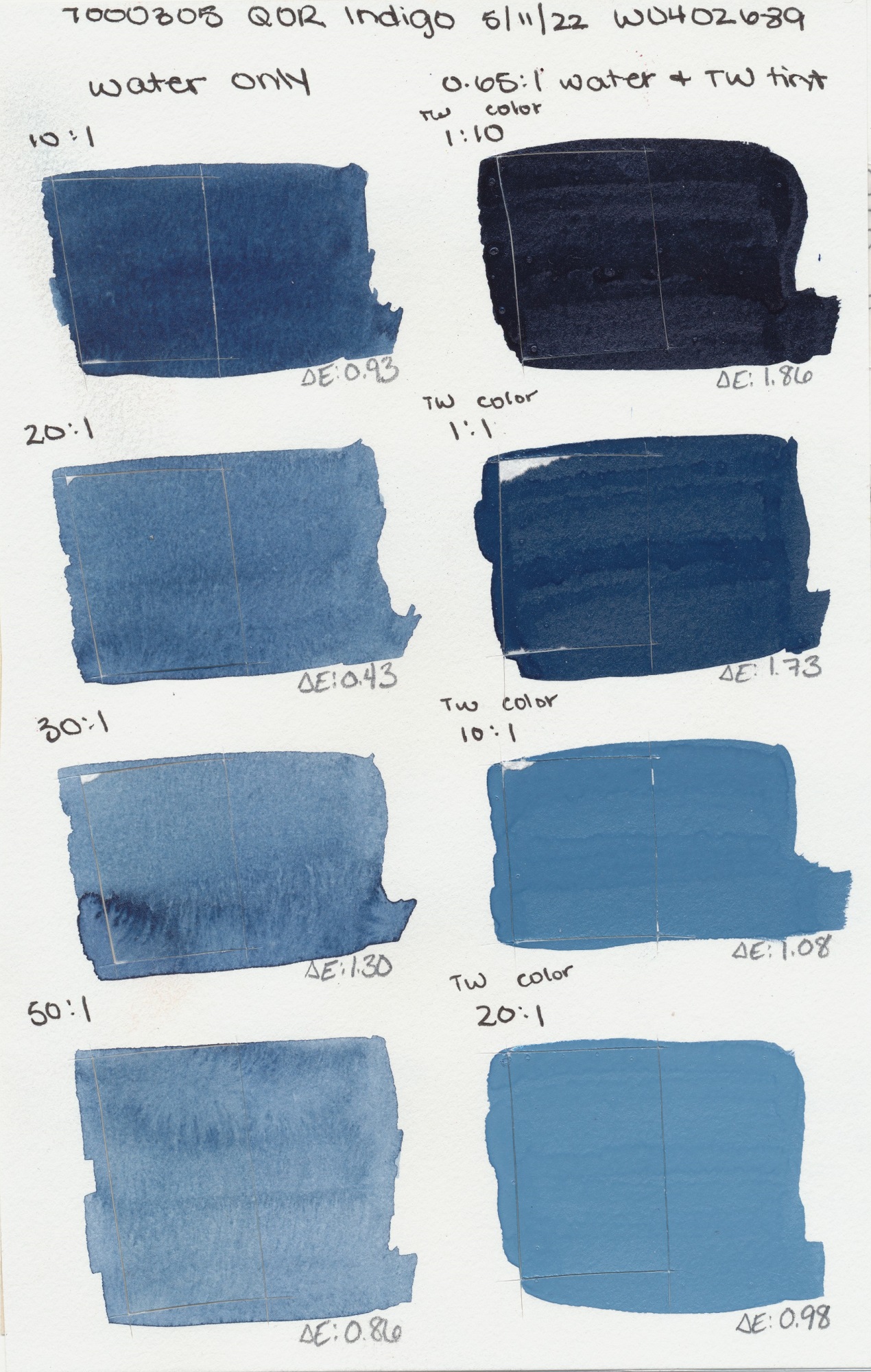
PB15:3, PBk7,
PV19
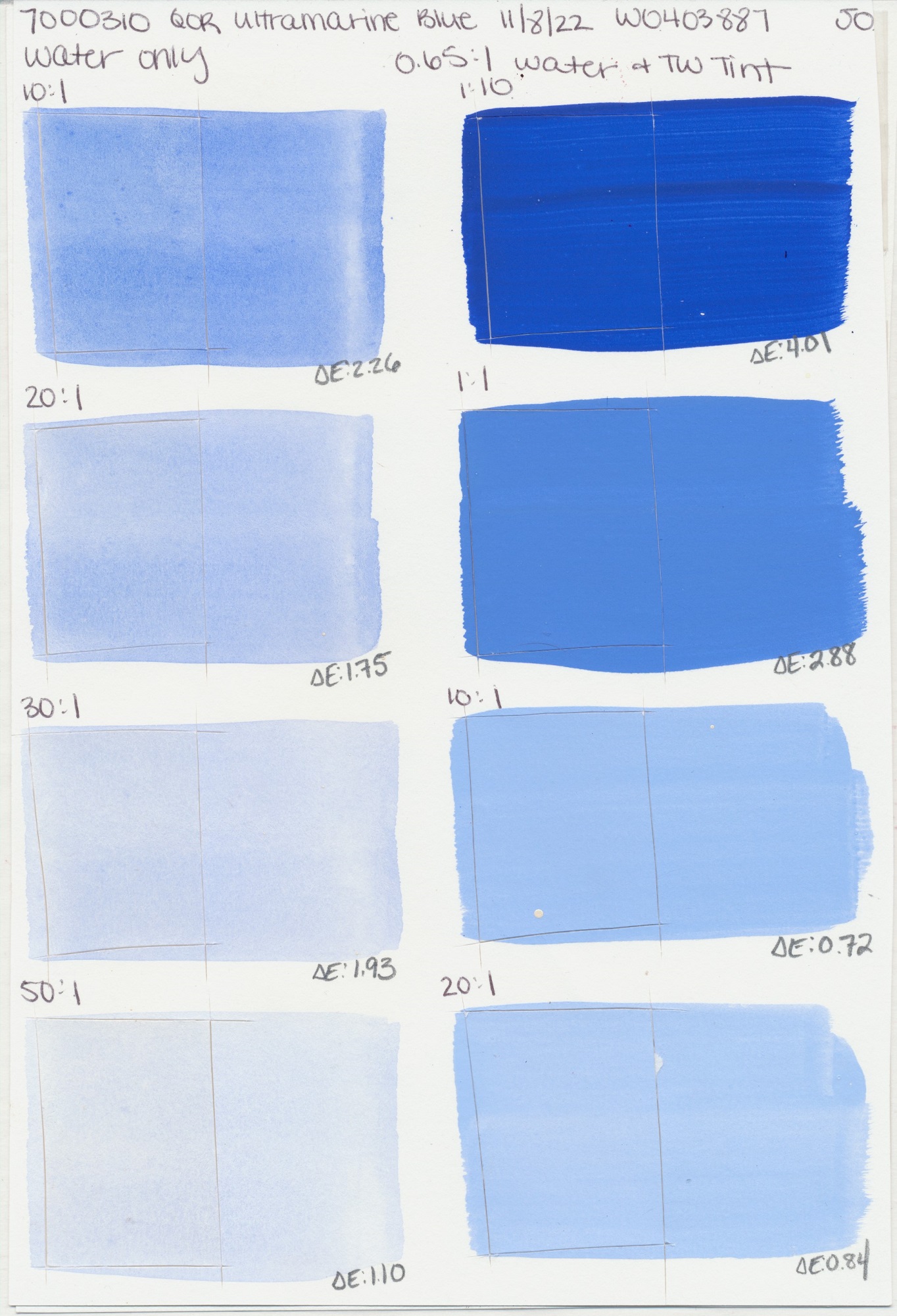
Blue
PB29
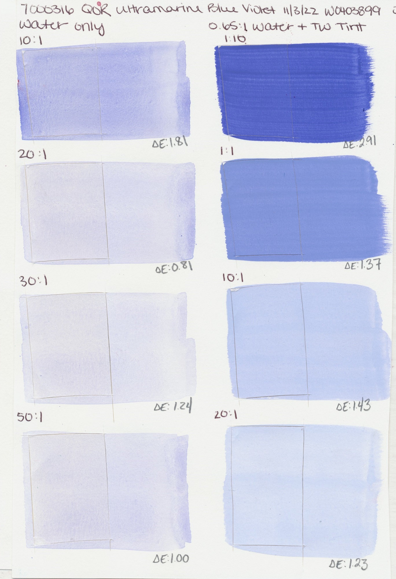
Violet
PV15, PB29
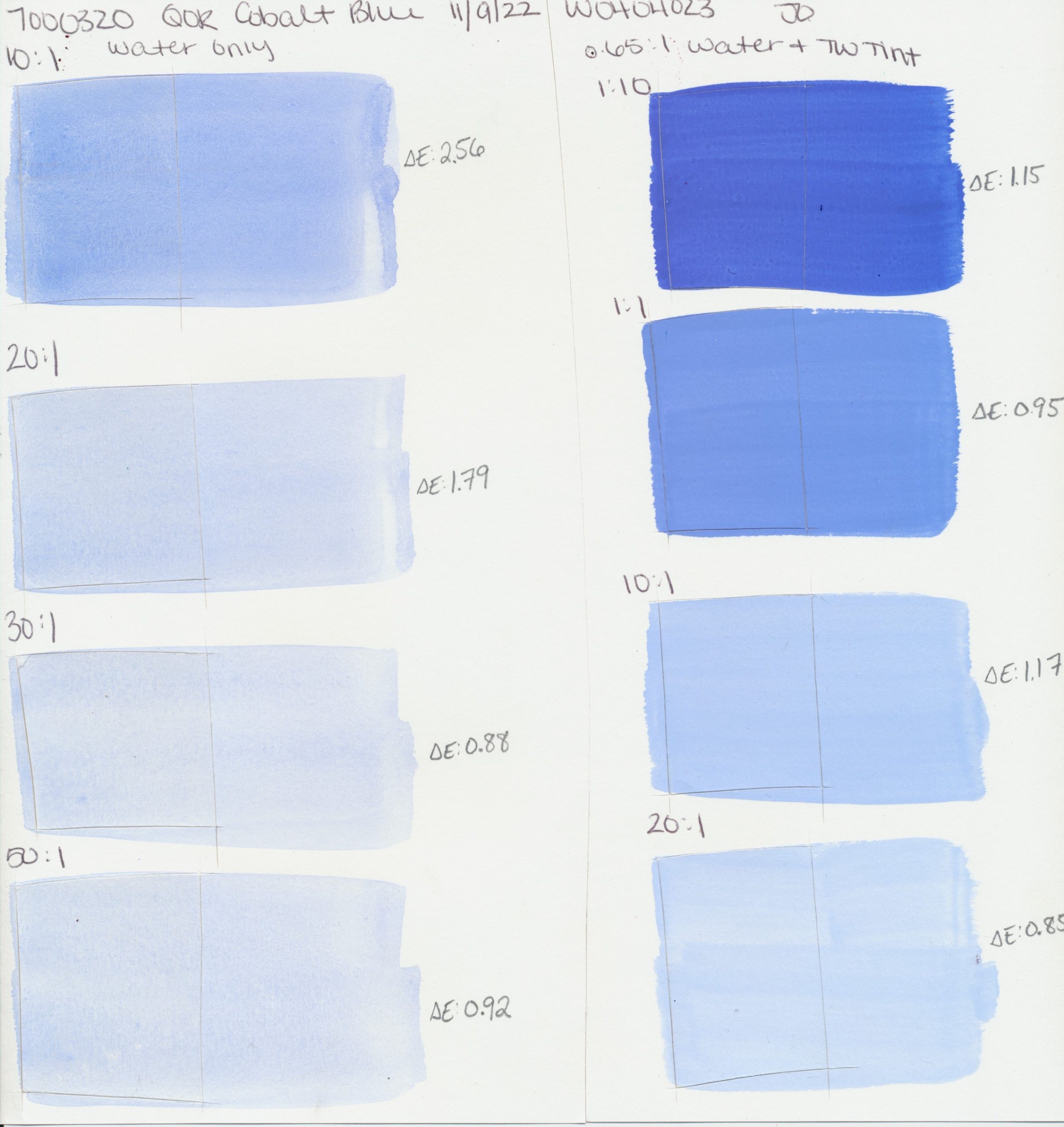
Blue
PB28
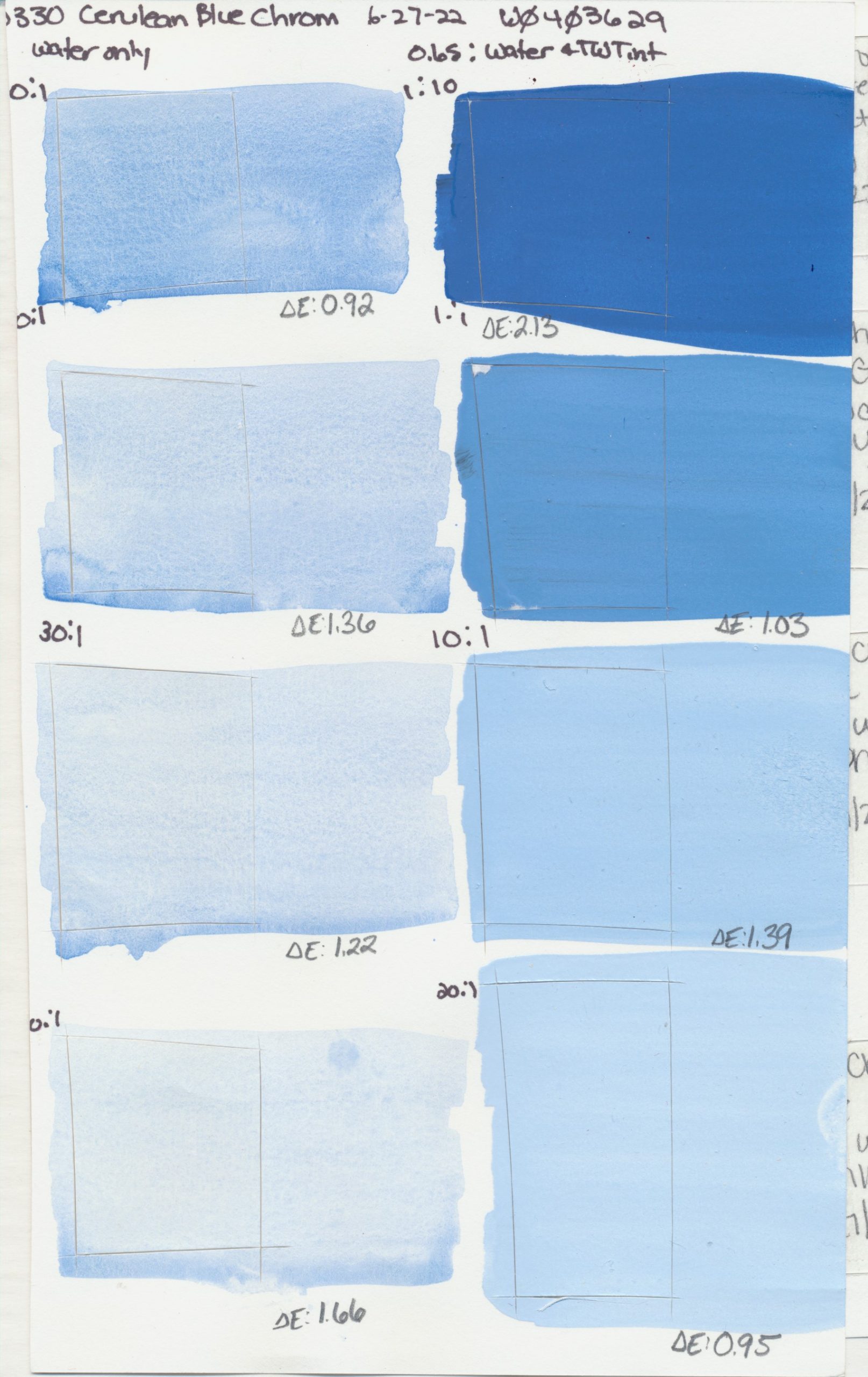
PB36:1
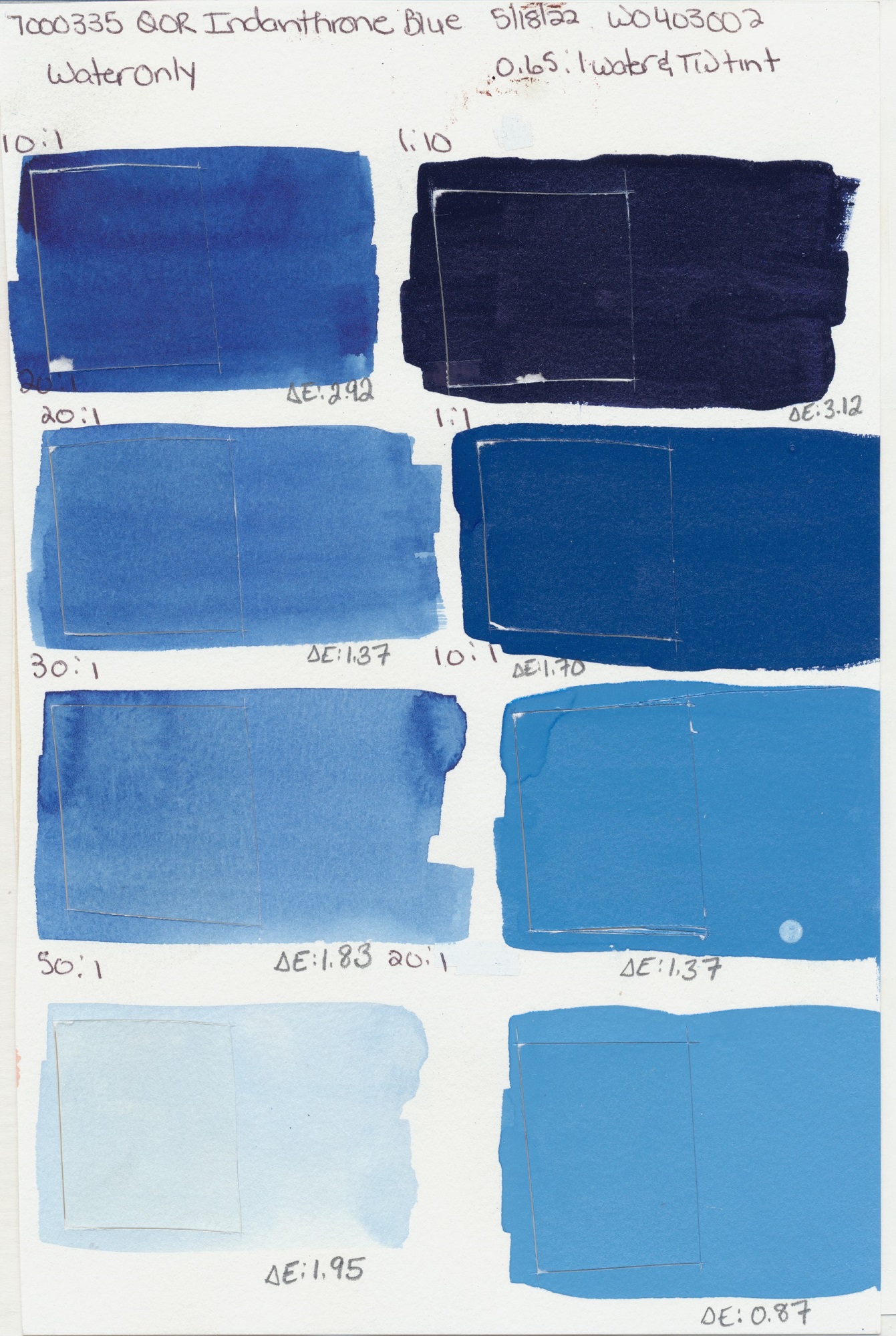
Blue
PB60
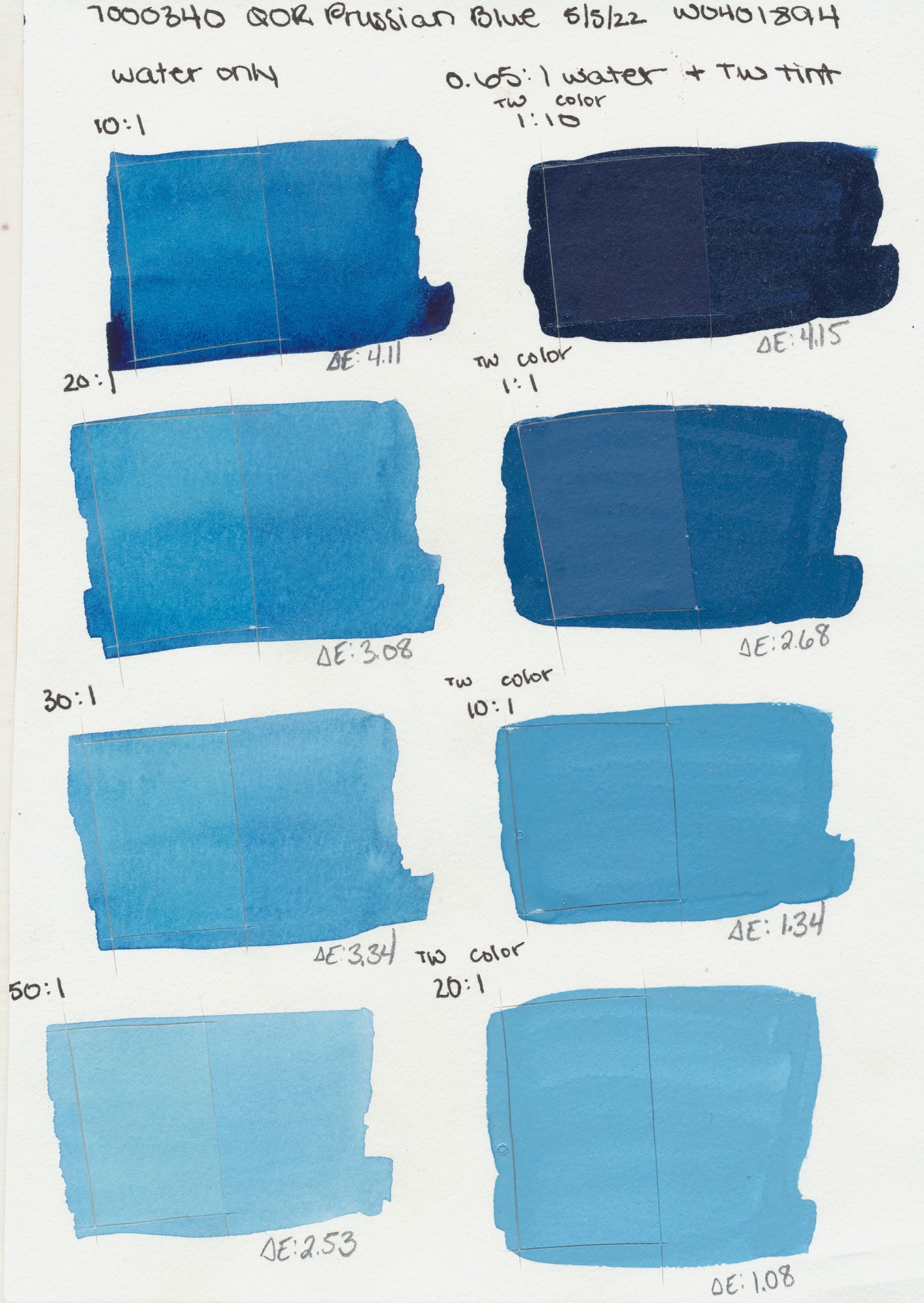
Blue
PB27
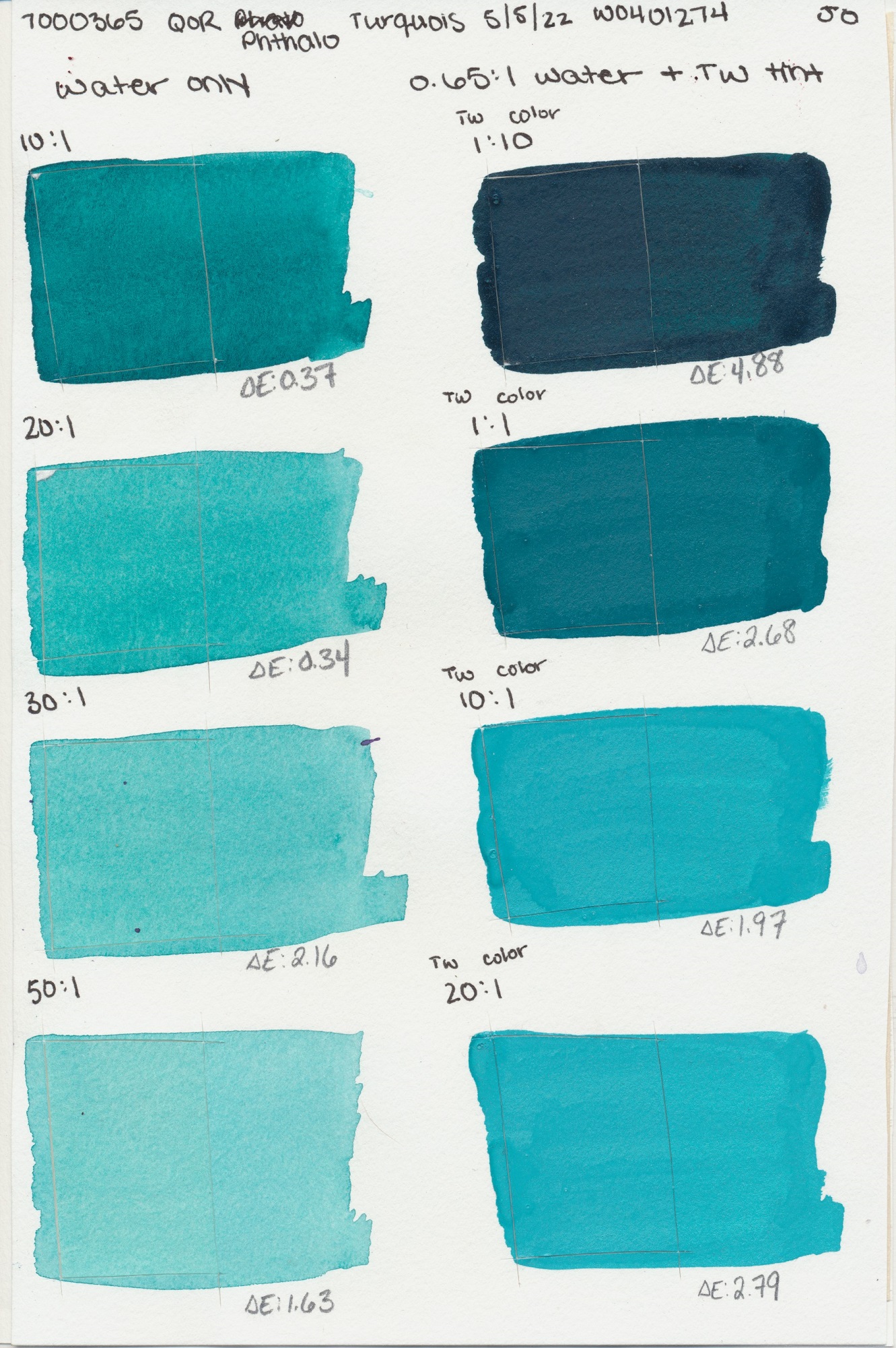
Turquoise
PG7, PB15:3
PB15:3
Blue
PB36
Blue
PG7, PB15:3
Turquoise
PB36
Teal
PG50
PG7
Green
PG18
Green Light
PG7, PY3
Green
PG26
PY150, PB60,
PR122
PG36, PR101,
PY150
Verte
PG23
Green
PG17
PR101, PY184,
PG7
PBk7, PG7,
PR101, PY42
Gold
PY129
Buff
PW6:1
(Natural)
PY43
PY42
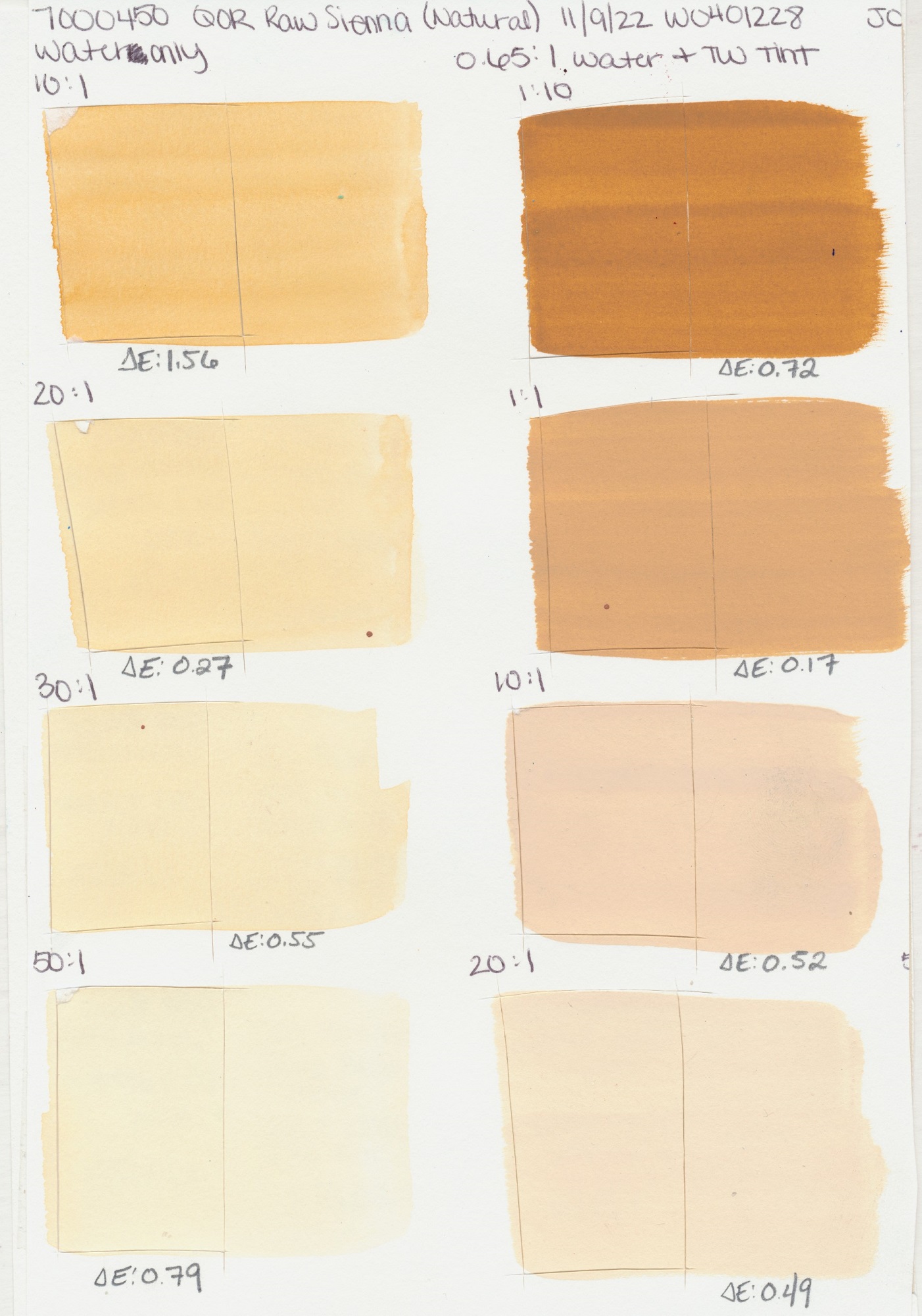
(Natural)
PY43
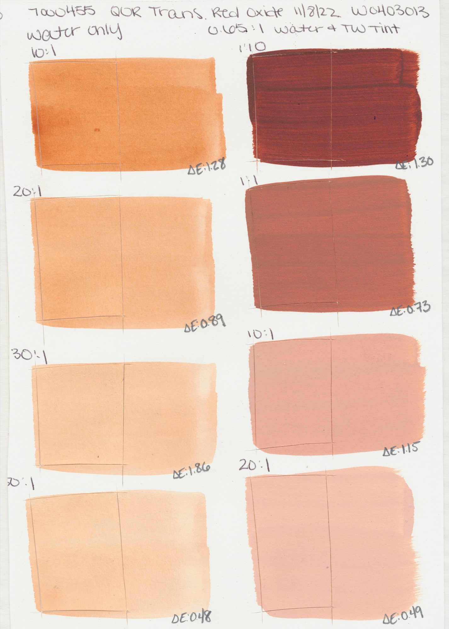
Oxide
PR101
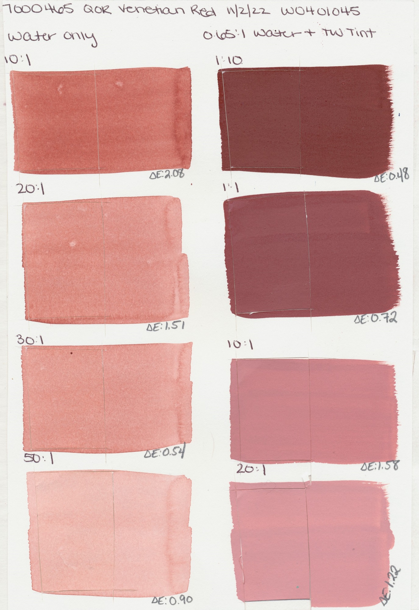
Red
PR101
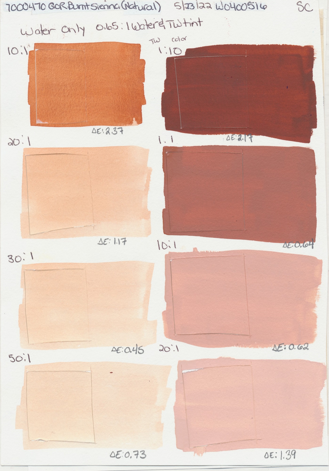
(Natural)
PBr7
PR101
(Natural)
PBr7
(Natural)
PBr7
Yellow
PY150
Brown
PR101
PR101, PY150,
PBk7
Black
PBk7
Black
PBk9
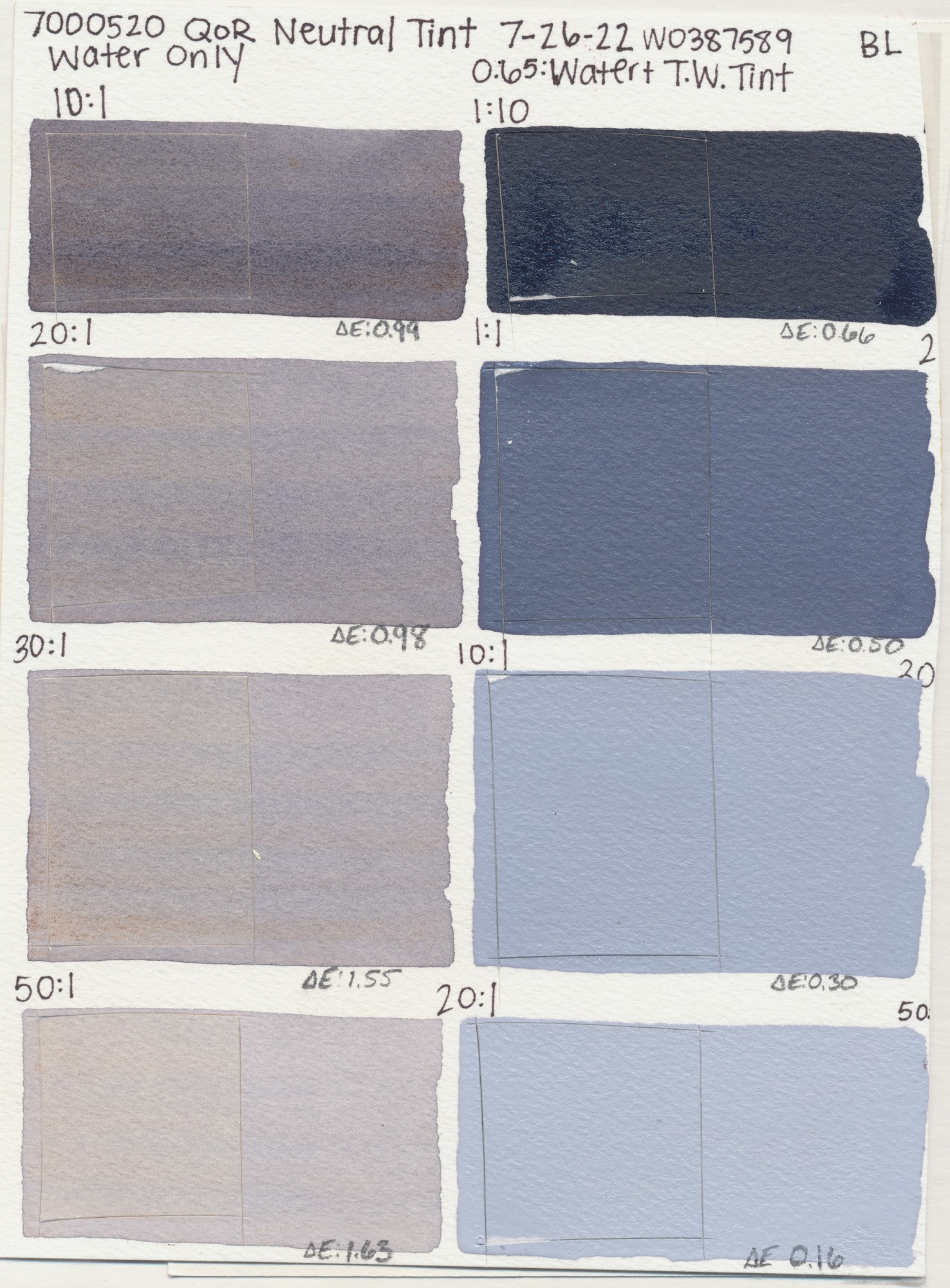
PY42, PR122,
PB15:3
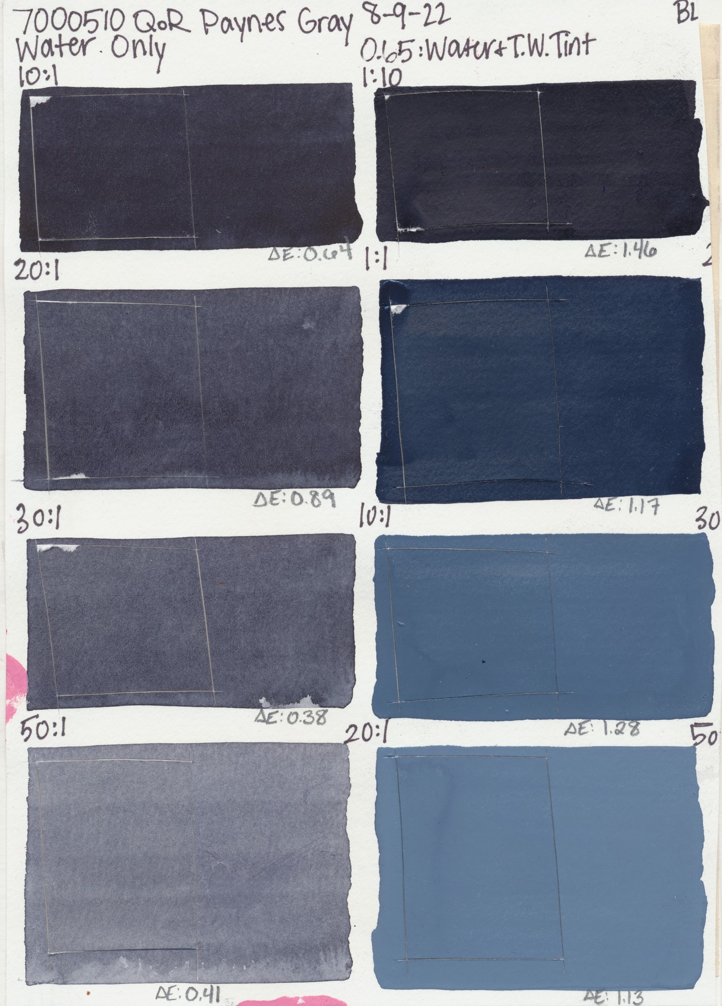
PB15:3, PBk7,
PV19
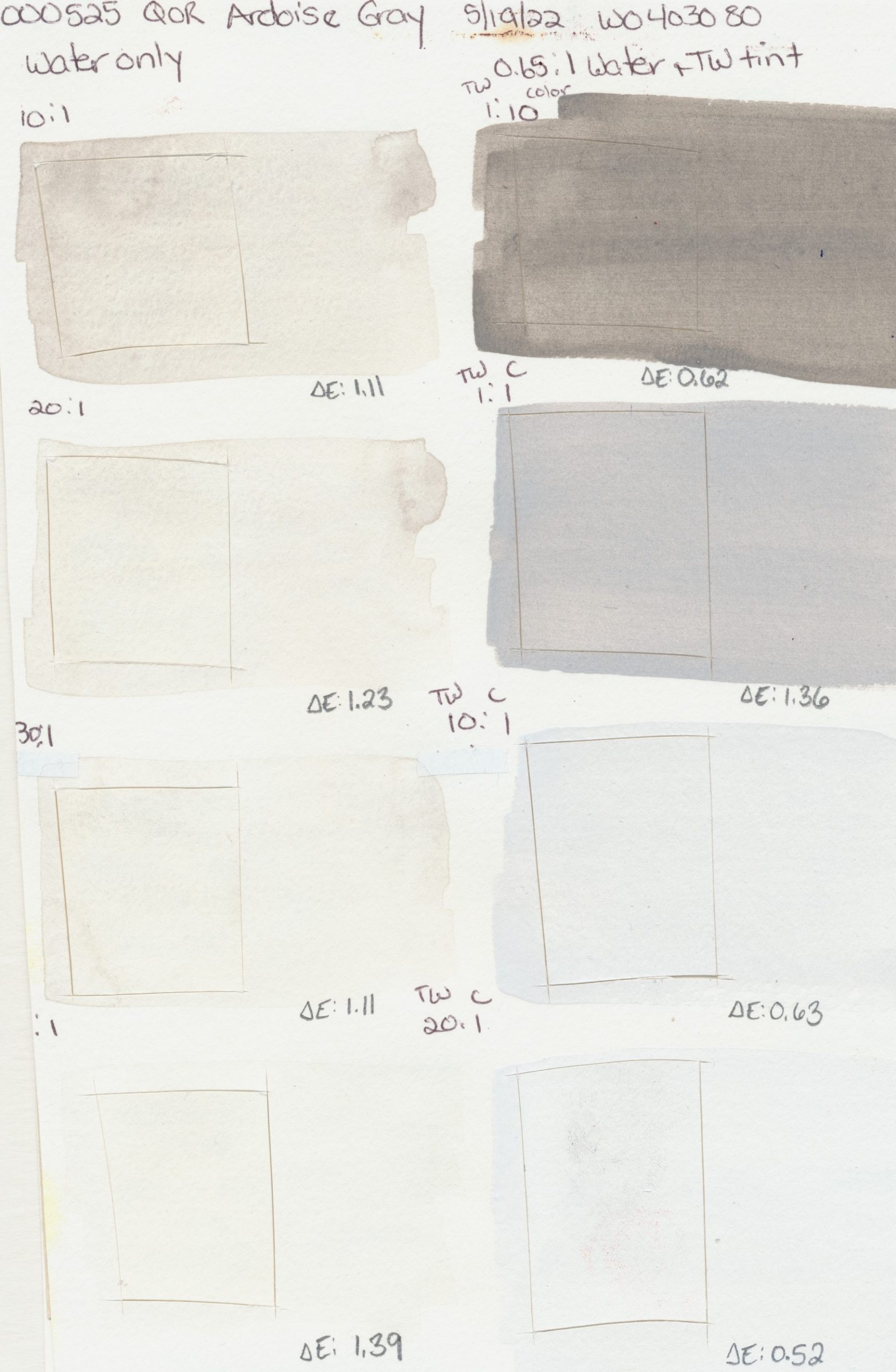
Gray
PBk19
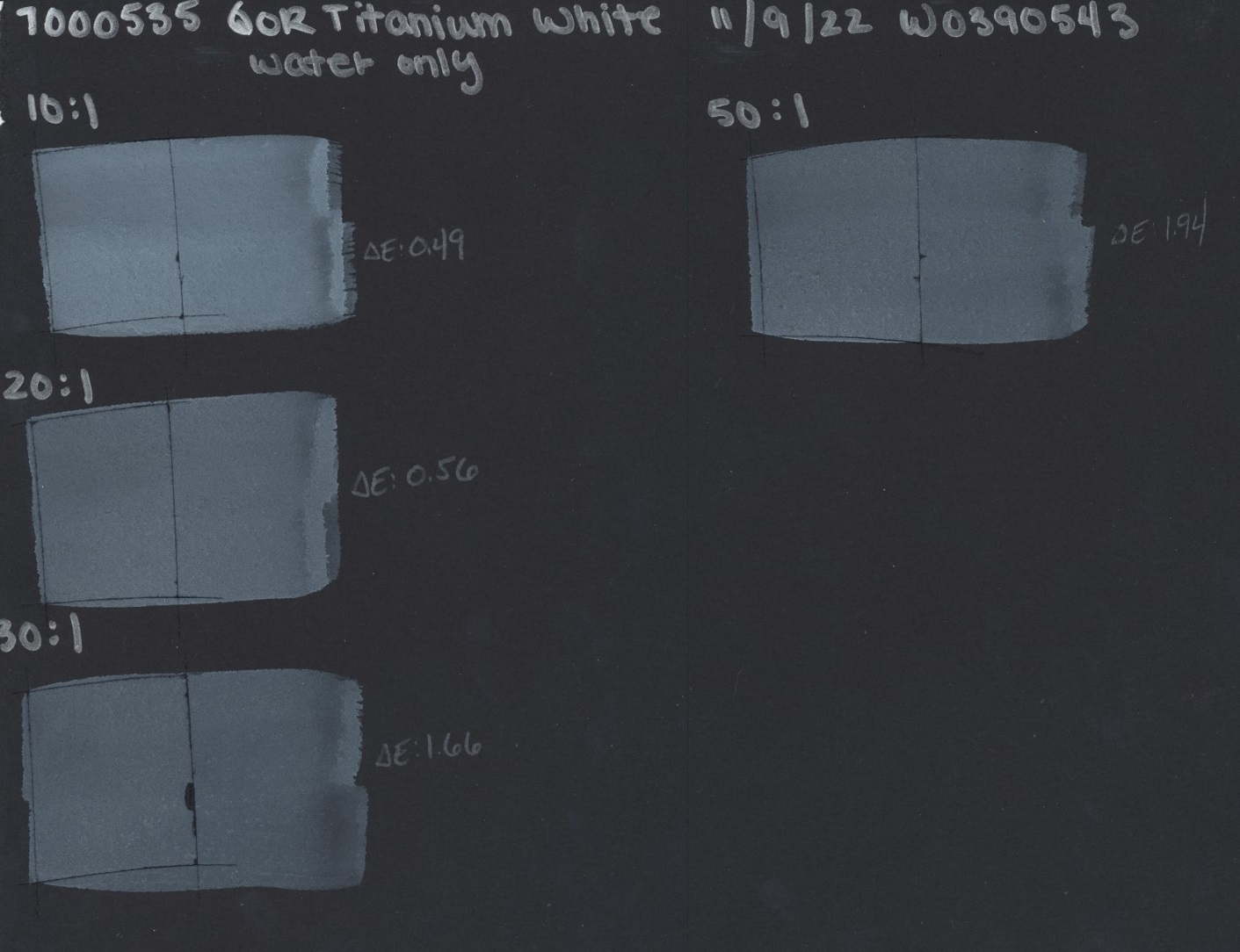
White
PW6
White
PW4
Gold
Pearl
Silver
PBK7


As always, we hope this information is helpful! Don’t hesitate to reach out to us at help@goldenpaints.com if you have questions or if you would like to leave a comment below.