
Defining Warm and Cool Colors: It’s All Relative
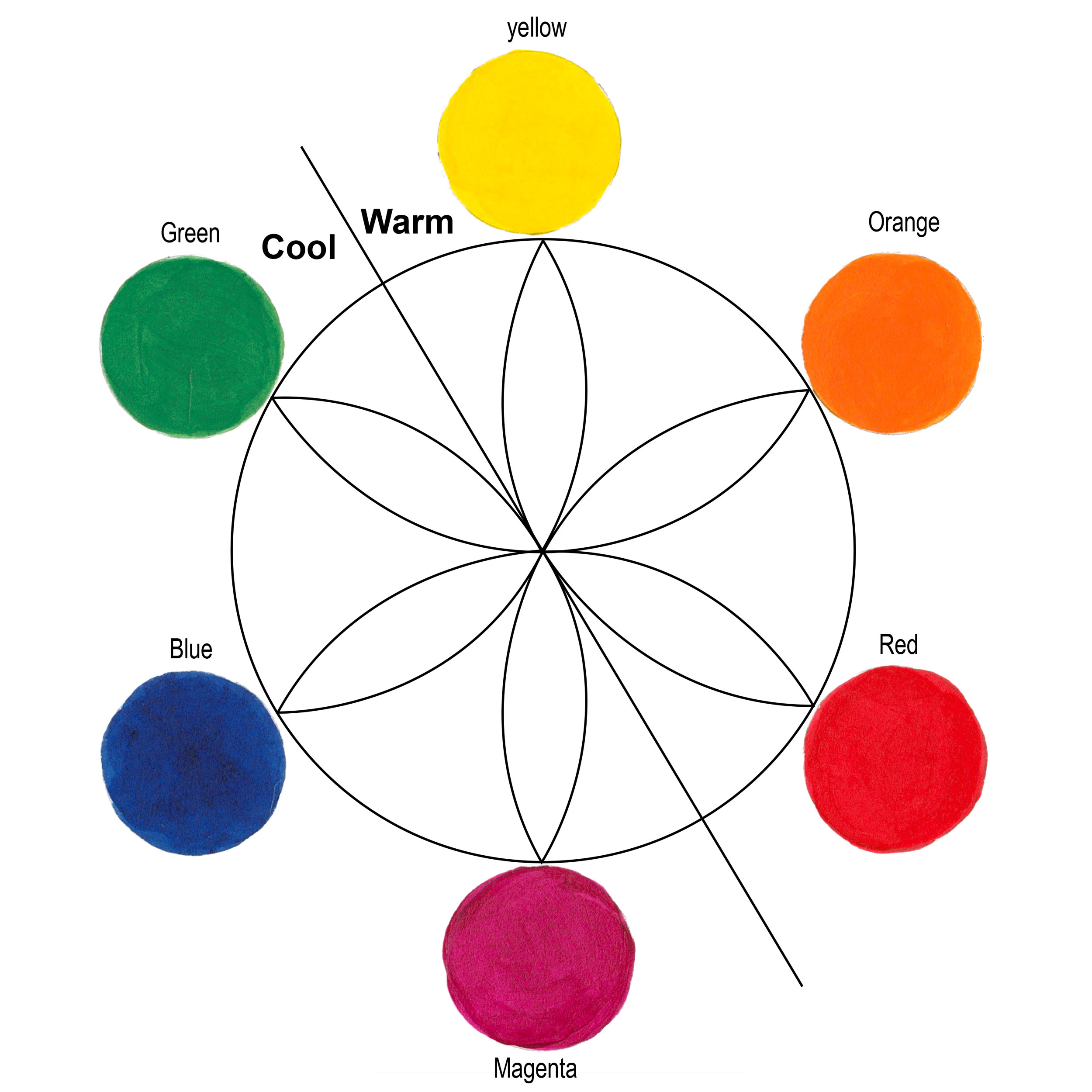
The concept of warm and cool colors has been written about for hundreds of years. Most theories start with the classic six point color wheel (three primary colors and three secondary colors). A dividing line splits the wheel into warm and cool. The line location varies based upon the reasoning of the theorist. Regardless, the general idea is the warm colors are Red, Orange and Yellow; and the cool colors are Green, Blue and Magenta (Figure 2).
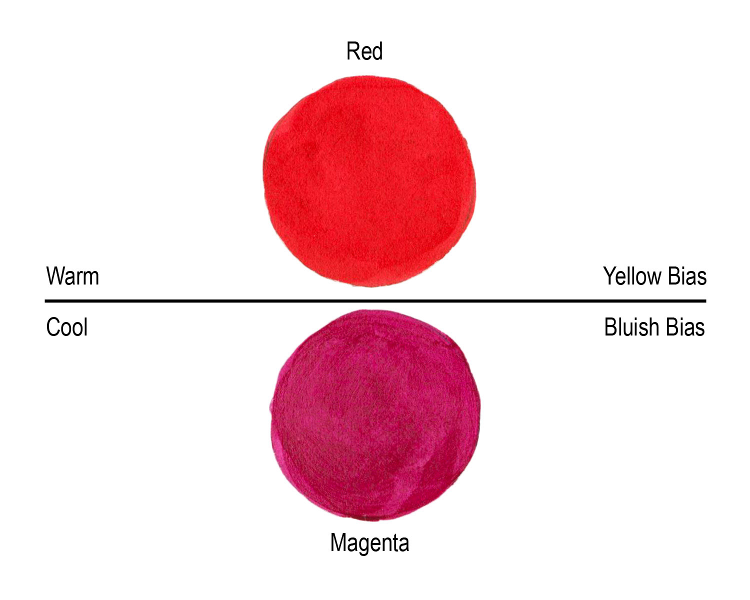
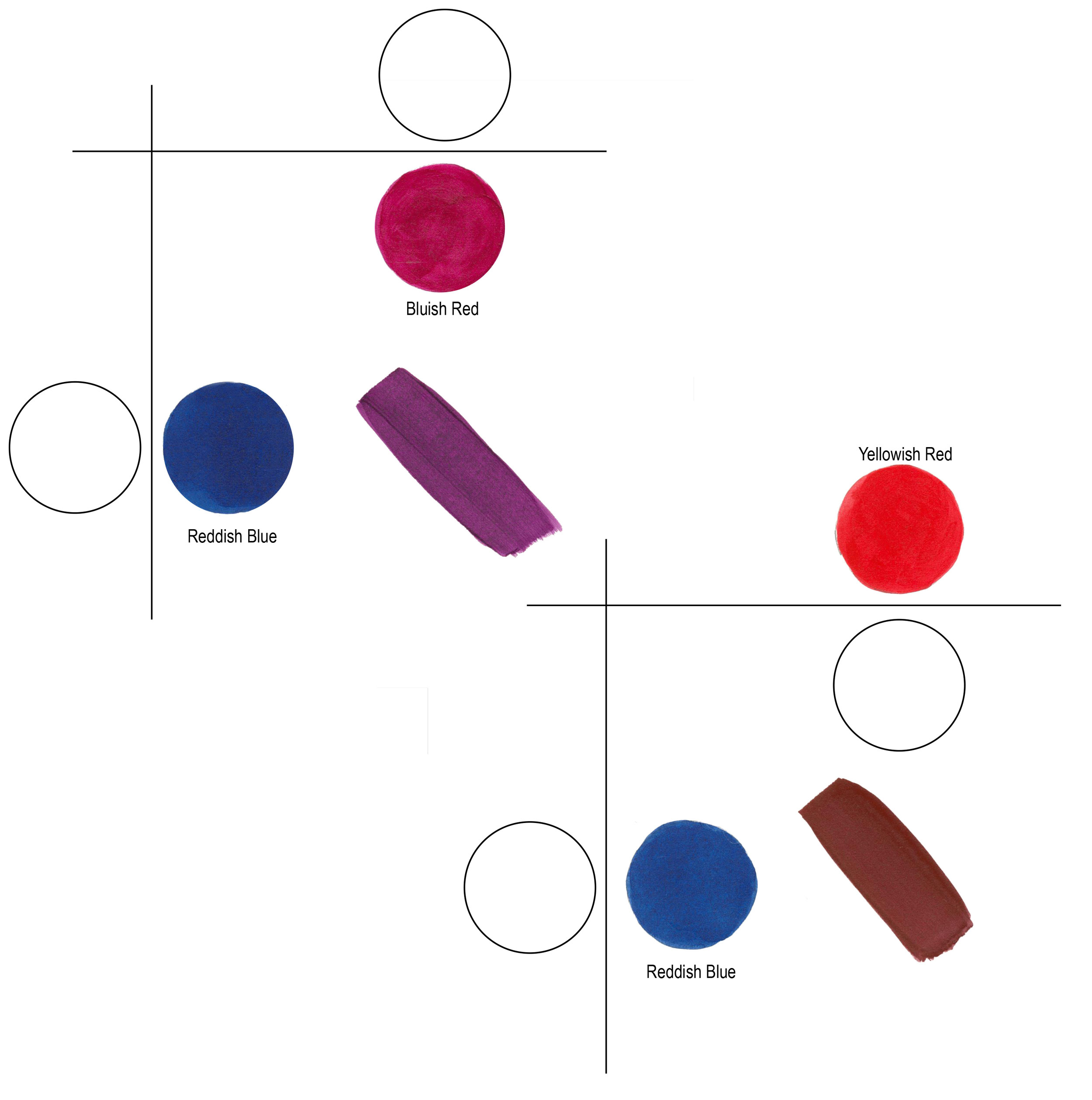
Compare “yellow” to “blue” and it’s easy to see yellow is warm and blue is cool. Comparing “red” to “magenta” might be less obvious since they are next to each other. But if you identify and compare the “color temperatures”, a bluish red (magenta) is cooler than a yellowish red (Figure 3). Describing how a color leans towards another primary or secondary is also referred to as its“bias.” A red, as we can see, can have a yellow or a blue bias.
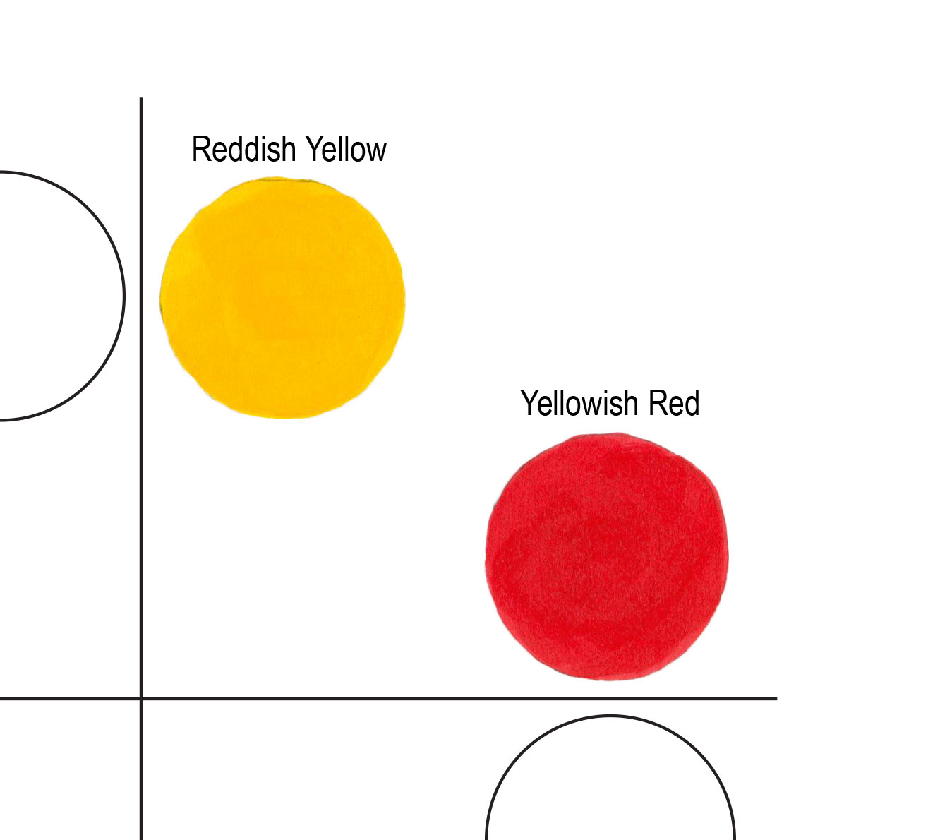
Color temperature is also important during paint mixing. In order to make clean mixtures use colors with similar color qualities. For example, mixing a yellowish red with reddish yellow yields bright secondary oranges (Figure 4). In describing a color to someone, we often refer to color “bias”. A red can have a yellow bias or it can have a blue bias.
To identify color temperature you’ll need to learn how to see and identify warm and cool colors. Some colors are easy to discern, but looking at our 108 colors in our Heavy Body Acrylics line, “color temperature” gets tricky. In the world of paint colors, there are warm AND cool greens, blues, red, yellows, earth colors, blacks and whites. Comparing a warm red to a cool red and then compare those to a third color, you should be able to see if it’s yellower, bluer, or in between the first two reds. Once you begin to “see” the differences it becomes easy to identify any color.
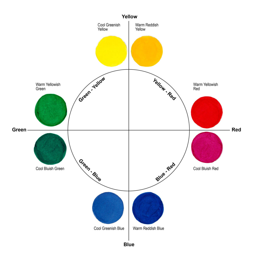
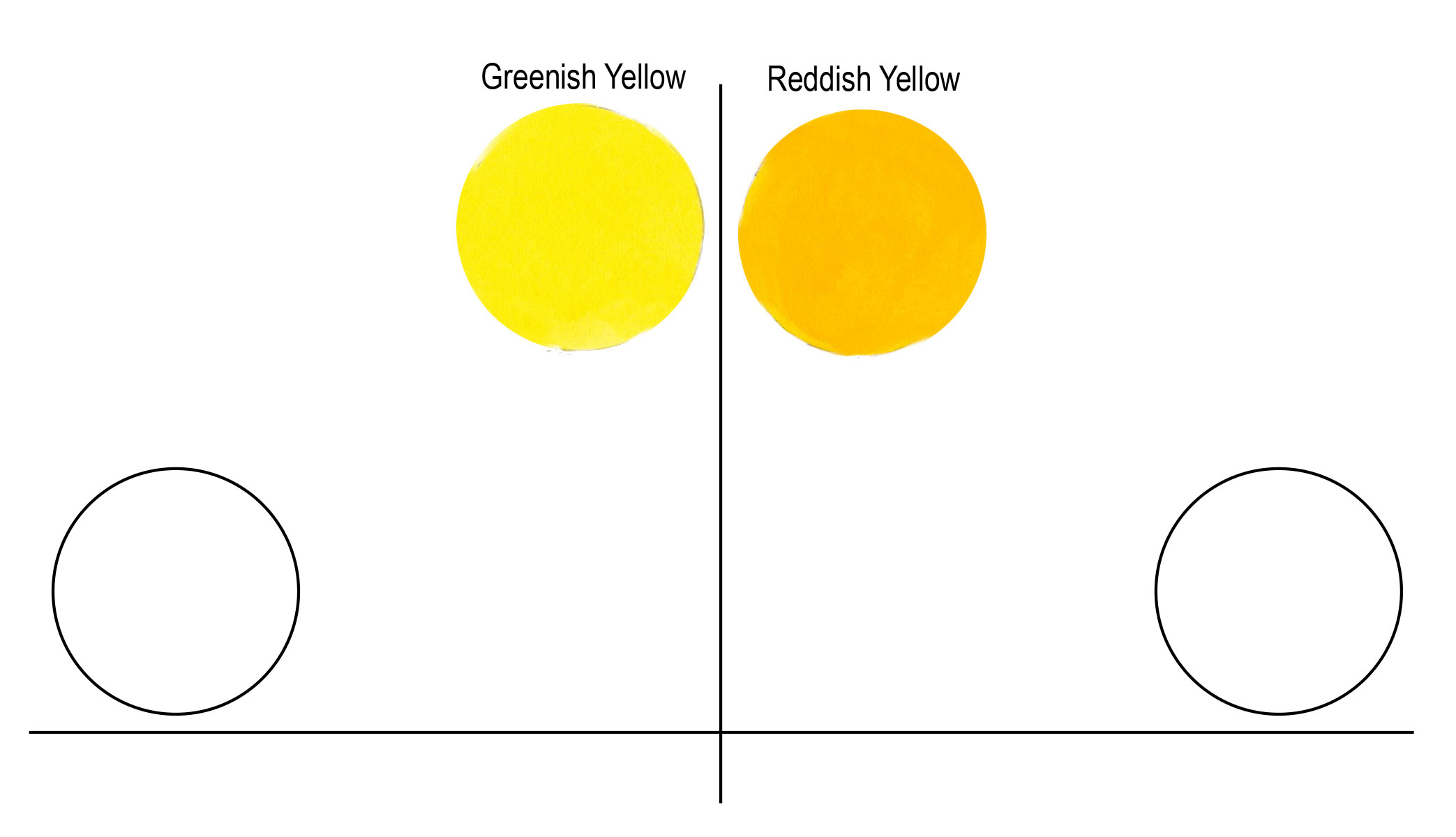
To make this as easy as possible, stretch out the color wheel to eight primary colors (Figure 1). The colors are on a grid. Yellow is at the top, with the left example being a cool yellow because it has a green bias, thus we describe this as a “Greenish Yellow”. The yellow to the right is a “Reddish Yellow” and identifies as a warm yellow (Figure 5).
Clockwise, we move toward reds. The top red is a “Yellowish Red” because it has a yellow bias. Not by accident, the Yellowish Red is in the same quadrant as the Reddish Yellow. Mixed together the resulting orange is “clean” (Figure 4). Clean color refers to having no biasness resulting in a duller or “muddy” color.
The lower red has a blue bias. Having the two reds next to each other makes it easier to identify the color temperature. Our “Bluish Red” mixes very cleanly with our “Reddish Blue” at the bottom right, resulting in vibrant purples and violets. Mixing the Yellowish Red with the Reddish Blue would make a dull maroon (Figure 6).
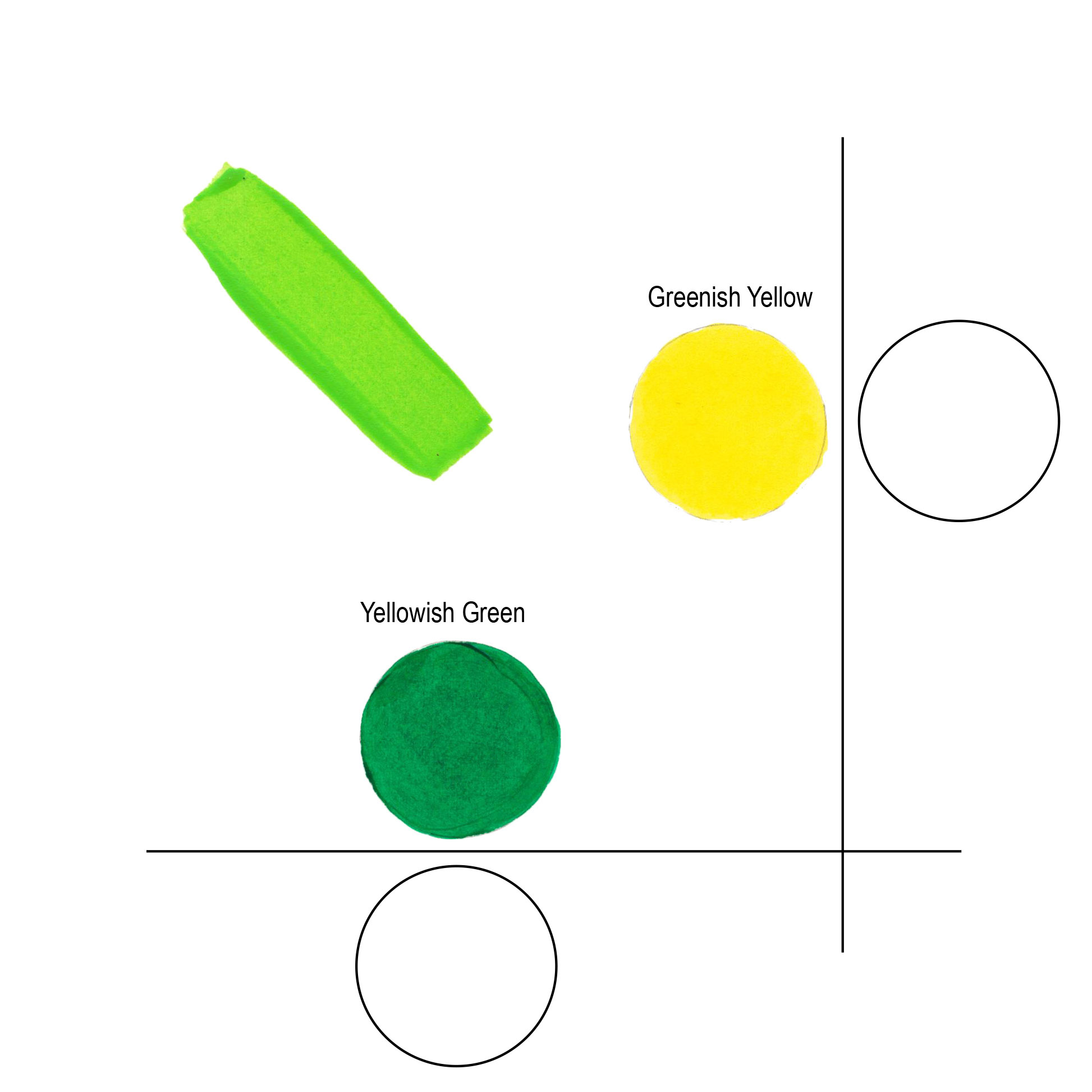
Each quadrant lines up similarly. The “Greenish Blue” or cool blue mixes cleanly with the cool “Bluish Green”. The “Yellowish Green” is warm and creates vibrant bright greens when mixed with its quadrant companion “Greenish Yellow” (Figure 7).
Color temperature doesn’t line up neatly when mixing colors. By chance the warm Reddish Yellow and warm Yellowish Red work together, but the warm Yellowish Green mixes best with the cool Greenish Yellow. What’s more important is that you can identify the color temperature and its dominant bias so you can choose the best mixing color based on your needs and paint colors you have on hand.
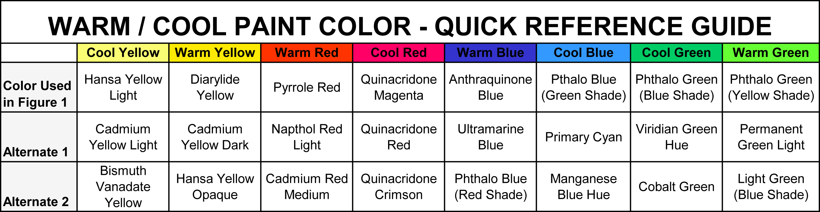
Below is a table that identifies the colors used to create this chart and additional examples of similar temperature colors (Table 1).
For a full listing of the GOLDEN Heavy Body Colors, arranged from Cool to Warm by color families, please see the following PDF: