MAKING A COLOR WHEEL
Click for Printable PDF
A color wheel is a visual map of color relationships and mixing possibilities and can be created in many different ways. These instructions correspond to the example shown below.
Each wheel is divided into twelve equal radial segments and four concentric rings, allowing for a wide range of mixing exploration. The three segments between each pair of primary colors represent progressive mixture intervals of those two hues. For the concentric circles, the method used for each of the four rings varies slightly depending on the type of paint.
This arrangement allows a quick comparison of how a color behaves in different strengths and mixtures.
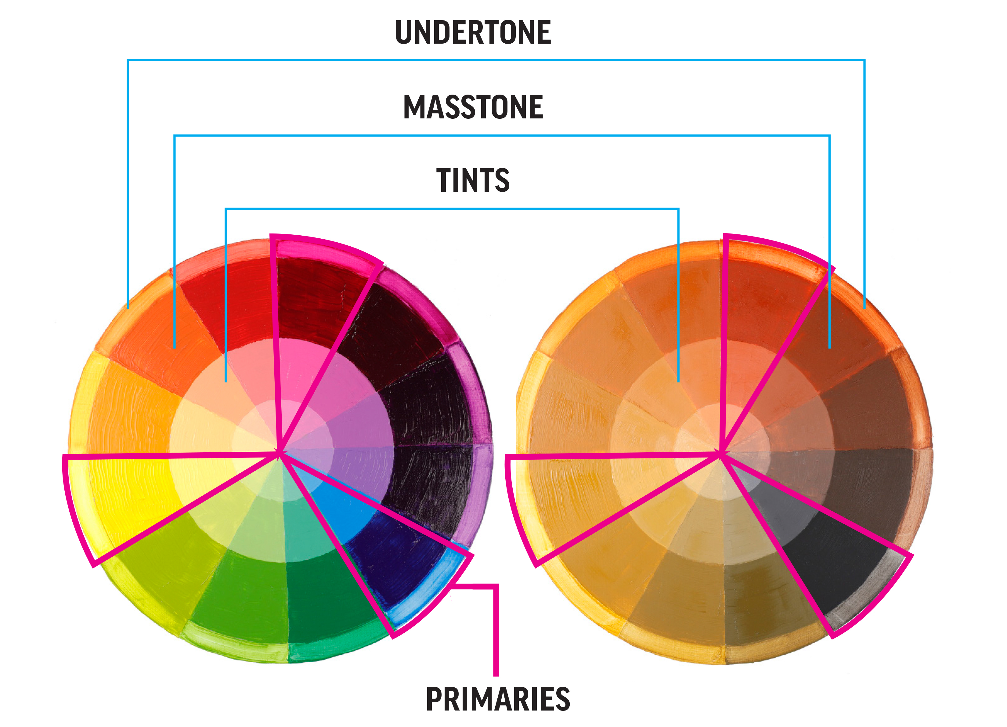
Williamsburg Oils & GOLDEN Acrylics
The color wheel shows four concentric rings, moving from outermost to innermost, representing different ways to observe a color: UNDERTONE, MASSTONE, and TINTS.
- UNDERTONE (outer ring): The outer ring was wiped to reveal the undertone. This is the color as it appears when applied very thinly over a white surface, revealing its subtle underlying hue.
- MASSTONE (second ring): This shows the color at full strength, straight from the tube or pigment. Paint was diluted slightly for brushability with linseed oil for oils and water for the acylics.
- TINTS (two inner rings): Color mixed with white at two different ratios:
1:1 tint (third ring) – 1 part color to 1 part white.
1:4 tint (innermost ring) – 1 part color to 4 parts white, producing a very light version of the color
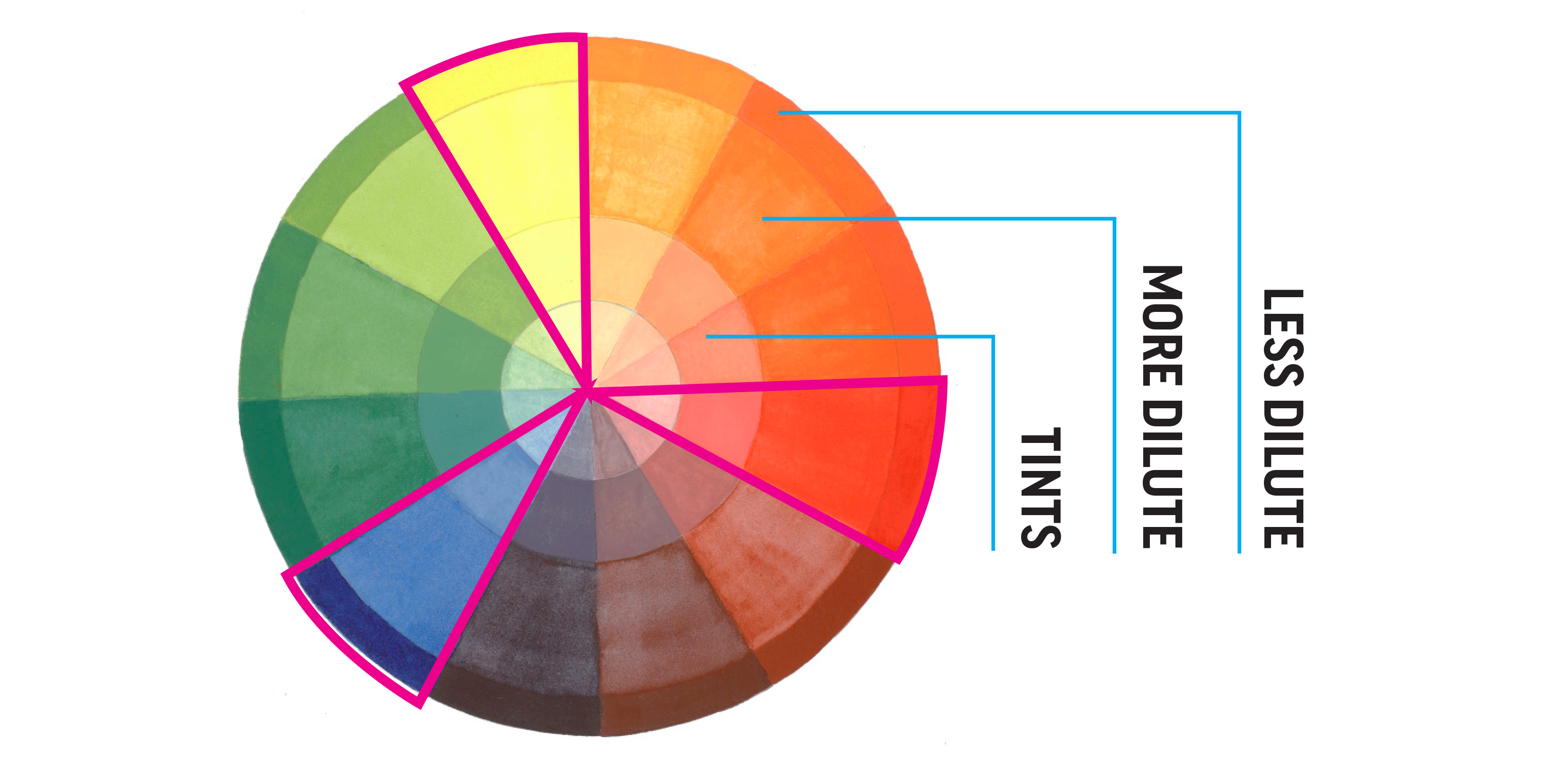
QoR Watercolors
Traditionally, watercolor is heavily diluted and applied in translucent washes and glazes. We reorganized this particular color wheel to showcase that application with the two outer rings expressing two versions of water dilution and the two inner rings showing tints.
LESS WATER (outer ring): The outermost ring uses less water (less dilute) to show a more dense, opaque application.
MORE WATER (second ring): The second ring or main section shows a more typical dilution to highlight the transparency of the colors.
TINTS (two inner rings): The inner rings were made with the same ratios of color to white as the oils and acrylics.
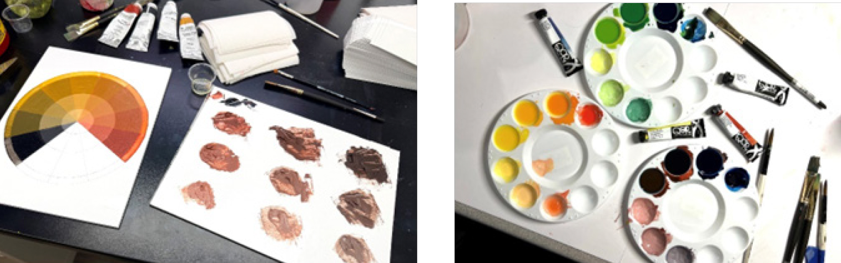
Tips - The photos below offer a glimpse into the process. On the left, oil paint mixtures made from Italian Pompeii Red and Ivory Black are arranged on palette paper. We start by mixing a visual midpoint between the two colors—this won’t always be a perfect 1:1 ratio, since pigments vary in tinting strength. From there, create one mixture that leans more red and one leaning more black. These are the stepping stones to build a range of tones. Adjust each until the progression feels right. Once the range is established, begin mixing tints. First, 1:1 and then 4:1 (Color to Titanium White). The image on the right shows comparable mixes prepared using watercolor.