Reality #1: Binder
The binder for acrylic is polymer emulsion. It is white or milky when wet, and clear, transparent and glossy when dry. The binder affects the mixture. When wet, a color will appear lighter in value, but once dry it will appear darker in value. When mixing colors you may want to mix colors, and allow a sample to dry before applying it to your artwork.
Reality #2: Pigments
There are two types of pigments that paints are made with: Inorganic and Organic. Each type of pigment has a loading capacity in regards to the binder. To put it simply...
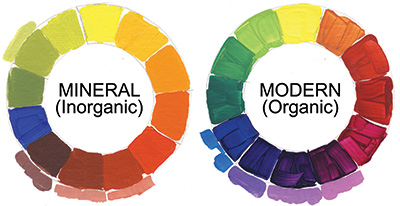
Inorganic pigments are derived from natural mineral or ores, commonly referred to as earth colors: Siennas, Umbers, Oxides, Cadmiums, Cobalts and Titaniums. These pigments are like minute rocks: dense, heavy, matte and opaque (light does not penetrate through these materials). The inorganic pigments will mix fairly easily into the acrylic binder and at a higher "load". The paint that is formulated will have more matte opaque pigment in ratio to the glossy binder. Once dry, inorganics have a matte surface.
Organic pigments have been synthetically manufactured in labs within the last fifty years. Organic pigments are formed from complex carbon chemistry and have chemical sounding names: Quinacridone, Naphthamide, Phthalo, Hansa and Anthraquinone. Generally, these pigments are translucent in nature and when viewed through a microscope often look like pieces of stained glass. Light does transmit through these pigments. They are difficult and quite finicky to mix in the acrylic binder. Too much and the paint turns into a thick gummy mess. When the paint is finally formulated it has a high gloss (more binder) and less pigment. This formulation of transparent binder and translucent pigment is a perfect vehicle for the rich glazing quality of GOLDEN Quinacridone Nickel/Azo Gold.
These matte and gloss characteristics have a lot to do with color, because they affect the way light waves are reflected back. Gloss mediums tend to "punch up" color and matte mediums "soften, or lower the intensity of color. This is discussed in more detail later in the article.
So, what does an inorganic and organic pigment have to do with color mixing? And who should care? You should.
Forget color theory for a moment and let's focus on the reality of pigments. A few simple facts: When Mineral pigments are mixed together, they create a "muddy" or low chroma mixture. When Organic pigments are mixed together, they maintain their brightness and yield clean, high chroma mixtures.
Let's mix some examples
Mix a Cadmium Red Medium and Cobalt Blue (inorganics) to create violet. Now use Quinacridone Red and Phthalo Blue (organics) to make another violet. One is not "better" than the other is, but one is certainly of a higher chroma (brighter).
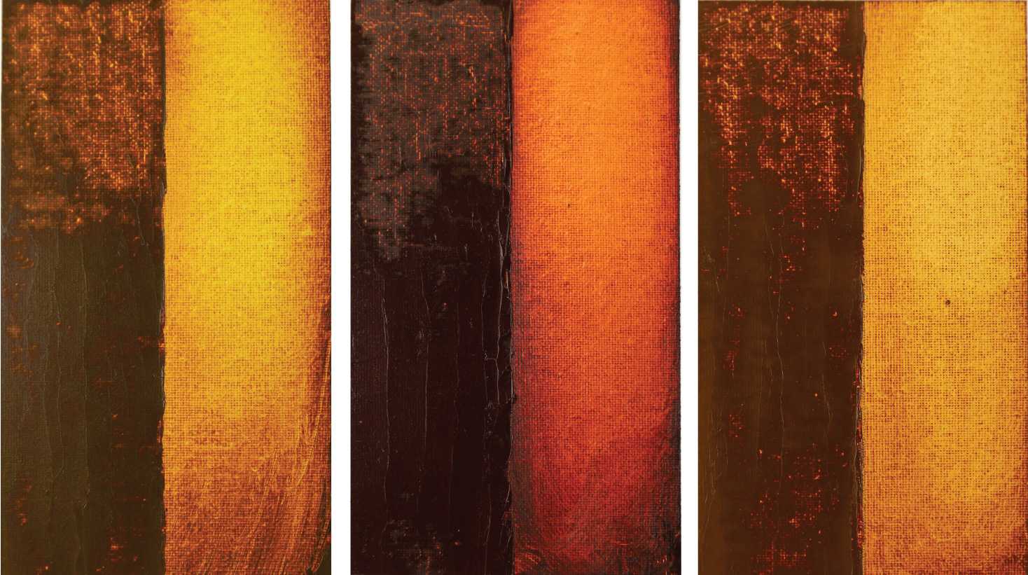
Take a look at the different versions of the Matisse painting below. One is painted with a limited palette of organics and the other inorganics. One is not a better palette than the other, but by understanding the "rules" of pigment mixing, you have solved many color mixing dilemmas and maybe even hours of mixing muddy color.
Inorganic pigments, left -- Organic pigments, right
Reality #3: Additives
Many additives can be added to acrylics, but matting agents are one of most widely used. Matting agents are a particulate matter, typically diatomaceous earth and fine white silica. When viewed in a glass jar, these matting agents look like white powder.
Acrylic Paint Philosophy
Manufacturers have varying views or philosophies on how an acrylic paint should look and perform. The addition of matting agents is one that is universally not agreed upon. GOLDEN Heavy Body and Fluid paints have no matting agents, opacifiers, additives, extenders, or fillers added. The Matte line of colors is formulated for an even surface quality of matte across the entire color line, and matting agents are used to produce this effect.
As a painter, what you need to understand is that the addition of matting agents to acrylic paint will affect color. It is not possible to take the shine off a beautiful rich glossy transparent GOLDEN Quinacridone Nickel/Azo Gold paint without sacrificing some of the intense chroma of the rich glaze. Visualize what happens to your rich black coffee when you add a powdered creamer. Addition of additives has caused many painters to abandon acrylics when attempting to paint with multiple layers of transparent glazes. Remember! Matting agents are "white stuff". When you add "white stuff" to your transparent glaze, the light bounces off the "white stuff" which causes the glaze to look dull. Plain and simple: The matting agents affect each layer of glaze, lowering chroma and inhibiting the light from moving through each layer.
If you don't like the natural gloss of the binder, the matting agent will do the trick, but it will affect the color. Matting agents are something many artists don't quite understand. When they do, they have a lot more choices and can make informed decisions on the acrylic paint which will give them the results they want.
Matting agents will also lessen color shift from wet to dry, lower surface tack and in large quantities create economically priced student grade paint. Gloss gels are transformed into a matte gel by adding matting agents. The addition of matting agents will allow you to draw on your dried surface with a pencil, since one has a gritty surface and the other a slick glossy surface. How does this affect color? None of these uses of matting agents are necessarily bad. What is important is that you understand that you cannot have your high key color and your matting agents together, and when you buy a paint with matting agents in the formula, you cannot recapture the high key of the color.
For more on color mixing see the Color Mixing Guide.


